Review: Falcon Pro Twitter client
It's a perilous time to be the developer of a Twitter client, with major changes to the service's API looming on the horizon. We've already seen one Android client shut down in large part because of it, and Windows Phone has seen one if its darlings leave the dance floor, too.
Then there's Falcon, which has quietly been improving for some time in an open beta at XDA Developers. Falcon (the app) actually started as Falcon (the widget) and finally emerged from the forums and is now available for purchase on Google Play as Falcon Pro for about $1.
How's it fare? Let's find out.
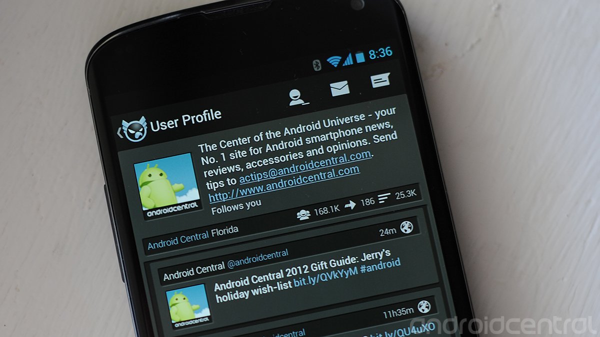
First and foremost, Falcon Pro is wonderfully designed. It's right up there with anything I've used previously, including a certain unicorn of a Twitter client that's yet to see public release. It's that good. Falcon's using a dark palate. There's sort of a top toolbar with an indicator that there's something in a pane to the left, followed by your timeline, mentions and DMs. The icons all sport unread counts, which is fine, though if you follow too many people, those numbers quickly become meaningless. On the right is the button to compose a new tweet. The icons are simple and intuitive. So far, so good.
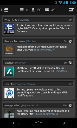
The timeline itself -- the most important part of any Twitter client -- is beautifully designed as well. The name and nickname of the account that posted the tweet is broken out slightly above the tweet itself, along with how long ago it was posted. Standard stuff, and it's really nicely designed here. Avatars are of a decent size, and the body of the tweet has plenty of contrast in white against the dark background. Tap an avatar to get a user's profile. Tap a tweet for more detail. If there's an image attached (and you get a preview in the time line), it'll load in larger fashion. (Tap it again to load in a full browser outside of Falcon.) Scrolling -- which can be the kiss of death for an otherwise excellent Twitter client -- for fast and smooth in Falcon. We've seen a few apps scroll faster -- but not many. Falcon impresses in this department, with only the occasional slowdown when new data is coming in.
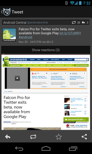
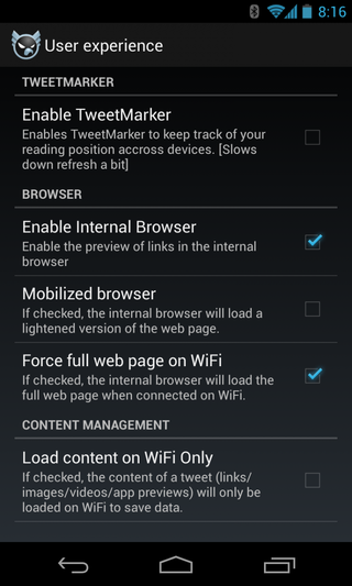
Links are handled smartly as well. Falcon has an "internal" browser, meaning it can load web pages without your having to leave the app. Tap on a tweet with a link attached, and the page will load in the app, under the tweet. There are options to load the page either in mobile form, or as a desktop view. It's worth trying both, as we've seen a few rendering problems in the full view. There's also an option to turn off the internal browser, if you wish.
Controls for replying, retweeting, favoriting and sharing tweets are simple and intuitive. Have we mentioned how well Falcon is designed?
Be an expert in 5 minutes
Get the latest news from Android Central, your trusted companion in the world of Android
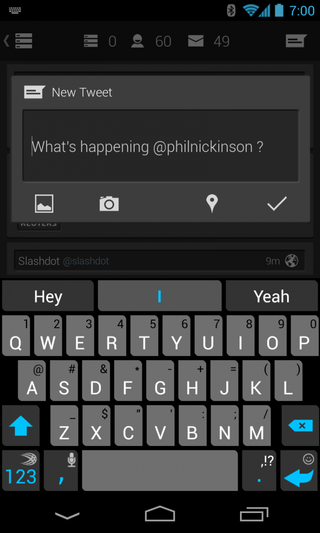
The window for composing a new tweet is simple, with clear buttons for attaching a picture from your phone, taking a new picture, the number of characters that are remaining, location toggle, and the send button. Falcon will save an unsent tweet as a draft, but there's no way to delete that draft that we can see. You'll have to use the backspace button to erase and start over.
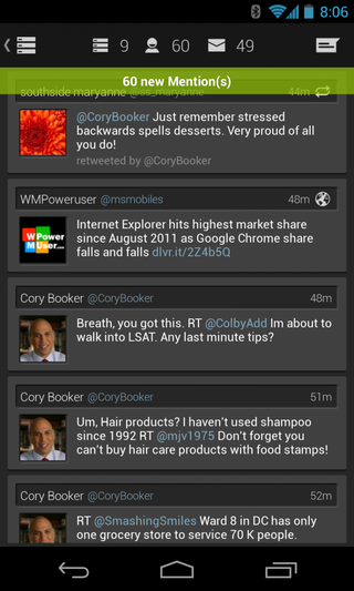
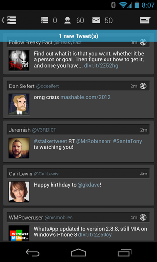
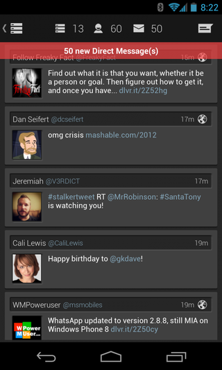
Back to the main timeline now. Whether you're looking at the main feed, your mentions or DMs, a quick pulldown will refresh the stream. You'll also see a colorful little drop-down notification, telling you how many new tweets have come in in each category. Red for direct messages, green for mentions, blue for tweets of accounts you're following. There's no way to turn them off, unfortunately. While it's good to have an indication that your streams have finished refreshing, the three seconds and three colors here become fairly annoying after the first three refreshes or so. A more subtle indicator would be nice, considering how much you'll be seeing it.
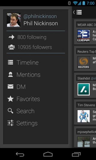
From the main timeline, you can swipe left or right for more features. Head left, and you see your account (tap the avatar to see your details and tweets). From there you can get to your lists of accounts you're following, as well as who's following you. You've also got more buttons to get to your timeline, mentions and DMs, just like the ones atop the main timeline view. (In another nice piece of design, note how the button at the top left of the timeline view changes depending on whether you're viewing your main feed, mentions or DMs.) Favorites and search live here as well.
The settings button brings you to options for syncing and notifications, changing the way the display looks (it says you can customize color, but that setting's missing still, instead you've only got options for displaying media inline, and changing the font size), and user experience (for changing those browser settings we mentioned above. There's also a button that takes you to Falcon Pro's listing on Google Play, so you can leave a review. (Presumably a good one.)
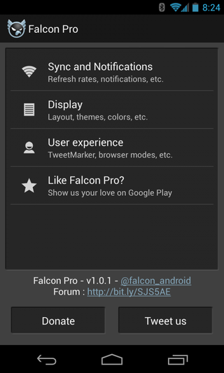
There's a "Donate" button down below that seems a bit out of place. It leads to the $1.99 Falcon widget, which is fine, but calling it "Donate" considering you just purchased the app in the first place seems a little gauche. And if you want a Falcon widget, you'll have to use that old standby in either its free or donation form. There's nothing built into the app yet.
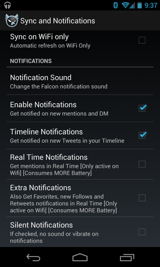
You've got the usual settings for notifications. You can change the sound, toggle notifications on and off, choose whether you want to be pinged on new mentions and DMs, or all new tweets, as well as favorites and new follows.
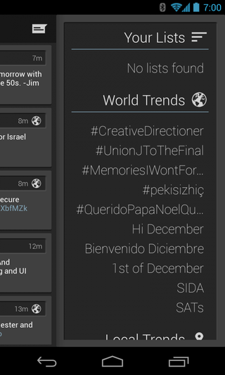
Back to the main timeline one more time. Swipe to the right and you'll see any lists you've created, along with global trending topics, and local trends, which might or might not have anything to do with where you are.
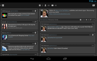
By the way. In portrait mode on a tablet, you get a second column of tweets. Another nice design touch.
The bottom line
Look, for $1, this is a no-brainer. Falcon is one of the best Twitter clients available today, and we expect to see further improvements as time goes on. First among them should be the ability to add a second account. That's the only thing keeping me from making Falcon my full-time Twitter client. For most folks out there, though, that's probably a non-issue. But it is a pretty big feature that's currently missing, so know that going into things.
For this being Version 1, however, we're extremely impressed with Falcon Pro and have no qualms whatsoever about recommending it.
