Quick look: Hootie for Twitter
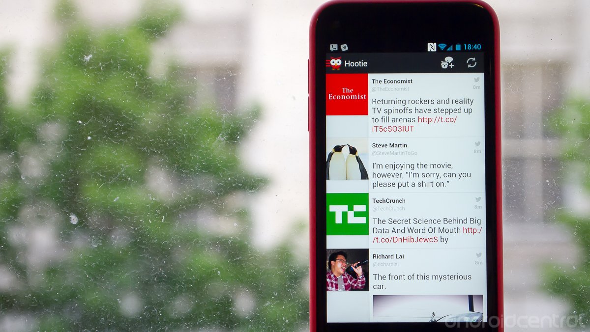
A clean and well-designed new client with a shortage of features but lots of potential
Twitter has been not-so-subtly placing restrictions on developers of third-party Twitter clients in recent months, drastically cutting down on the number of new options out there. But they haven't scared everyone away quite yet -- Hootie is a new client from developer Two Toasters that's a little rough around the edges but has a lot going for it. While it isn't likely to replace your main client of choice if you're a junkie for tweaks and settings, there's a lot here to love that will have us keeping our eye on it going forward.
Hang around after the break and learn a little more about Hootie, a new Twitter client that just hit Google Play.
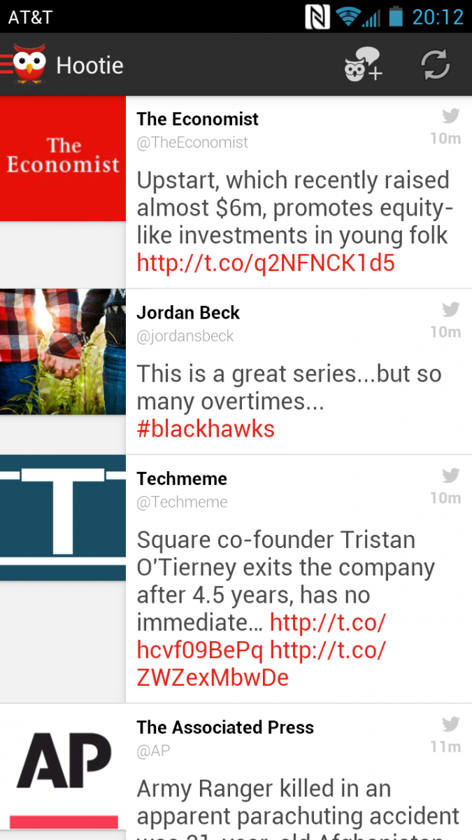
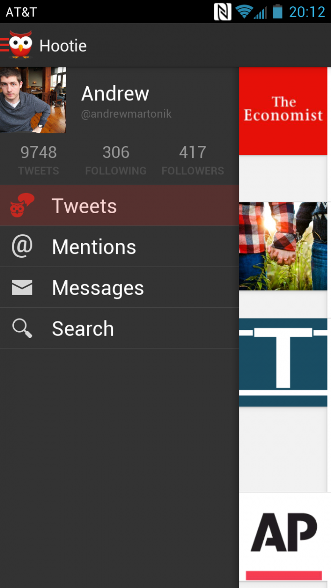
The biggest draw of Hootie, at least for us, is its extremely clean and simple interface, which focuses on user and in-line images as well as links to draw you through the timeline. The main interface is simple, with a basic timeline view, slide-in drawer on the left to switch tabs and view your own profile, and an action bar up top. The entire app is based on a dark/light grey, red and white color scheme, with basic "holo" style interface elements.
The timeline view is simple and scrolls amazingly smoothly with a nice stretching animation when scrolling quickly through tweets. User names and links are highlighted in red to provide contrast, and images are shown very largely in the timeline view. Tapping tweets expands reply, retweet, favorite, share and info buttons -- tapping the info button gives a slide-in panel with expanded information, a full view of any pictures in the tweet and options now in the action bar to DM, retweet and reply to the user. The smooth and simple theme continues into viewing user profiles (including your own profile), which gives a beautiful layout and all the proper information.


A well-done top action bar provides users with the ability to refresh the timeline or compose a new tweet anywhere in the interface, no matter what the app is currently displaying. The functionality basically stops here though, as Hootie doesn't have any sort of a settings menu, user controls or tweaks available. Hitting the menu key simply offers options to filter tweets or sign out of the app completely, there's no settings menu to control refresh intervals, notifications, text size, layout, theme or anything of the sort.
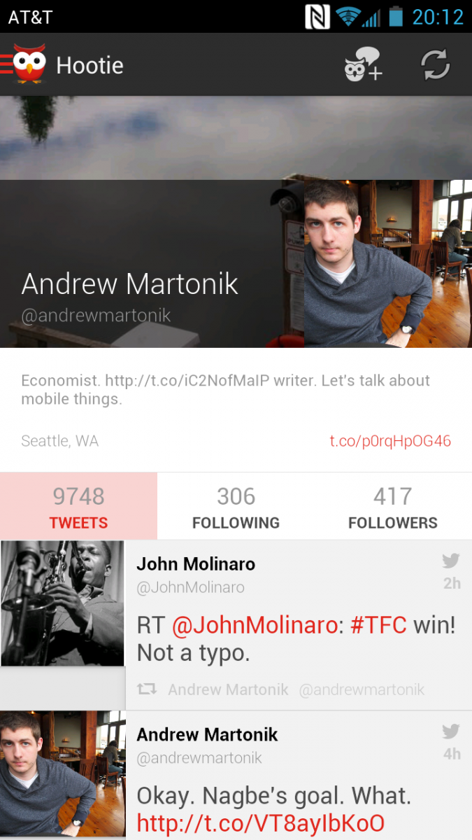
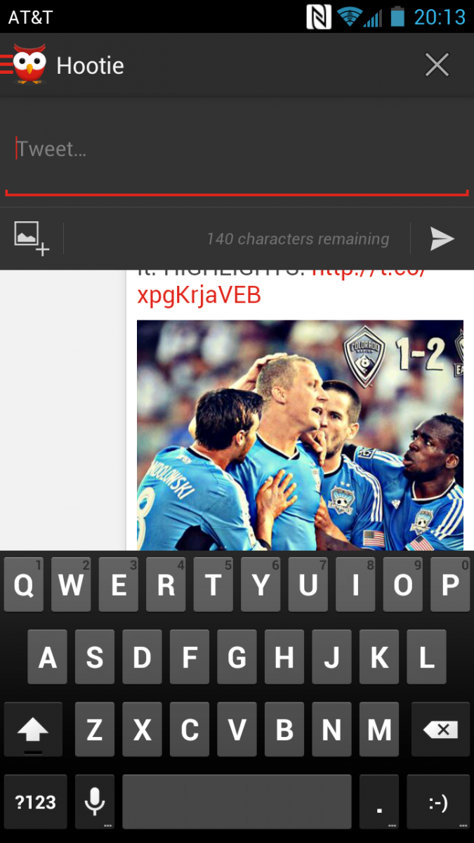
So why are we still excited about Hootie, given all of its shortcomings? Because for a large number of users, it will tick all the boxes for a general-purpose Twitter client. Most people just need a beautiful and great-performing client that will help them read their Twitter timeline and provide some basic functionality. Hootie provides that, and does so extremely well. For the rest of us power users that want more tweaks and features, we would suggest keeping an eye on Hootie going forward. There's some serious quality in terms of both design and engineering in this app, enough that it has us excited to see Hootie evolve in future updates.
Be an expert in 5 minutes
Get the latest news from Android Central, your trusted companion in the world of Android
Andrew was an Executive Editor, U.S. at Android Central between 2012 and 2020.

