PayPal updated with refreshed UI
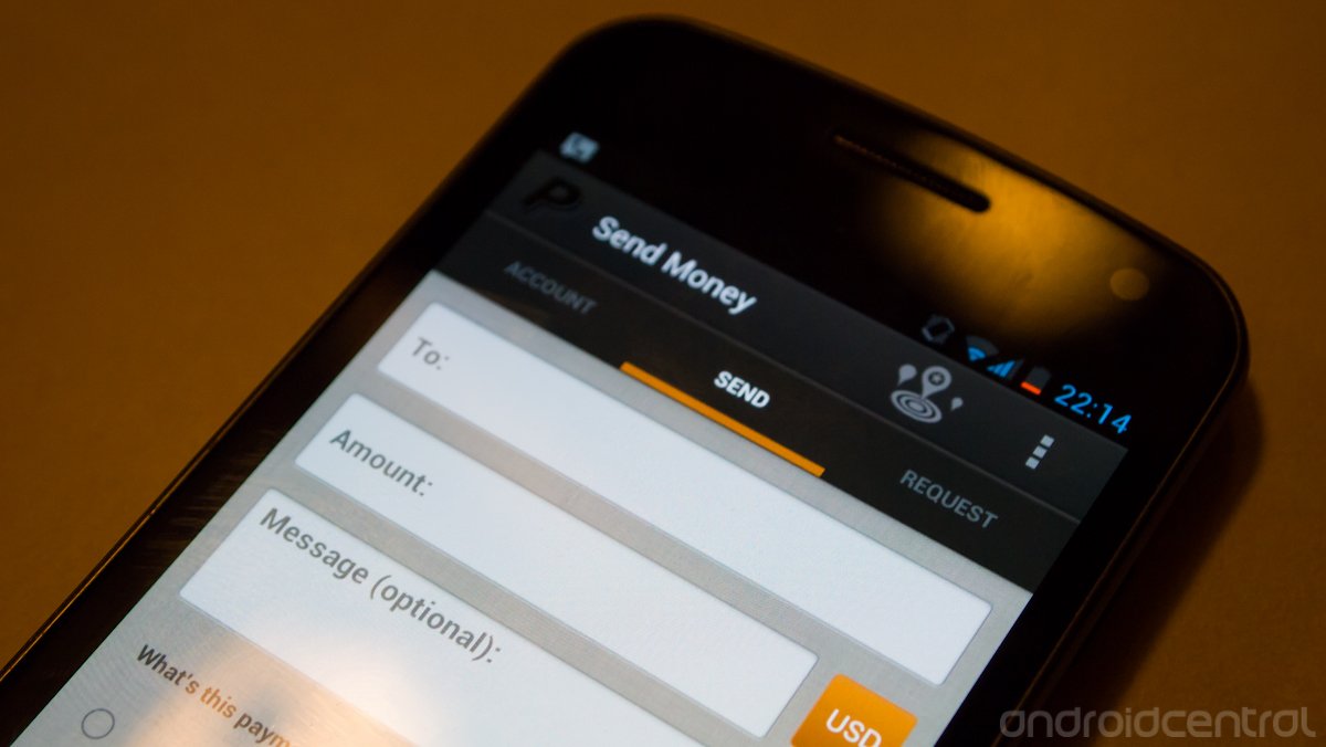
Although the previous version of the PayPal app was functional, it wasn't going to win any design awards. It was clearly something from a previous era -- one where phones had menu buttons to be specific. Luckily the latest version has undergone quite a bit of a makeover, following a few of the latest Android design guidelines for 4.x devices. Gone is the legacy menu button, replaced by an overflow settings button in the top action bar. The app now looks like it follows more of a "holo" UI, with separate tabs at the top of the app, but unfortunately looks can be deceiving and the only way to switch between tabs is to select them directly. It's understandable that each app will tailor the guidelines to their own needs though.
Overall, it's great to see another app developer putting in the time to update and follow the latest guidelines. The apps look and perform better, especially as a higher percentage of users move up to Android 4.0 and above. Hit the Google Play link above to download or update the app on your device.
Be an expert in 5 minutes
Get the latest news from Android Central, your trusted companion in the world of Android
Andrew was an Executive Editor, U.S. at Android Central between 2012 and 2020.

