News360 v3.0: a big update to the popular app

News360 chooses to sidestep other apps that focus on social news recommendations, and instead offers user-focused content generation from a wide variety of sources. The aim is to provide multiple angles to the same story, which is said to offer a well-rounded experience. The app continues to offer the same feature set as before, but is now wrapped in a much more attractive user interface.
Hang with us after the break and see if the redesigned News360 is still a compelling news reader option.


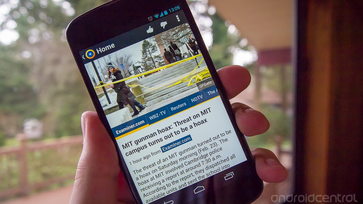
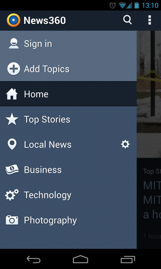
News360 has made the move -- like many others -- to a holo design, which is drastically cleaner and easier on the eyes than previous versions. While it follows the new guidelines, the developer has also customized the color scheme to add a bit of differentiation to the design. The interface is anchored by a full-page view of a single image and its associated headline. Swiping to the left reveals the next story and its headline, while swiping in from the very left edge reveals a navigation menu. In this menu you can switch between categories and manage your account.
The basic view when swiping between articles shows nothing more than the aforementioned headline and image, but the stories are just one tap away. The actual article browser is where News360 breaks away from other news clients. Once you select a headline you'd like to read more about, you then have access to that story from dozens (and often hundreds) of different sources. You can scroll horizontally through the sources and choose which you'd like to read, getting a snippet from each as you select. Once you find one that catches your eye, you can view the full article in the built-in browser or text-only reader.
Now that sounds a little confusing, but in normal usage it works quite smoothly. It's simple to choose news based on a topic or event, then be presented with hundreds of different sources reporting the same topic. It gives you more options if you're looking for a specific viewpoint on a story, or can give you multiple views of the same article if you want to broaden your knowledge base. At the same time if you just want to choose one article and read the first source to get a general idea of what's going on, you'll always have that option.


You can manually manage which categories you're interested in seeing -- such as business, technology, arts, music, science and more -- but you can't choose specifically which sources you'd like to see within them. When reading a complete article you have the option to "thumbs up" or "thumbs down" that given article, which News360 says will help tailor its news selections for you over time, but you can't tell it to stop showing one source all together.
The one complaint to be had with this approach of offering countless sources per story is that some of the content can be of questionable quality. While News360 claims to give a well-balanced list of sources for each topic, the high-profile and trusted sites are often put side-by-side with less reputable ones. It's a tough line to walk as a content aggregator, and users always have that trusty "thumbs down" button when they come across something they don't want.
Be an expert in 5 minutes
Get the latest news from Android Central, your trusted companion in the world of Android
News360 is certainly taking an interesting approach to the news system, offering users an extremely wide range of sources to choose from for each topic. The new interface has been executed well, which makes this popular app worth considering again. If you're looking for a different way to get your news, News360 may be worth a look.
Andrew was an Executive Editor, U.S. at Android Central between 2012 and 2020.


