Motorola Droid XYBOARD review
It's been a long year for Android tablets. Motorola was first to the Honeycomb party with the Motorola Xoom. And while it was the quasi-official developer tablet (and really no slouch of a device), the Xoom was quickly overshadowed by lighter, slimmer tablets. And so the Xoom languished. But at least it languished in good company as it and every other Honeycomb tablet has remained that -- a Honeycomb tablet. Little progress has been made, from a consumer standpoint, in getting 2011's tablets off of that interim version of Android.
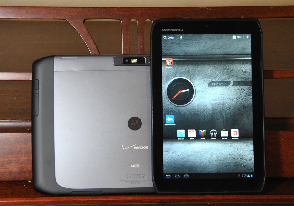
And that brings us to the Motorola Droid XYBOARD. Actually, a pair of XYBOARDs. Motorola's got a 10.1-inch version as well as an 8.2-incher. They've been redesigned -- slimmer, sleeker, and with a few oddball design cues. But they're still running Honeycomb. And they're still pricey.
Will they be enough to turn the tide for Motorola's Android tablet stable? Read on for our complete Motorola Droid XYBOARD review.
Pros
- A worthy upgrade from the Motorola Xoom. Nice to see an 8-inch version alongside the full 10-incher. Faster and more svelte than the Xoom. Nice industrial design.
Cons
- Ugh. The XYBOARD name (never mind that we're playing along with the capitalization game) is awful. And the tablet's still pricey and launched with Honeycomb.
The Bottom Line
The XYBOARD isn't a bad tablet -- far from it. But what does it bring to the tablet in 2012 that other tablets haven't already done in 2011?
Be an expert in 5 minutes
Get the latest news from Android Central, your trusted companion in the world of Android
| Video walkthroughHardware reviewSoftware reviewCamera tests | Droid XYBOARD specsHow to rootXYBOARD forums |
For our purposes, we're mostly going to review both versions of the XYBOARD as if they're a single tablet. We'll mention differences where applicable, and we'll talk about the overall feel of the two sizes. But for all intents and purposes, save for screen size and battery capacity, you're looking at the same device.
The name
Let's just get this out of the way: XYBOARD is a horrible name. Not that smartphones and tablets have a habit of being well-named, but XYBOARD just about takes it, save for the Sprint Samsung Galaxy S II Epic 4G Touch. Have you seen the Verizon commercials for the Droid RAZR where if you buy one, you get $100 off a Droid XYBOARD? Nothing in that statement tells you (nor does the commercial show you) what the hell you're getting $100 off of.
There's cute, and then there's tech sexy -- and XYBOARD is neither. That doesn't (or at least shouldn't) weigh on our review, or your decision to purchase. But that doesn't mean the name's not ridiculous. There. We feel better now.
The video walkthroughs
XYBOARD 10.1 walkthrough
Youtube link for mobile viewing
XYBOARD 8.2 walkthrough
Youtube link for mobile viewing
The hardware
As is the case with tablets, the XYBOARD at its core is a screen and a big battery, with parts crammed in between. That hasn't changed here. But whereas the original Xoom was fat and heavy (at least by most 2011 tablet standards), the XYBOARD has shaved off those corners and slimmed down a bit. It's still not terribly light -- the XYBOARD 10.1 did shave off about 130 grams, down to 603 -- but it's noticeably slimmer at 8.8mm thin. (The Xoom is 12.9mm.)
Not a lot to say about the front of the XYBOARD -- it's a big screen. You definitely can tell where they redesigned the corners. We actually prefer the rounded look for aesthetics, but the XYBOARD definitely has differentiated itself here.
The XYBOARD has a front-facing 1.3MP camera, for what it's worth, and there's a hidden notification light tucked nearby.
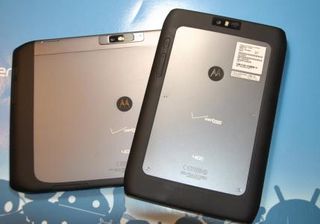
Flip it over, and that's where the real design flare is found. Motorola's gone full industrial on the XYBOARD -- it very much looks and feels like the Droid RAZR's big brother. There's a metallic plate in the middle, mated to the body by exposed screws. The Motorola and Verizon logos are in full display in the center.
Ringing the metallic plate and continuing to the bezel is soft-touch plastic. It looks nice, feels nice and does a good job at providing grip as the metallic plate most certainly does not.
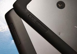
The power button and volume buttons are tucked flush into the soft-touch ring. It's an interesting design choice, and we never did manage to get used to them being there. It's an awkward reach-around if you want to change volume on the fly, and there's not enough differentiation in feel between the power and volume buttons. Is it the worst thing in the world? No. But more often than not we find ourselves fumbling for the buttons instead of instinctively pressing them.
There's a 5MP camera with flash tucked into the usual place on the top short side.
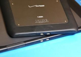
On the XYBOARD 8.2, the microUSB, HDMI and SIM card ports (with the latter hidden behind a door) are all on the bottom short side bezel. Yes, we said microUSB, praise the almighty Bugdroid. We're back to microUSB for charging and syncing, though note that the tablets will charge slower when connected to a computer via microUSB. There is a pair of speakers tucked down here, too. And as usually is the case with Motorola speakers, they're good.
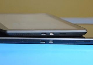
The XYBOARD 10.1 has its ports on the bottom long edge, and the speakers have been moved to the rear of the device.
The top edges of the XYBOARDs have an antenna and 3.5mm headphone jack.
What's under the hood
Motorola's traded in the first dual-core Tegra 2 processor for a dual-core TI OMAP 4430 running at 1.2 GHz. It's plenty fast, as you'd expect. But it's already been eclipsed by the new quad-core devices that are starting to hit the market. It's nothing to turn your nose up at, but neither is it bleeding-edge. The XYBOARD's got a full 1GB of RAM, as it should.
As for onboard storage, you're looking at a few options. The XYBOARD 10.1 comes in 16GB, 32GB or 64GB flavors, and the XYBOARD 8.2 comes in 16GB or 32GB versions. (The new Wifi-only version XYBOARDs only come in 16GB or 32GB varieties.)
With big tablets come big batteries, and the XYBOARDs are no exception. The XYBOARD 10.1 has 7000 mAh at its disposal, while the 8.2 takes things down to 3960 mAh. We found typical battery life for tablets -- and typical battery life for LTE devices. The faster the data, the bigger the suck. You'll want to use Wifi when you can to save on battery life.
Verizon's LTE works as Verizon's LTE does. When it's connected, it's nice and fast.
The software
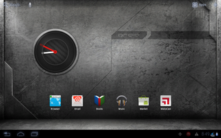
The XYBOARDs are running Android 3.2 Honeycomb, and Motorola already has promised an update to Android 4.0 Ice Cream Sandwich. There's not a whole lot here that we haven't seen on countless tablets over the past 12 months, but Motorola has thrown in a few of its better improvements, like the MOTOPRINT service for wireless printing. There's been a tad of skinning of icons, but nothing that should bother you.
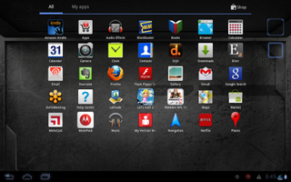
This being a non-Google Experience device (unlike the Xoom), Verizon and Moto have preloaded a few apps for you. The standouts are Amazon Kindle, BlockBuster, VCAST Apps, Audio Effects, GoToMeeting, Let's Golf 2, Madden NFL 12, MotoCast, MotoPack, My Verizon MobileQuickoffice HD, Skitch, Slingbox, VCAST Media Manager, VideoSurf and VZ Navigator.
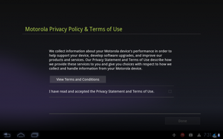
We mentioned this in the hands-on video, but Motorola deserves some kudos for putting its privacy policy front-and-center. You get a notification in the System Bar, and the privacy document, while long, does a nice job of telling you everything you're agreeing to -- and whom to contact with questions.
Otherwise, not a lot to say about the software. It's Honeycomb. We're not expecting any major UI changes with Ice Cream Sandwich. If that changes, we'll revisit.
The camera
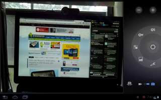
What's old is new again. Same old Honeycomb camera app, which is decent enough. You've got plenty of modes and scenes to play with.
As for quality of the images, let's go to the examples ...




Youtube link for mobile viewing
The wrap-up
We've said before that somebody had to be first to the tablet race, and that was Motorola with the Xoom. The XYBOARD 10.1 and XYBOARD 8.2 are decent enough tablets, and they're nice improvements on the Xoom. We're also delighted to see an 8.2-inch version launch alongside the more traditional 10.1-incher. There's absolutely a place for the smaller size.
But as is too often the case with major-manufacturer devices, they're just too damn expensive. The Wifi-only verison of the XYBOARD 8.2 is going for $399, and that's not horrible. But neither does it make the $200 Kindle Fire or $250 Nook Tablet look less attractive. And if you're going with a Verizon LTE version, don't forget about the added cost of montly data fees.
And we're really not knocking the XYBOARD's hardware -- it's damn nice. But it's damn nice for 2011. Nothing wrong with that at all, but we can't help but wonder how long it'll take Motorola to get some quad-core fare, and that gives us pause in recommending the XYBOARD.

