MOTOACTV review
Oh, hello, Moto.
When Motorola announced the MOTOACTV, I really didn't know that to think. An Android-based fitness tracker? Aren't there much cheaper apps for that sort of thing? Then the specs came out and it sounded kind of cool. Still, a phone can do everything the MOTOACTV can.
So what makes the MOTOACTV special? Is it as useful as Motorola purports it to be, or is it another passing fad in the Android world, destined to be dead on arrival, another product to waste away at the bottom of the bargain bin?
I've got an idea, so saddle up, partner, cause you're about to find out.
| It's small, light, and built like a tank. There's no doubts Motorola built the MOTOACTV to be just that, and it'll hang with you no matter the terrain, every step of the way. The web portal is well thought out, too, and really adds something to the experience. | In typical Motorola fashion, the MOTOACTV really wants to play nice with Motorola equipment, nothing else. The pedometer adds steps when you swing your arm (even if you're not walking), and the numbers it gives you are inconsistent with apps that track the same activity. Setup is clunky. |
| Row 1 - Cell 0 | |
| Motorola went out on a limb with the MOTOACTV, so it deserves credit for that. The so-so battery life, fairly locked-down environment, and questionable results all make me wonder if the MOTOACTV is as good as Moto hoped it would be. |
| Hardware reviewSoftware reviewApp reviewThe web portal | MOTOACTV articles |
The hardware
YouTube link for mobile viewing
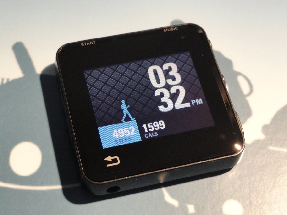
The MOTOACTV certainly is unique. It's small, square, and you can wear it on a wristband. At first glance, it might come off like some overly-large hipster watch that does much, much more than just tell the time.
If only Motorola had made the device as small as the screen (or the screen as large as the device), the whole affair would be better. Instead, what you get is an 1.6-inch screen surrounded by a bezel wide enough to drive a truck on. It makes the MOTOACTV bulkier than it needs to be, and while it still doesn't become overbearing on your wrist, when you notice how much space is wasted on the bezel, you'll feel the same way, too.
Be an expert in 5 minutes
Get the latest news from Android Central, your trusted companion in the world of Android
It's also a bit on the portly side, coming in at 9.6mm thick. When you take into consideration the fact that the 600MHz processor, Bluetooth, Wifi, GPS, and battery are all crammed into this square package, it takes a bit of the sting off, but then you'll look at it again and snidely think to yourself, "Maybe you need to be more active, MOTOACTV."
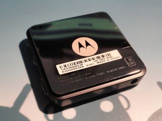
The front of the MOTOACTV is sporting Corning's tough-as-nails Gorilla Glass, which is great, considering the normal wear and tear that'll happen during exercise. The back is a gorgeous, reflective silver metal with a single Motorola logo in the middle, your device's label underneath, and your storage amount in the bottom-right corner.
Unfortunately, you'll never really be looking at the back because you'll always have the MOTOACTV snapped into something. Motorola made sure there's no shortage of accessories to attach your device to, but we'll touch more on that later.

Along the top of the front are labels for two buttons on the top bezel, Start and Music. Hidden in the monstrously large bezel around the screen along the top of the screen is the notification light. It'll blink if you've got any notifications on your phone (assuming you've paired the two together).
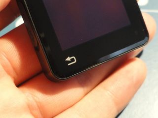
The bottom of the front face has a capacitive back button and light sensor. The screen automatically adjusts it's brightness if you're inside or outside in an effort to maxmize readability and battery life.
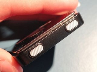
The actual top of the MOTOACTV houses the aforementioned Start and Music buttons. They've got a solid, metallic feel to them, but you've got to press fairly hard to get them to respond. When they are pushed hard enough, there's a slightly audible clicking sound to let you know you've gone all the way.
There's also some shortcuts for both the Start and Music buttons that, once you've mastered them, make the experience of navigating around the MOTOACTV that much easier.
For the music button:
- A single press plays or pauses the current track
- A double press moves to the next track
- A triple press moves to the previous track
- A long press opens up the music player/returns you to the music player
I know a triple press sounds pretty ridiculous when you're working out, but at least they tried.
For the start button:
- Pressing it on the workout screen pauses or resumes your workout
- Pressing it while not on the workout screen returns your workout to the Live Data screen
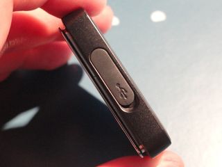
The left bezel has your trusty microUSB port that you'll be using for charging and syncing data to your MOTOACTV. Pretty straightforward.
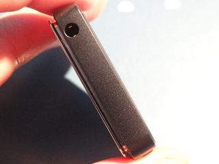
The bottom bezel contains a solitary 3.5mm headphone jack (for those of us who aren't in the wireless game yet). Motorola was kind enough to include some wired earbuds with mine and the sound wasn't too shabby. You do run into the occasional yanking-of-things-out-of-your-ear when the cord gets caught on something, but that's the price we pay for plugging in in the first place.
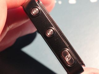
The right bezel is probably the most exciting. It's the busiest, the shiniest, and the most decked out of all of them. Instead of just two buttons seen on the top bezel, the right bezel is sporting a full three buttons, all of them made out of the same material as the Start and Music buttons.
There's the same familiar clicking feel when they're pressed, and yes, you still have to push harder than you think. The three buttons are for volume and the device power, with the two volume buttons trying to replicate a volume rocker as best they can while still being two separate, half-sized buttons.
It pains me to say that the power button also isn't just for turning the MOTOACTV on. Like all of our cell phones, the screen will turn off after too much inactivity, so you'll be pressing that power button often, even if you just want to tell the time. Fortunately, the screen stays on during workouts, so it's really only when you're being a soft-body and lounging that you'll find yourself searching for the power button.
Because Motorola wants to make sure there's never any reason for you to not take your hardware somewhere, they've already got an impressive line of four accessories you can snap your little device into.
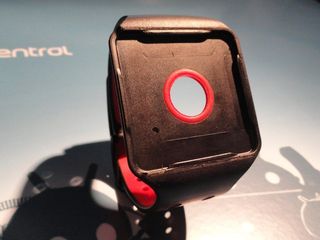
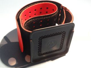
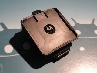
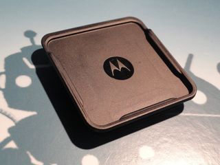
(From top-left to bottom-right: watch band, arm band, bike handlebar clip, waist clip)
All four of these accessories hold the device well, and while the watch band is fairly stylish, it can get a little sticky after you've been sweating for a bit. That's not to say it's uncomfortable (there's never discomfort or pain), but you'll want to take it off to dry it sooner rather than later, I think.
The arm band is really soft and comfortable, which is wonderful. Pair it with some Bluetooth headphones and you're in runner's paradise.
The handlebar clip I didn't get to use, but both it and the waist clip hold the device snugly. I'm not sure why you'd want to keep the device in a pocket or your waist though, because grabbing it to turn the screen off and on would certainly become a pain.
The software

The MOTOACTV is running Android, but as for what version, we don't really know. But it also doesn't really matter. But because it's running Android, though, the interface is already fairly familiar to anyone who has used anything Android.
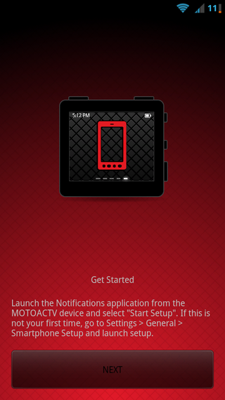
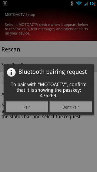
When you first boot up your MOTOACTV, you'll want to set everything up, like your MOTOACTV online account, your Wifi networks for the device to upload data with, and your age, gender, and weight. All of this is fairly intuitive, and the MOTOACTV really walks you through it. Once you've done the initial setup, you're free to move around the cabin homescreens. Our only real gripe here is that it still pairs like a normal Bluetooth device. That is to say, it's really not very consumer-friendly.
You swipe left and right to get around and tap on a screen to open up it's menu. Because there's no hard menu key, the options you see on the screen are what you get. This can lead to some inefficient and convoluted ways to get something done, and in the case of the settings menu, lots of scrolling and backtracking to find something.
Ignoring that, the software on the MOTOACTV is pretty well built. It's obviously been highly skinned and customized, but despite that, doesn't stutter. A persistant niggle is that an arm swing is taken as a step on the pedometer, so if you happen to move your arms often, you'll rack up a lot of phantom steps, which in turn leads to phantom calories burned.
There also are icons for the battery, Bluetooth, and GPS in the top-right corner. Bluetooth and GPS only show up when they're active, but the battery icon is persistant (as it should be). While there's no numerical readout for your remaining battery, the amount left in the icon is pretty true to the state of the charge left, so you won't get caught with a sudden shutoff when you thought you had a quarter of your battery left.
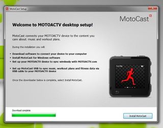
There's also a mandatory install of Motorola's MotoCast software the first time, just so you can get your MOTOACTV account synced up with your device. It also says you have to use it to sync your music, but you can drag and drop files into the folders like any removeable storage. It's kind of annoying, and once my account was created, I uninstalled it.
The MOTOACTV app
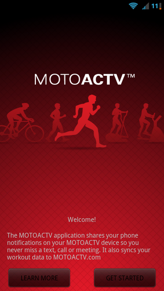
Motorola, in its infinite wisdom, designed a companion app for their MOTOACTV device under the same name. At first glance this is an absolutely brilliant idea, but for one reason and one reason alone, it's terrible.
It's only designed to work with Motorola phones.
Yes, you read that correctly. Instead of designing an app that would work on all Android phone (and therefore be more marketable), Motorola thought thought they could shoehorn everyone into buying a Motorola phone to go with their shiny new MOTOACTV fitness deal.
Unsurprisingly, using that search engine we know and love, you can find the results of some enterprising developers in getting the MOTOACTV app to run on your non-Motorola, non-Blur phone.
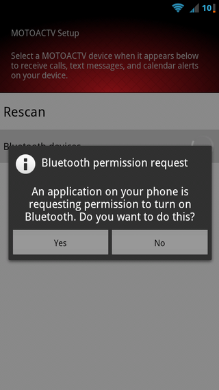
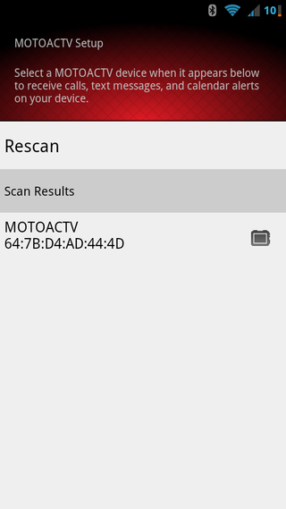
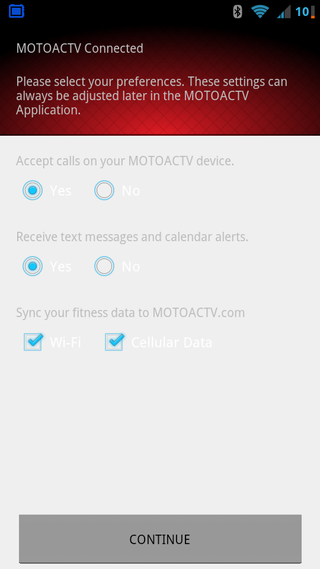
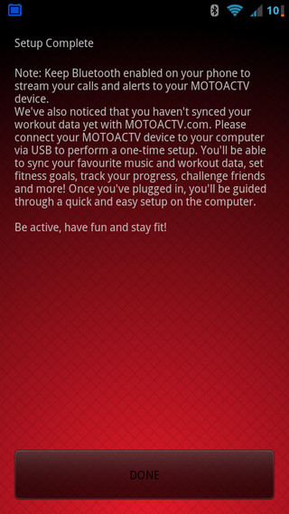
As for the app itself (once it's working), it's fairly elementary. You need to use Bluetooth to pair up your phone and the device (which isn't terrible, assuming the phone and device sync correctly), which is 1.) kind of a drain on both device's batteries and 2.) not all that consumer-friendly, especially if you're totally new to this sort of thing.
Granted, your MOTOACTV device will send a request to your phone to automatically turn on Bluetooth, but I've got to assume this will still be both new and overwhelming for some folks out there.
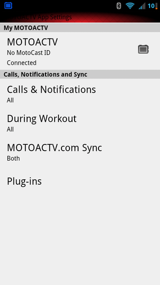
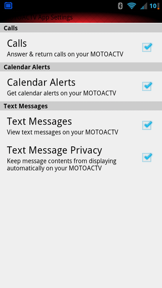
Once you've got the app all nice and synced up with your device, you can do a small number of things. It's got settings to send calls and other notifications from your phone to the MOTOACTV display, and a seprarate set of options for getting notifications when you're working out (not in idle mode).
Perhaps the most powerful option (in my eyes) is that it'll let you sync your workout data to MOTOACTV's web portal using your phone's Wifi and cell data, which means you're not forced to get on one of the networks you put on the device in the first place.
If you do choose to upload using your phone's cell data, the upload is nearly instant. Seconds after I'd finished my workout, the results were already up on MOTOACTV's web portal, ready to be dissected.
MOTOACTV.com
If you're going to have a real-time fitness tracker, you better have a bustling online web portal to go along with it, and Motorola certainly delivers in the form of MOTOACTV.com.
If you've ever used anything like Runkeeper or Endomondo, the web interface will look fairly familiar, but we'll go through it anyway.
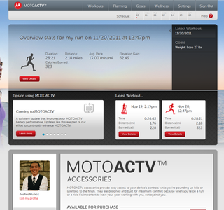
Upon logging in to MOTOACTV.com, you'll be shown a brief overview of your latest workout at the top of the page, with all the pertinent information alongside it. Beneath that are tips and tricks on using your MOTOACTV device, and to the right of that are your latest two workouts.
Just south of that is your profile picture (hey Mom!) and Motorola's gigantic space reserved for hocking their own wares. While it's definitely understandable, I could do without them taking up most of the page for themselves.
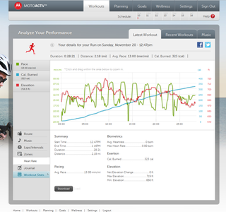
If you hop into the workouts tab, you can click on any of your workouts to see detailed metrics in a variety of fields. This was my jog using Couch to 5k, and as you can see, I've turned on calories, pace, and elevation. There's a number of other metrics to see (like heart rate) that'll give you more insight onto what you're doing as you exercise, which I think is great.
Below the graphs are more detailed fields containing your route information (if you were outside), the music you listened to, your time per lap, heart rate zones (if you have a heart rate monitor attached), a blank space for journal entries, and overall workout stats.
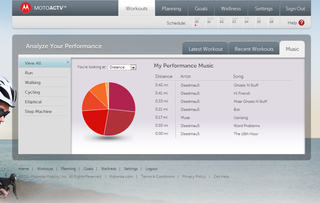
If you're interested in what you're listening to when you exercise, MOTOACTV keeps track of that, too. You can see what you listen to the most and how well you perform to certain tracks. Over time, your MOTOACTV will learn what tracks hype you up, and, if you ask it to, will play them when it thinks you need a boost. Equal parts creepy and awesome.
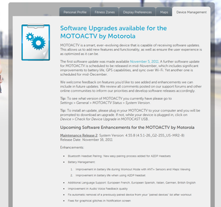
The settings area has lots to see, and one item of interest are the pending updates to the MOTOACTV device. Motorola already has two or three updates in queue, all of which bring various technical and aesthetic enhancements down the pipe. It's good to see them being so proactive with their updates, because it at least tells their customers that they won't be left out in the lurch.
Other noteworthy parts of MOTOACTV.com is the Goals area where you can set a weight loss, distance, or time goal, and the portal will give you a plan to help you reach your goal. The other best part of MOTOACTV.com is that you can plan workouts ahead of time and then you can simply select them from your list on your MOTOACTV device, hassle-free.
If you're the type who is on a tight schedule (or you just don't like fiddling around on the device all that much), setting up your workouts ahead of time online is both efficient and a breeze.
Other odds and ends
- I couldn't pair my Zephyr Bluetooth heart rate monitor to the MOTOACTV no matter how many times I tried. I find this limitation unnerving and behoove Motorola to rethink restricting things as silly as what Bluetooth accessories can pair with the MOTOACTV.
- Battery life is only so-so. If you're wearing this in "all day monitoring" mode, expect to be charging it every night.
- GPS is pretty damn accurate, which puts this at a great price point against other dedicated GPS watches.
- The arm-swing pedometer reading really needs to be worked out if anyone is going to have any chance of knowing how many steps they took and calories they burned in a day.
- I'm not sure who is wrong, but in a workout that was tracked by Endomondo and MOTOACTV, there is a difference in calories burned by more than 100 (with Moto giving me the higher number). Maybe Endomondo is lowballing me, but I'd be worried I'm not burning as much as MOTOACTV is saying, and therefore not progressing as fast as I think I should be.
The wrap-up
The MOTOACTV is an interesting little beast. Part GPS fitness tracker, part watch, part notifications hub, Motorola definitely ran the risk of creating a jack of all trades, but a master of none.
I'm pleased to say, however, that Motorola really succeeds in trying to get a foothold in the fitness market. The fact the MOTOACTV has accurate GPS alone makes it worth buying for a fitness junkie, but other aspects diminish it's usefulness.
The pedometer tracking is obviously flimsy and Motorola's walled garden for applications and accessories both is a pain. The application runs really well once you've found a modified version, but it shouldn't have to come to that.
The same goes for accessories, except no one should be forced to buy a new heart rate monitor just so they can track their heart rate using their MOTOACTV.
The web portal is gorgeous and easy to use, which can't often be said for Motorola products, so they've really knocked it outta the park on that one. Couple that with promised updates and, if they can make good on them, we've got a powerful new fitness tracker.
Still, I can't help but think how many of these functions are replicated by a simple exercise app for our phones (see: RunKeeper, Endomondo), and then the validity of such a device becomes murky.
It's definitely cool and definitely functional, but at the end of the day, if you've got an armband for your phone, you've had everything MOTOACTV had to offer for a while.

