Material Design-inspired Google Play app update now rolling out

Materiyolo
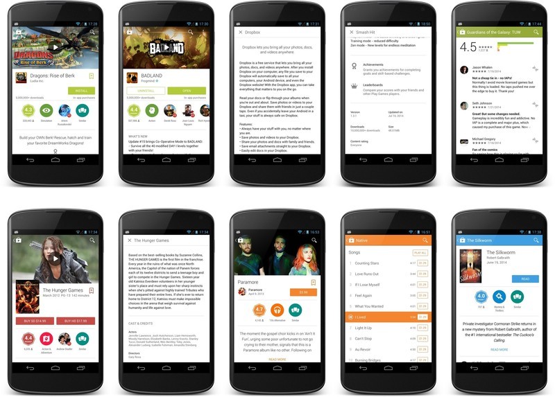
As shown off at Google I/O 2014, the new version of Google Play is beautiful, heavy on the Material Design, and starting to push out now to regular folk like you and me.
While much of the interface is unchanged, when you dive into an application's page (or a book, or movie, or music) you'll see the big changes. New animations, new badges, an awesome header of the associated video (if one is included) are just the beginning, and the whole design of the new content pages looks to have been built from scratch with the new design language.
There are some changes to get used to, as well. Content descriptions now are displayed full screen, and this is where you'll need to look to see any change logs. This is also where you'll find information like version number, the last update time, or the number of downloads.
It looks very nice and has us pumped to see the next version where more of the design has been updated.
Via: +Kirill Grouchnikov

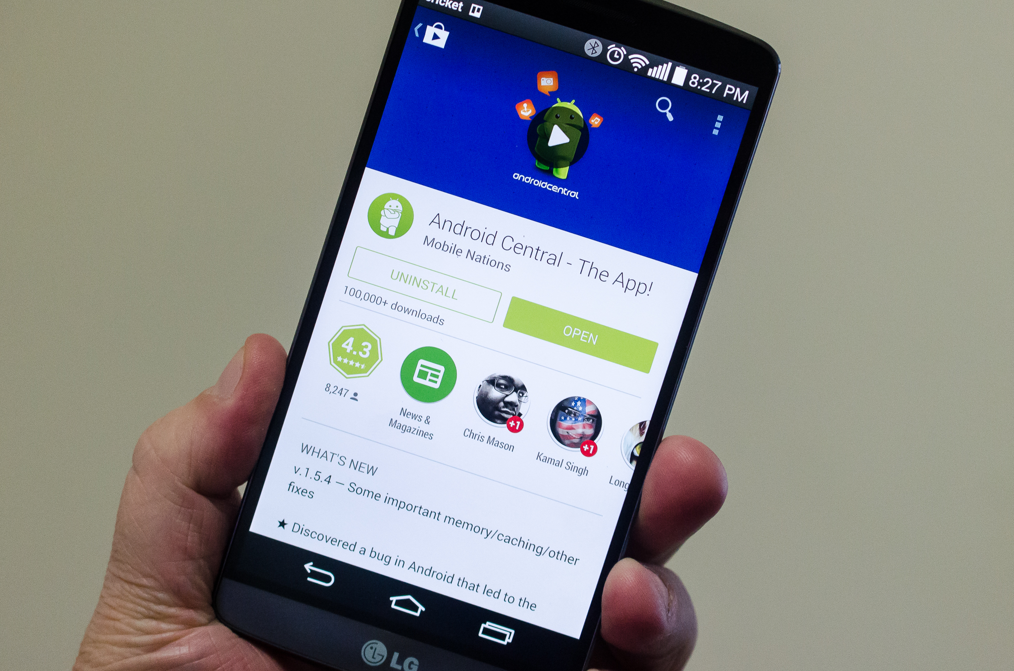
If you want to try out the awesome Android Central app you see in the picture, you can find it right here!
Be an expert in 5 minutes
Get the latest news from Android Central, your trusted companion in the world of Android

Jerry is an amateur woodworker and struggling shade tree mechanic. There's nothing he can't take apart, but many things he can't reassemble. You'll find him writing and speaking his loud opinion on Android Central and occasionally on Threads.
