Material (Beta): yet another social news reader

Material is an interesting app that's hoping to take a slice of the pie in the social news reader space, and is doing so with a beta version of its app that initially impresses in both design and functionality. Where Material may fall a bit short is in the category of differentiation. The implementation and execution of its solid design goals doesn't necessarily set it far enough apart from other apps that are in the same category.
Hang with us after the break and see what makes Material compelling, even in its current beta state.


The basic premise of Material is to look at interactions and articles from your Twitter and Facebook feeds, and then create personalized "editions" (they liken it to a magazine) that serve you news content based on the analysis. When you first open the app, you're prompted to authorize your Twitter and/or Facebook accounts -- you can choose which to use -- and everything happens in the background from there. After a short period of processing, you'll be delivered your first edition.
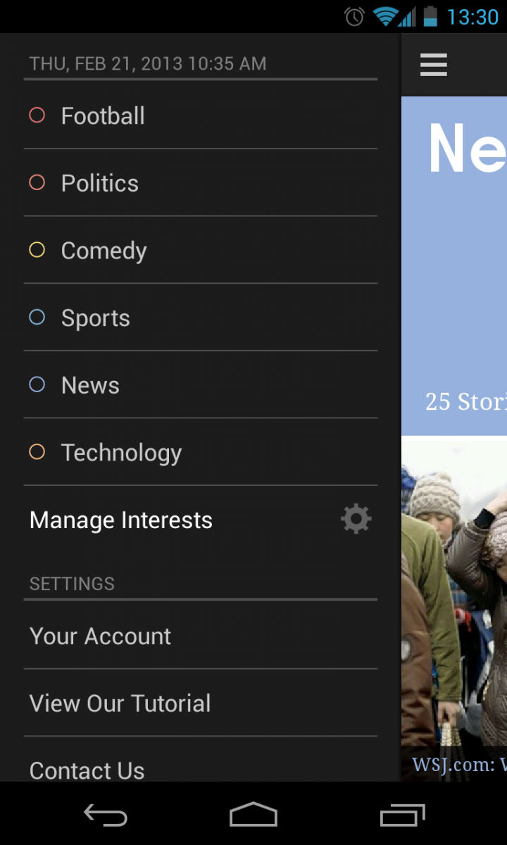
These editions are delivered twice a day, so they aren't updated in real time. What you get to read is just precisely what was available at the time it was generated. Each edition is broken up into different categories based on the story content, and these categories are also automatically generated. In my own use, the first edition did a pretty good job of choosing categories that are useful to me but it wasn't perfect. For example I got lots of information about "football", even though I'm not a football fan. Mixed in with the NFL stories were lots of soccer stories -- football, internationally -- so its clear that things got a little confused.
Material isn't disclosing exactly how it is selecting the articles or categories, but we're going to assume its something more sophisticated than just a listing of every article your friends or followers have linked to throughout the day. The app is supposed to learn over time what articles you're reading to get a better idea of what categories to serve you, and we'd hope that they do so. You can manually edit categories if needed, but if you end up having to go through and micro-manage your sources, you might as well go with a service that does no prediction at all.


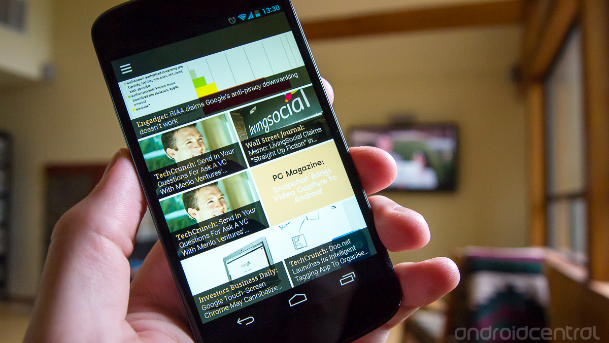
Prediction and editions aside, the app is designed and functions extremely well. The interface is basic and intuitive, with a use paradigm of scrolling up and down to read within a category, and side to side to switch categories. Hidden behind a slide-in panel on the left is a category selector and settings menu. The categories are color-coded to help give you a sense of which you're in, and each article is represented as a title overlaid on a tile of the header image. Unfortunately not all web page stories are formatted properly to show the header image, but Material makes up for it with plain colored backgrounds instead.
When in an article you're just looking at the mobile web view of the page, which a vast majority of the time offers a good experience. Sometimes the formatting is incorrect for the narrow view of the app, but the blame really lands on the websites themselves for not formatting things properly. One nice feature of the app is that when you reach the bottom of a given article, you can continue to scroll and land on the top of the next article. It saves a lot of extra swipes and taps to get through your reading.
Be an expert in 5 minutes
Get the latest news from Android Central, your trusted companion in the world of Android
In its current state, it's clear to me that Material is deserving of its "Beta" tag. The interface and design of the app are certainly top-notch, but the execution of the idea is lacking at this point. I see great potential for Material if the predictions and features receive a bit more polish when the app sheds its beta suffix.
Andrew was an Executive Editor, U.S. at Android Central between 2012 and 2020.

