LG Nexus 4 review
The Google Nexus 4 is easily the best since the original, but this one does come with some compromise
There's something about taking a Nexus phone out of the box that still gives goosebumps. Even now, with the LG Nexus 4 -- a phone that leaked every which way to Sunday before finally being announced, sans Google event, thanks to Hurricane Sandy -- hands tremble a little bit. This time around, however, those tremors are from a sense of unease as much as they are from excitement.
After two generations of Samsung devices, Google's Nexus phone line shifts to LG. Worldwide standing aside -- and make no mistake, there's a big world out there, and a lot of it owns LG hardware -- it's not a company with much cachet here in the States.
Article continues belowAdd to that the preconceived hangups folks have about some of the Nexus 4's specs, and we're in for a drama-filled start for the fourth iteration of Google's premier smartphone.
This is going to be fun. Strap in, everybody. It's time for the full Android Central review of the Google Nexus 4 by LG.
Pros
- The Nexus 4 builds on the design of the Galaxy Nexus - and makes it even better. LG's build quality is supurb. The display is excellent, with a fast processor and GPU to push things. Android 4.2 brings some welcome new features (see Photo Share and Quick Settings). Unlocked price cannot be beat.
Cons
Get the latest news from Android Central, your trusted companion in the world of Android
- Storage options are on the low side at 8 and 16GB, with no microSD storage. No option for LTE data. Internal battery will be a turn-off for some. Long-term durability of the glassy back is unknown.
The Bottom Line
The Nexus 4, LG's first phone in Google's premier line, easily is the best "stock" Android phone thus far, and it's the best in the Nexus line since HTC's Nexus One. The hardware is more top-of-the-line than we're used to in the Nexus platform. The design improves on what LG's done with its own Optimus G. And the software improvements in Android 4.2 make the platform that much more impressive. The phone's not without compromise, but it's also an easy phone to recommend, especially for the price.
The Nexus 4 walkthrough
The hardware
Here's the funny thing about the Nexus 4 -- we kind of knew it was coming, and we kind of knew what it would be like. First came the rumblings that LG would be the manufacturer, and that it'd be a close cousin to the Optimus G, which the Korean manufacturer launched in September in Seoul. LG brought in journalists from throughout the world (including us) to get the first look at the Optimus G. And looking at the first leaked pictures, as well as the rumored specs, it was pretty apparent we'd be seeing the same species in the Nexus 4.
The Nexus 4 display
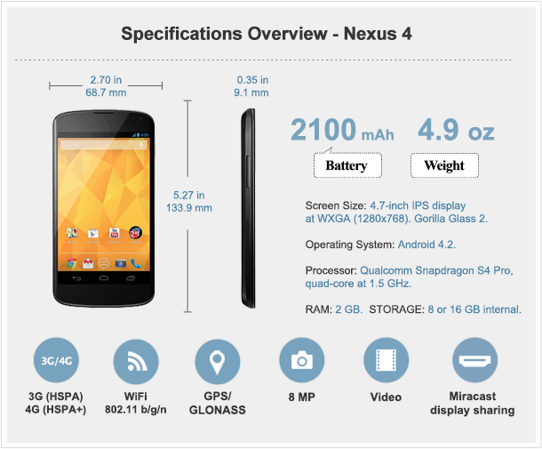
So let's start out front. LG's using the same 4.7-inch IPS display at 768x1280 resolution as on the Optimus G. That packs in a few more pixels than the Samsung Galaxy did (a mere 720p wide). IPS displays are known for their brilliance, and LG's proved itself here. Colors, while toned down a tad from the Super AMOLED panel in the Samsung Galaxy Nexus, are very crisp, and individual pixels aren't as apparent. But the biggest difference perhaps is in color temperature. Whites are white again, and side-by-side the Nexus 4 makes the Galaxy Nexus display look like a yellow tobacco stain. If we had to pick two displays to duke it out for the next year, we'd pick LG's IPS display, and the Super LCD2 display being used by HTC.
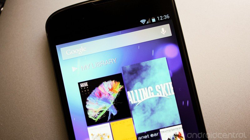
The Nexus 4 display is covered by Gorilla Glass 2, and it takes a subtle curve toward the edges of the phone -- a very nice design touch. We wouldn't call that "curved glass" or a "curved display" or anything, though. The front-facing camera's in the top right corner, and the earpiece is a sliver where the display meets the top edge. There's a notification light below the screen that works the same as on the Galaxy Nexus.
Outdoors, the display is very much usable in direction sunlight. Maybe not quite as much as the HTC One X, but it's really close. Same goes for if you're wearing sunglasses.
Reading text on the Nexus 4 was a breeze, be it in Chrome or in Google Play Books or Amazon's Kindle app.
=$jump?>
The body
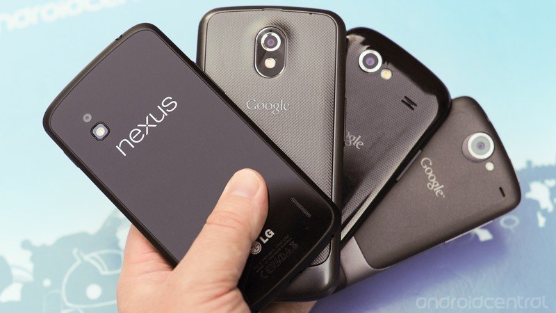
The really interesting thing here is that the Nexus 4, from the front anyway, could easily be mistaken for the Galaxy Nexus, at least by a layman. They're close enough in size and shape, though the Nexus 4 has better design cues. (Whether that's from LG or Google we'll be debating for some time.)
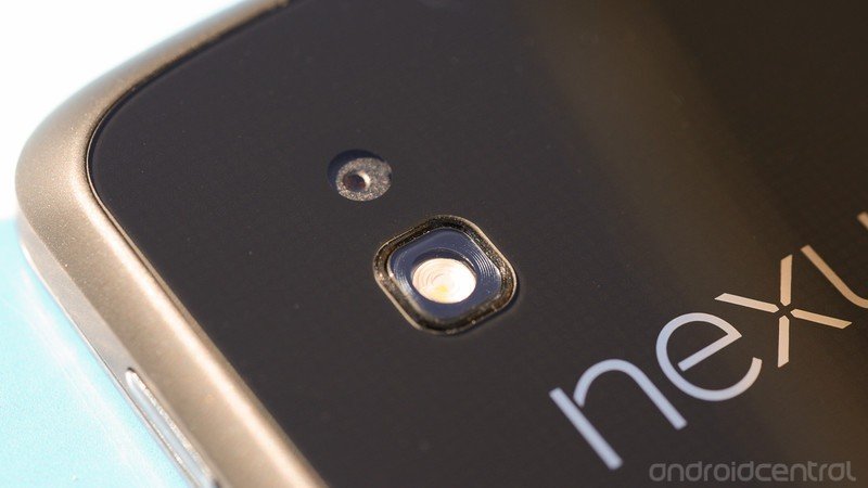
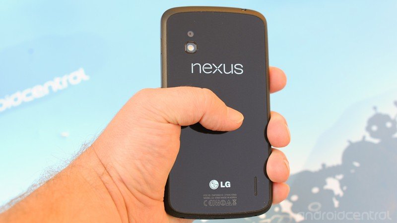
First, the boring stuff: The Nexus 4's 8-megapixel camera is flush with the body of the phone. It doesn't stick out at all. But then there's the flash, which has a tiny little ring around it. The more astute will recall that this is the same scheme used in the 8MP version of the Optimus G.
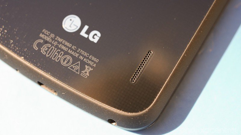
There's also a little sliver of a speaker in the lower right corner of the back of the phone. Again, it's done in exactly the same fashion as the Optimus G. (See the trend here yet?) The bad news is that it's also flush with the phone, so sound is severely muted if the phone's left flat on a table. Prop it up, however, and you've got a decently loud speaker that's pretty crisp.
A lot of folks have asked about the speaker quality compared to the Galaxy Nexus. We're pretty confident in saying it's better. (How much better is subjective, though.) More highs get through, and you get a fuller sound because of it.
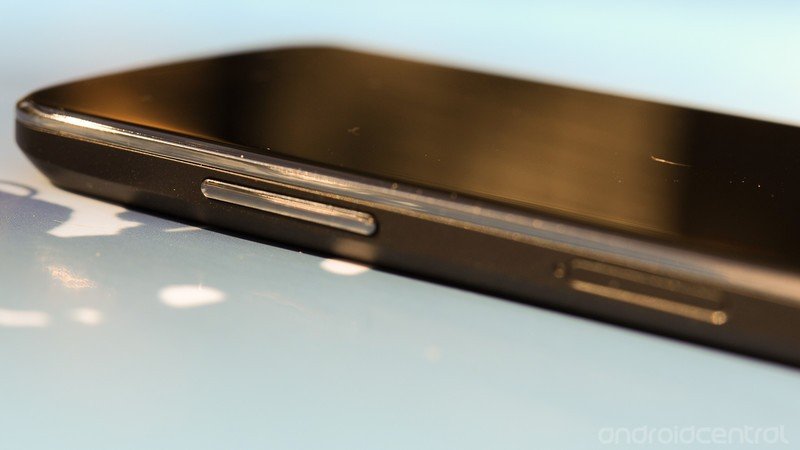
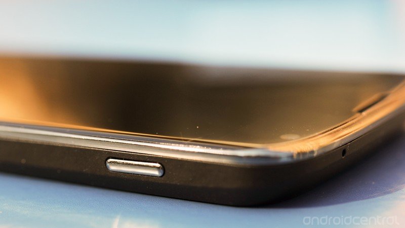
The sides of the Nexus 4 are done up in a rubber soft-touch coating. And it's a good thing, too, because it provides some much-needed grip for what is an otherwise very slippery phone. (A couple big panels of smooth glass will do that.) Power button's on the right, volume rocker is on the left. Fun fact: The micro-SIM tray is in nearly the exact same spot as on the Optimus G. That's not overly surprising, given that they share the same internals. Still interesting, though. (Oh, and the little tool you use to pop out the SIM card try is the same as you get with the Optimus G.)
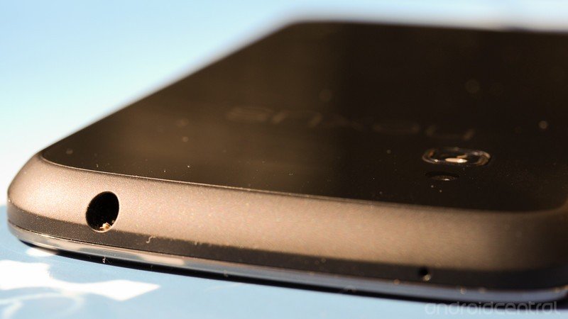
The 3.5 mm headphone jack is on the top edge. I prefer it on the bottom, as I'm a head-down-in-the-pocket kind of smartphone user, and that way the headphone jack points toward my melon, just the way I like it.
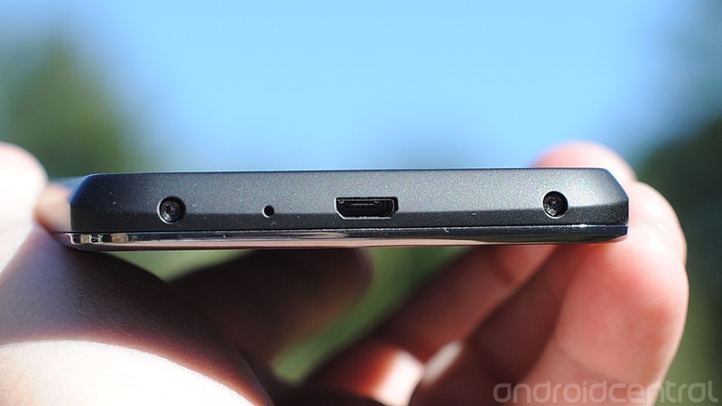
The bottom bezel's got a microphone and the micro-USB port. It's also got a couple of exposed screws -- just like the Optimus G. (Hey, we said they're close cousins.) While it is possible to remove them and get to the internal battery, that's "serviceable" isn't anywhere near the same as "removable." You will not be swapping batteries on the fly, and unless you're the tinkering type with zero regard for warranties, just forgot those screws even exist.
=$jump?>
That beautiful backside
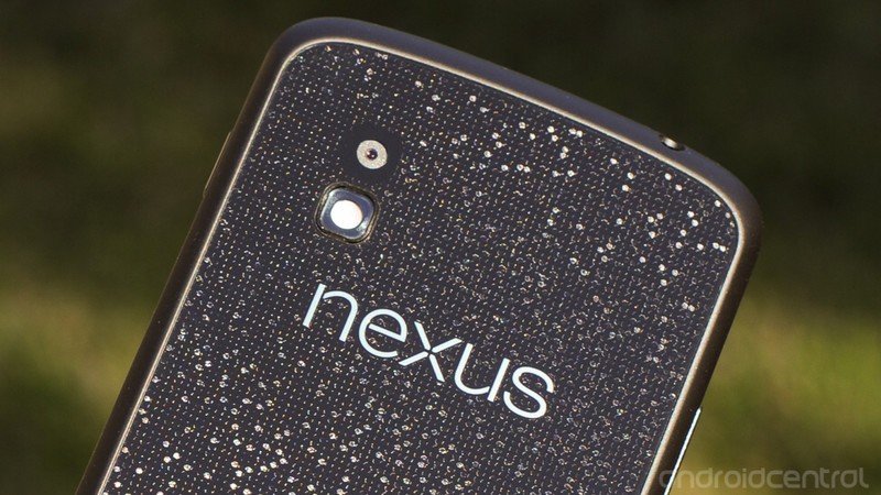
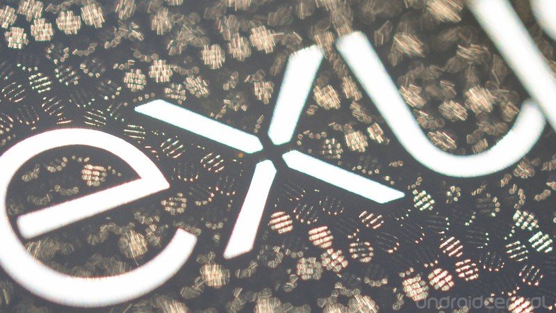
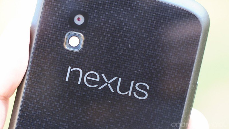
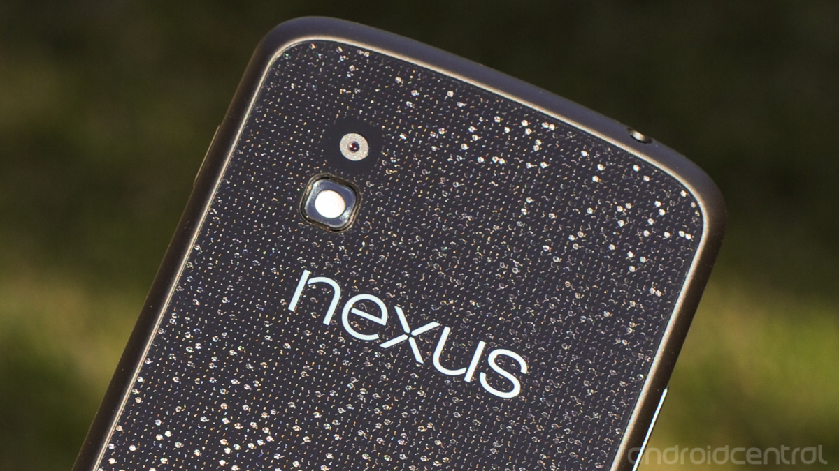
And now the really cool part: The back of the Nexus 4. Oh, that back. This is another one of those features where we knew we were looking at the Optimus G incarnate. Just like on its worldwide cousin, the Nexus 4 has the "Crystal Reflective Process" from head to toe. That's LG's name for a really cool design feature that's almost holographic and adds the illusion of a 3-D texture. But it's covered by some sort of hard, glassy material (we still don't actually know why LG refuses to call it glass, but whatever), and where your brain expects your fingers to actually feel something there is only smoothness.
It's important to note that a few of our pictures here (especially above and back at the beginning of this review) overemphasize the Crystal Reflective Process design. It's not shining in your face all day. It doesn't look like bad '70s bling in your hand. It's much more subtle. And unless you look at the phone at just the right angle, the design its completely muted -- you might not notice it at all.
At the more macro level, with the phone in your hand and not a half-inch from your eyeball, the Nexus 4's Crystal Reflective Process design actually goes back to the live wallpaper of the original Nexus 1. Only here it's even more like watching the code of The Matrix fly by. It's beautiful, especially if you catch it in the right light. It's wonderfully done, and so much more sophisticated than the textured plastic of the Galaxy Nexus.
The bad news is that this back is still a glass-like substance. We're already seeing a few hairline scratches. Chances are there will be more, and the jury's out on the long-term durability of this design, in both the Nexus 4 and the Optimus G. Drops will happen. Breaks will happen. How easily, and to how many owners? We'll just have to see.
Our suggestion? Hang onto the damn thing.
The feel
And that's really the metaphor for the entire industrial design of the Nexus 4 versus its predecessor. Whereas the Galaxy Nexus wowed us by being the first traditional smartphone (ie not the Galaxy Note) with a display of such size, and its sweeping lines and subtle curve kept things interesting, the plastic body was a turn-off for many. I've never given too much credence to the "if it's plastic, it's crap" crowd. But there's no denying that a lot of glass and a little bit of soft-touch go a long way toward producing a much more sophisticated looking -- and feeling -- smartphone. And that's what LG's got in the Optimus G, and now in the Nexus 4.
We use the word "solid" a lot when it comes to quality smartphones, and I'm going to use it again here. Two big glass panels (or one glass and one something like glass) make for a solid phone. The design is a little more boxy than the Galaxy Nexus or Galaxy S3, but the Nexus 4 just feels like a solid smartphone, because it is solid. It weighs 4 grams more than the Galaxy nexus, it's just a smidge wider, and it doesn't have the same curves. But the soft-touch edges -- and their dual-angle design still make it a comfortable fit in the hand.
=$jump?>
Under the hood
The Nexus 4 is rocking Qualcomm's Snapdragon S4 Pro processor. That's a quad-core processor running at 1.5 GHz, for those worried about that sort of thing. It's got the Adreno 320 graphics processor, and 2 gigabytes of RAM. Yeah. It's a beast. (It's also the same as what you'll find in the -- awww, you know this line by now.) We've got zero problems with the phone's performance. It can get pretty warm when it's really gets going, though. One thing missing from the Nexus 4 that the Optimus G has, however, is the "Quad-core control" settings. You'll be able to tweak things through third-party apps, of course.
Battery life
This is a big one, seeing as how the 2100 mAh battery isn't removable. But let's not pretend this is new. Android has been moving toward internal batteries for a year or so now, even if it's new for the Nexus line. Every manufacturer we've talked to has told how it frees up space. There's no sense in acting like it's not a viable design option. If you have to be able to swap batteries on the fly -- and there's absolutely no shame in that -- you'll want to look elsewhere.
The usual caveats apply, of course. We all use our phones differently. After a week of use, both in our usual at-home configuration as well as away from the comfort of stable Wifi, we're very happy with battery life. The Qualcomm Snapdragon S4 Pro is supposed to be extremely economical, and that's what we're seeing in our initial testing. Ten hours of moderate to rough use isn't out of the question on a cellular connection. And make no mistake -- your network connection matters a lot. It's not impossible to drain the battery in just a few hours if the radio's constantly looking for signal. We've done it.
On Wifi all day -- even with the usual battery suck that is smartphone testing -- we eked out more than 18 hours on our first full day of use, and 15 or so thereafter. (For those who worry about screen-on time -- which along with network connection is just one of the things we take into consideration when it comes to battery use, we've been averaging between 3 and 5 hours on a charge.)
We'll keep an eye on battery life and update here as needed. But our impression after a week of use is very good. Some phones are better, sure. But you can always just plug in the phone at some point during the day.
Charging is quick, as well, if you're worried about that sort of thing. The Nexus 4 also is set up for wireless charging with the Qi standard. (For all you folks who have a Palm Touchstone laying around, no, it doesn't work.)
Storage
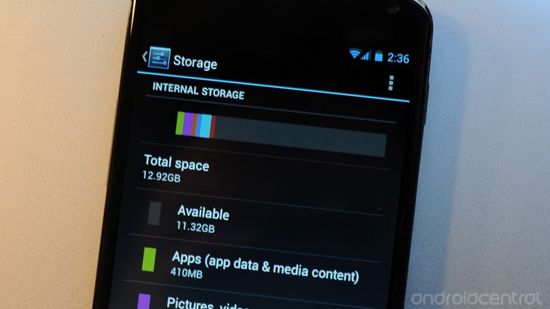
Storage is where we hit another of the major sticking points for the Nexus 4. Google's making the phone available with either 8 gigabytes of on-board storage, or 16GB of storage. There's a $50 difference between the two, and we're going so far as recommending you opt for the larger storage option. The 16 GB version of the Nexus 4 has about 13GB of space available to you at first boot. (With my usual suite of apps installed, as well as a couple games for testing, I've still got more than 11 GB available.)
The other side of that coin is that the Nexus 4 doesn't have any expandable storage. There's no microSD card. We've been trying to prep folks for that for some time now (as has Google). It's the way it was on the Nexus S, Galaxy Nexus and Nexus 7, and such is the case now. If that's a deal-breaker for you, then it's a deal-breaker. Not a whole lot we can do about it.
We're not going wade too deep into the storage debate here. It is what it is, and you'll have to make the purchase decision yourself. While we'd prefer at least a 32GB option, we're OK with 16GB, but just barely. That's our minimum. Is it possible Google at some point will make available Nexus 4s with more storage? Sure. It's possible. But for now, this is what we've got, and we recommending spending the extra money now.
Data and the drama over LTE
Then there's this. The Nexus 4 is a GSM device only. That is, GSM/UMTS/HSPA+ data only. No CDMA, no LTE. The good news is that the Nexus 4 is a 42 Mbps-capable device, so you've got some fast data at the ready, if your carrier supports it. But, no. It's not LTE. Again, we're not terribly surprised but that move, for any number of reasons. (If we had to pick one, though, we'd point toward Verizon's treatment of the Galaxy Nexus, basically reducing it to peasant smartphone status.)
We've gone round and round internally over whether this should be a showstopper. And the truth is we're split down the middle. For some of us, it's a big deal. For others, we understand Google's reasoning, and we're OK with it. If this were any other device -- a "regular" phone on a regular carrier with LTE -- we'd be raising holy hell on principle. But Google's Nexus line has never been about having the most top-of-the-line hardware. (Though no one can argue that the Nexus 4 shuns that paradigm and simply rocks it on paper.) Simply put, Nexus is not your typical smartphone.
Google doesn't have to care about promoting a hot phone on the Biggest/Fastest/Hardest/Longest 4G LTE Network In The Whole Freakin' Universe™ like the carriers do. Its tune is HSPA+. You can either dance with the one that brung you, or go find a phone that's more your speed.
Put it another way: You've got three options: Killer specs, LTE, and an affordable price. Pick two. See if you came up with the same ones Google did for the Nexus 4.
But, Google, we implore you: Find a way to make LTE work. Be it battery, be it frequency, standards, or be it the godawful mess that is the carrier system in the U.S. -- LTE needs to happen on the Nexus line. It's what's next. Otherwise, it becomes the equivalent of the Google homepage being slaved to dial-up modems while the rest of the Internet rolls on 100Mbps fiber.
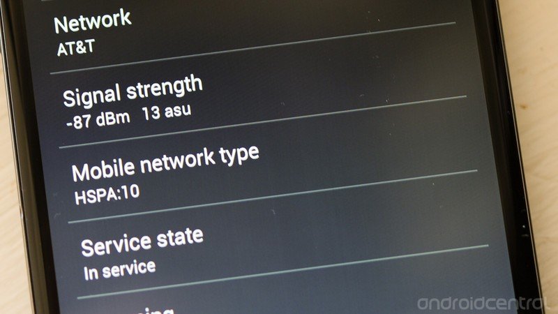
We've used the Nexus 4 on AT&T proper and on a Straight Talk T-Mobile account, and both performed as well as they do on our other devices. (The Nexus 4 has all the radio frequencies to use AT&T or T-Mobile's services, or any other GSM network outside the U.S.) Neither gives some magical speed boost; the Nexus 4 serves up data exactly how we'd expect. Reception will, of course, vary where you live. Whether you can live without LTE or CDMA version is something you'll have to decide on your own. If you really want to give it a go, our recommendation is to buy a Nexus 4 and try it on one of the no-contract options out there. If you decide it's not for you, there's a better than average chance you'll be able to resell the phone for full value.
Oh, and of course there's Wifi on board. The Nexus 4 has 802.11 b/g/n (with 2.4 GHz and 5 GHz available). In some quick unscientific testing, the Nexus 4 appears to do Wifi a little better than its predecessor, especially at greater distances.
=$jump?>
The software
The LG Nexus 4 is the first phone to run Android 4.2. It's still Jelly Bean, and it's not a radical departure or anything. but it's got some new features and some visual tweaks. If you've used Ice Cream Sandwich or Jelly Bean through Android 4.1.2, you'll be right at home here. There are no real surprises, and all the usual Google apps are on board, though there are some new treats.
When you talk about Nexus phones, you're talking about "stock" Android. That is, the user interface and apps are "pure Google." They come directly from Google, and its designers and engineers. To some, this is the only way to fly. Stock Android and its "Holo"-themed user interface is quick, clean and relatively unburdened. It's not trying to do too much while remaining flexible and extensible.
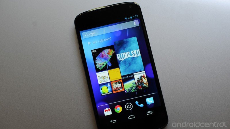
To that end, not a whole lot has changed. Jelly Bean still looks and feels like Jelly Bean. There still are five home screens, with widgets and apps and whatnot. (The biggest addition there is the "My Library" widget that debuted on the Nexus 7.) The Nexus 4 does not change the way you use Jelly Bean (mostly), and it's not a radical departure from Android in any way.
There are some noticeable additions in features. Let's highlight some of them. (And we'll go into more detail of these features in future posts in the coming days.)
Developer settings, unlocking and rooting
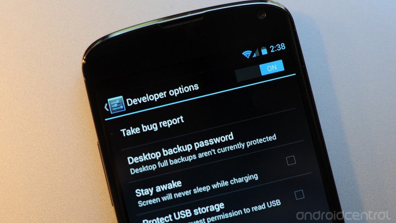
This is a Nexus. There will be hacking. There will be rooting. And the bootloader shall be unlocked. These are all fairly trivial things when it comes to a Nexus phone, but Google's had a little fun with us in Android 4.2 when it comes to the developer options. They're simply not visible in the usual place in the settings menu. Have a look for yourself when you get an Android 4.2 device. They're not there.
Here's the deal: You know those Easter eggs Google likes to bake into Android, where you tap the version name enough times and a little graphic comes up? (See Honeycomb, Ice Cream Sandwich and Jelly Bean.) The developer settings have been hidden behind one of these, too.
To unlock the Nexus 4 developer settings, go to the settings menu. Then choose "About phone." Scroll down to the bottom, to "Build number." Tap it once. Tap it twice. Tap it three times and you'll get a little message saying you're now four steps from being a developer. (Well, four steps from unlocking the dev options on your phone anyway.)
Yes, the developer settings have been hidden on the Nexus 4, hidden behind seven taps of the build number. There's certainly an argument for doing that. I've always been a little surprised that the dev options have been left visible on non-Nexus (I like to call them "consumer") Android smartphones. There's not really anything in there that'll get you in trouble, but it's also not something grandma needs to get into. It'll be interesting to see what the likes of HTC and Motorola and Samsung and the other manufacturers do with this. (My bet is they'll follow Google's lead, and you'll have to unhide them.)
If you're going to do any tinkering with your Nexus 4, like unlocking the bootloader or using a rooted image or loading a custom ROM, you're going to need the developer setting (and USB debugging specifically). And that's how you get to them.
The lock screen
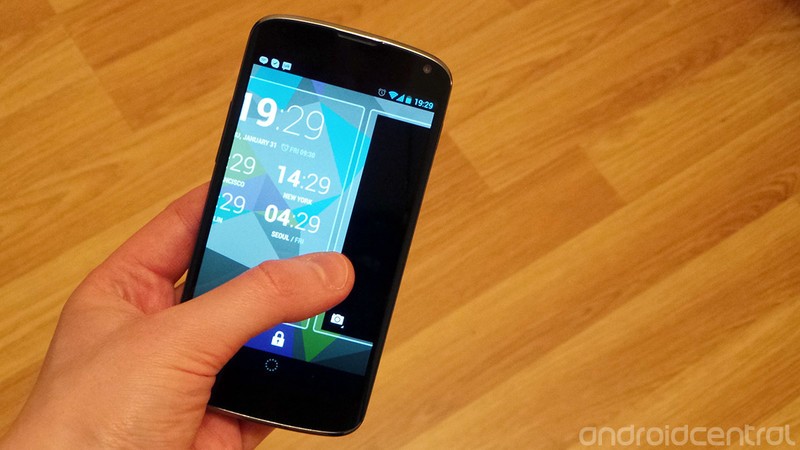
Android 4.2 introduces lock screen widgets, with the intention bringing even greater functionality to the OS even when the device isn't fully unlocked. That means there's a lot more going on than the simple clock and slide-to-unlock mechanism we've become used to. The lock screen -- like the home screen -- is made out of panels, and each can be occupied by an expandable widget. By default you've got a digital clock, and a swipe to the right will reveal a camera widget... which isn't really a widget so much as a blank space that vaguely resembles the camera app.
Swipe down on a widget to expand it, or up from below when it's full-screen to minimize it. If a widget is minimized, you can switch between panels by dragging the edge of the screen left or right. If not, you can scroll by dragging anywhere on the screen. And if you've set lock screen security, like a PIN or pattern lock, this appears instead of the circular unlock area.
If all that sounds a little convoluted, it's because it is. It's easy enough to use once you've gotten the hang of it, but the lock screen widget setup isn't quite as intuitive and well-designed as the rest of the OS -- bluntly, the widgets feel a little out of place. There are also security concerns to do with having your information displayed at the lock screen, though applying lock screen security is one solution to this. But our biggest usability gripe has to do with the inconsistent way you're meant to navigate between lock screen widgets. That's made worse by the fact that with some widgets, like the default clock, it's not immediately obvious whether they're expanded or not. These are all issues that could confuse newer smartphone users, and on an app as frequently-used as the lock screen, that's a big deal.
On the whole, lock screen widgets on Android 4.2 aren't terrible, and depending on how you use your phone, they could actually be pretty useful. Personally, though, we're not convinced just yet, and think this area of Android could use a little refinement. That said, we're interested to see what happens when third-party devs start getting stuck into lock screen widgets.
The notification/quick settings pulldown
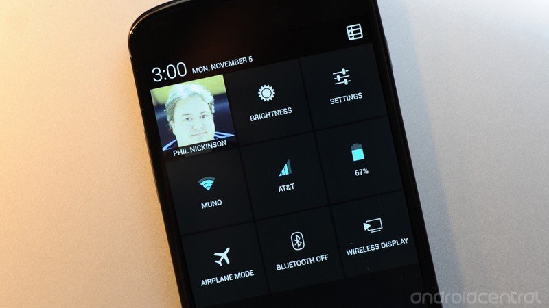
Just about every manufacturer and enthusiast custom ROM has, at some point, added quick settings to the notification pulldown. Google, finally, has joined that club, though it's done so in a different manner. Pull down the notification shade and you'll see the settings shortcut button has changed to … something else. Tap that button, and notifications flip over to quick settings. By default (at least in our preview build), you'll your name and face, as attached to your Google account. Then there are quick settings for brightness, general settings, Wifi, data usage, battery, airplane mode and Bluetooth.
Here's a neat trick, though: You can access the quick settings directly by dragging down from the top of the screen with two fingers. It might take a couple tries, but you'll quickly get the hang of it. Why do things this way? It keeps the notification bar clean (see our recent review of the Samsung Galaxy Note 2 for why that's important), and it gives you a fast way to get to the settings. These aren't merely toggles -- and there's certainly an argument for them, both in design and function. Instead, you've got full settings shortcuts. (Read: More on the new quick settings.)
New and improved Gmail app
This new version of Jelly Bean brings a new version of the Gmail app. Scrolling in HTML e-mails is ridiculously smooth. (There's still no zooming in and out, though.) There's a new option (you'll have to enable it in settings) that shrinks messages to fit the screen and allows you to zoom back in. I never really got used to it, but it does help some.
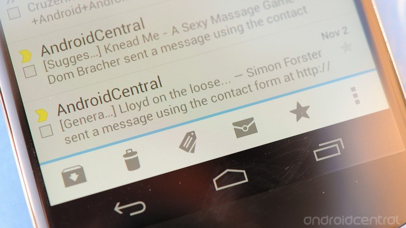
Icons have been tweaked a little, too. Gone is the file cabinet for archiving e-mails. (That one always seemed a little forced.) There's also a new "report phishing" button for e-mails that go beyond spam.
But for us, probably the biggest improvement is the ability to swipe e-mails in the conversation list. By default, it archives or deletes. You can change that in the settings to always delete, or you can set it to have no effect. Once you remember to use it, e-mail management becomes infinitely easier.
We expect this updated Gmail app to roll out to other phones once the Nexus 4 and Android 4.2 are officially released.
Keyboard gets its swipe on
Google keeps improving its stock keyboard with every release of Android. The big changes this time around are the addition of a gesture-input method (yes, like Swype, or the upcoming version of SwiftKey), and some new prediction to go with it, plus updated dictionaries. (Again, that's treading into waters traditionally owned by SwiftKey.)
As stock keyboards go, Android 4.2 remains pretty good, if maybe a little too simple. The prediction is decent enough. The gesture input is smooth, and the the path your finger takes is indicated by a blue line that trails off as you move from letter to letter. It's very nicely done.
The way predictions are presented to you are interesting. You get a choice of three words, just above the keyboard. That's pretty standard. But if you're using the gesture input, the No. 1 prediction floats just above your finger on the screen, so your eyes don't have to move from where you're going to swipe next back to the center of the screen.
Both the gesture input and floating predictions can be toggled in the keyboard settings.
One place the stock keyboard still falls short compared to alternatives is in secondary functions. It's just too clean, too simple. Having to tap over (the equivalent of hitting shift on a full keyboard) to access basic punctuation and symbols (thus keeping the design of the keyboard cleaner) probably is seen as a feature, but keyboards such as Swype and Swiftkey (among many others) have proven that functionality can still look good.
I've used the stock Android 4.2 exclusively on the Nexus 4. It's good. But as Swype promotes improved prediction and SwiftKey adds gesture input, they both trump Google's stock keyboard on ye olde hunt-and-peck front.
Miracast display sharing
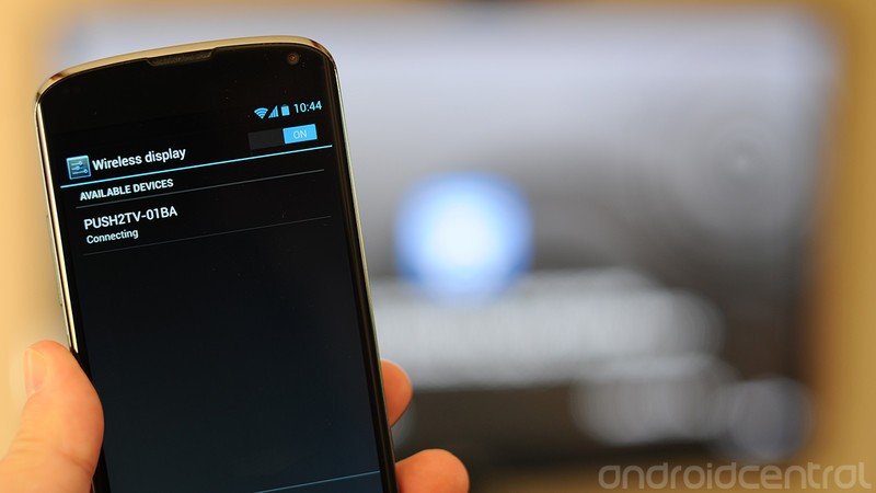
Another phone, another way to stream content wirelessly to a monitor. Or so it seems. Apple has AirPlay. DLNA has been around on Android phones, off and on, for some time. Samsung has its AllShare system. HTC does its MediaLink HD over Wifi Direct. Intel has Wi-Di, and its cousin, Miracast, is what's next.
You turn it on in the settings menu. (And once you do so, it'll be an option in the Quick Settings.) The catch, of course, is that you'll need a Miracast-capable TV or monitor to stream to. Or you'll need an adapter. The Nexus 4 and Android 4.2 have Miracast built in. Find something you can stream to, and, um, stream to it.
Something to be aware of, however, is that Miracast is a relatively new technology. We've already run into the hiccup of a Miracast television adapter that doesn't actually connect to the Nexus 4 because it's "pre-standard compliant." That is, while Android 4.2 may have working Miracast software, the hardware we're trying to connect it to doesn't. (Sort of like what happened in the early days of 802.11 n Wifi connections.) Miracast display sharing is a cool feature to have, but don't buy the phone for it just yet.
Daydreams
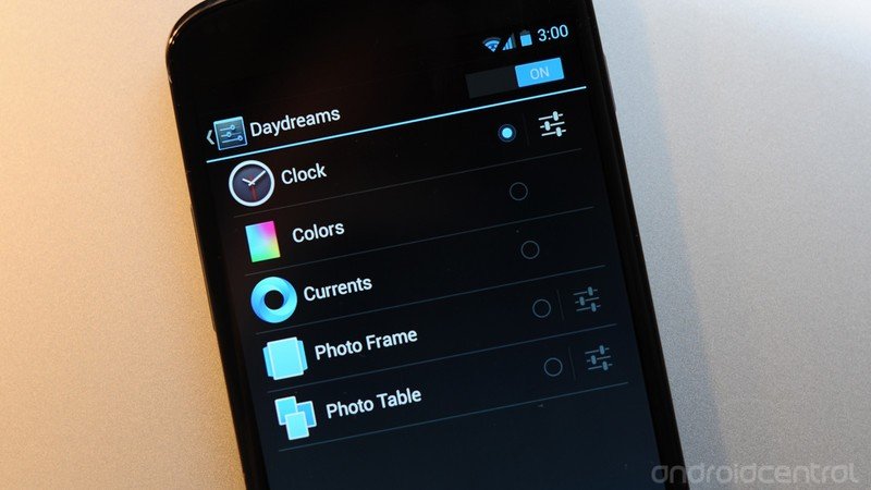
Tucked into the display settings you'll find an option for "Daydreams." These are screensaver-type options that can run when the phone is docked, or when it's charging.
Daydreams has options to show a digital or analog clock, a rainbow color pattern, subscriptions from Google Currents, serve as a photo frame, or as a sort of photo gallery. It's a cool little feature, and it'll works even better (both in form and function) on a tablet. (And you can't help but wonder if this'll make its way to Google TV or a future version of the Nexus Q.)
New Clock app
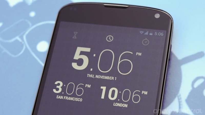
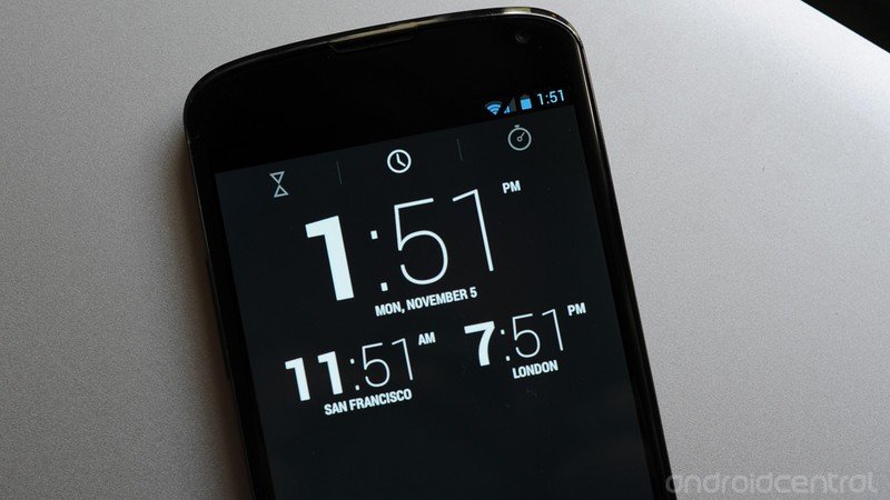
Google's beefed up the clock app in Android 4.2. It's doing wearing a number of hats. Consider: Basic desktop clock. Timer. World clock. Stopwatch. Emphasizing the hour was (ahem) a bold move. Not sure it's necessary from a design standpoint, but it does look cool.
Remember how in the early days of smartphones you might have to hack in your city to get world clocks and weather settings to work? The list of locations you can add to the world clock functions is ridiculous.
=$jump?>
The camera and its new app
This one's the biggie, folks. Google has a brand-new camera in Android 4.2. It's simultaneously familiar, yet new features are going to take some serious getting used to.
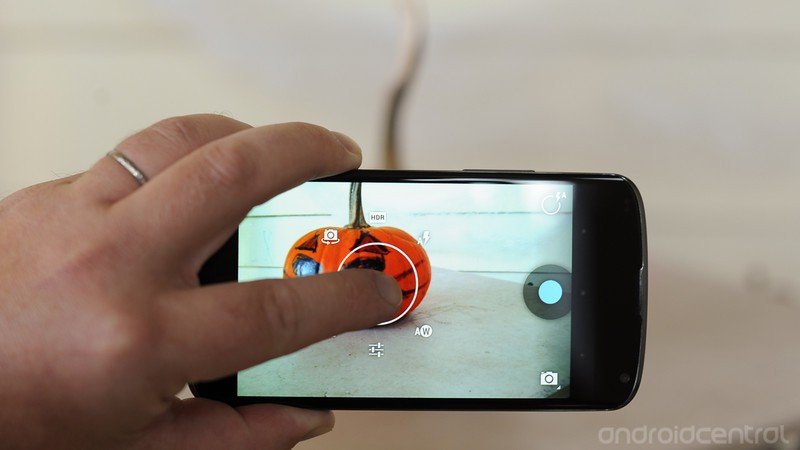
The camera app at first appears to be pretty sparse. Big blue shutter button, camera modes (Ooooo, look! A new one!) and a circle that does … something. Every now and then you'll see a focus ring appear. (Or you can touch the screen to focus on a point, and the ring pops up then.)
That circle button and the focus ring are the first big changes, and they're actually one and the same (which is why the look the same). Tap the circle button and it brings up options, in a circular pattern around that focus ring. Those options are HDR mode (finally!), flash settings, white balance, front/rear camera toggle, exposure and camera settings. The camera settings themselves are pretty sparse -- you have action, night, sunset, party and auto scene modes, a toggle for storing your GPS location, and a choice of image size, which by default is 8 megapixels, or 3264×2448. The settings ring takes a little getting used to -- training your brain that it's there -- but it works, even if it is a little awkward.
Photosphere
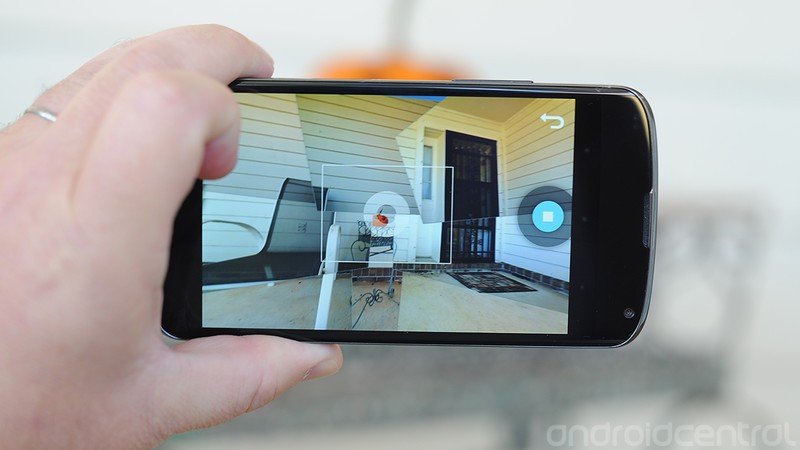
The new camera mode is the much-heralded "Photo Sphere." This is different than panorama shots, which first arrived in stock Android with the Galaxy Nexus and Android 4.0. Instead of stitching five or six linear shots together, you can pan up and down as well, making a 360-degree "Photo Sphere." You might look a little silly taking the Photo Sphere pic -- and it helps if there's no body walking nearby (forget about doing it in a group of people) -- but the result is very cool. You've got a 360-degree panorama that you can explore from your phone and even upload to Google Maps. (There's also a weird "Tiny Planet" option that takes your Photo Sphere pic and wraps it around, well, a tiny planet. (You can change the size of your orb.)
Another sharing option is Google+. View a Photo Sphere pic from your desktop and laptop, and you can pan and zoom all day. That's also a genius move by Google, basically saying "Here's a cool new feature in Android -- now come use our G+ social network to really take advantage of it!" You won't find Photo Sphere pics on Facebook. You can't even properly view them in the Google+ app. (We'd really like to see that change.) And if you open a Photo Sphere pic on the desktop, it just looks like a poorly stitched panorama. It's either the Android 4.2 Gallery, or Google+
For examples of Photo Share pics, I recommend the following:
- My personal Photo Share gallery on Google+
- Our list of 24 awesome Photo Share pics so far
- Search for #photosphere on Google+
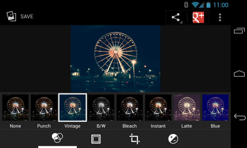
There are new options for after you've taken your picture, too. Yes, filters have come to stock Android, for better or for worse, complete with frames, cropping and post-shot saturation controls.
One feature that's still lacking in the stock Android camera/gallery apps is the ability to snap a still image from a video during playback. You can, however, snap one while recording by tapping the display.
Camera samples
This is, as we say, where the rubber meets the road.
The front-facing camera
The rear-facing camera
Warning: Sample images open in full resolution in a new window
Other odds and ends
- We've had nary a problem with GPS or Bluetooth. Work as advertised.
- Mentioned above, but worth repeating: The rear speaker is loud. Maybe a little overdriven at times.
- As has been the case with the Galaxy Nexus for a number of months now, Google Wallet is pre-installed (along with all the other Google apps you'd expect -- Gmail, Google Maps, etc).
- There's currently a wicked bug in Google Voice in Android 4.2 that crashes the app if you create a new text message and attempt to add a contact to the message.
- Phone calls (yes, some people still do those) were crisp and clear, with the earpiece speaker sufficiently loud.
Pricing
Much hay has been made over how Google has priced the Nexus 4. At launch, the 8-gigabyte version costs $299, and the 16GB model is $349. Those are both off-contract prices. (T-Mobile U.S. is offering a subsidized 16GB model at $199.)
Frankly. We don't care if Google's taking a bath on the hardware costs, or if it had to sacrifice a baby goat at the stroke of midnight. For an unlocked, cutting-edge smartphone -- LTE, battery and storage concerns not withstanding -- these are ridiculous prices. No contracts. No plans. If you're on a GSM carrier, you pop in your SIM card and go. We'd gladly pay a little extra for a 32GB version of the Nexus 4, sure. But $350 outright for a 16GB model is nothing to scoff at.
Throw out the carrier politics. Ignore how much of a hit Google might be taking on the device itself. Those are fun things to argue about, but they really don't matter to our wallets in the slightest. You simply cannot find a better deal on a high-end smartphone.
=$jump?>
The bottom line
It's easy to say that this is the best Nexus phone Google has released in its four generations. That should be a given, right? Bigger, better display. More power. Better battery life. Camera you won't be ashamed to take out in public.
Android keeps improving, keeps adding features. It's the inevitable march of the Android evolution. In terms of build quality -- fit and finish, materials, etc. -- this is the best Nexus since HTC was first up to bat with the Nexus One, a phone that still evokes a good deal of nerdy emotion anytime you pick it up. (If it doesn't, get your head examined.) We said it before, and we'll say it again -- glass and soft-touch beat plastic any day of the week. (That is, of course, presuming that the Nexus 4 holds up in the long run -- we're still a tad skittish about all that scratchable, crackable surface.)
But it's more than all that, really. The idea of "Nexus" keeps growing with each version. Whereas the Nexus One was born from the early Android developer phones, it remaind out of the hands of most normal consumers. That slowly started to change with the Nexus S 4G on Sprint. And then with the Galaxy Nexus on Verizon (though that may have cause more harm than good), and later on Sprint.
At the same time, Google has taken a bit of a step back with the Nexus 4, at least initially. We'd recommend this phone to just about anyone -- short of someone working on a construction site, perhaps -- but that's not to say there aren't compromises. There's no CDMA version. No LTE. No expandable storage. And Google has its reasons for that. Don't agree with 'em? Go buy another phone. There are lots of good ones out there.
This is the Nexus. This is Google's phone. It's built, designed and sold the way Google wants it to be done. It showcases Google's Android operating system and sense of design better than any other manufacturer, and does so leaving room for the owner to customize, tinker and hack as he or she see fit. That's the way it should be. And that's the way it is with the Nexus 4.
