Hands on with the Spotify for Android update preview

For me, Spotify is how I listen to probably 75% of any music at the moment. While the service -- and for that matter price -- is superb, the Android application has definitely been lacking. There have been rumblings for a while about an update, and then just like that it dropped. The preview of the newest version is only available as a direct download from Spotify at present, and isn't the finished article. What is there though is pretty special, and a significant upgrade from the previous offering. We've had a couple of days to play around with it now, so if you haven't tried it out yet, stick around. A full hands on plus some tasty screenshots await you after the break.
The most significant change is the UI. There isn't a single trace left of its predecessor. Design cues have been drawn from Ice Cream Sandwich, and that is in no way a bad thing. Once you sign in, you're still greeted with your playlists as before. But it looks so different, ordered in a distinctly ICS style list. At the top of the page, any playlists downloaded to your device are now highlighted in their own section. Good news for those with a lot of playlists for sure.
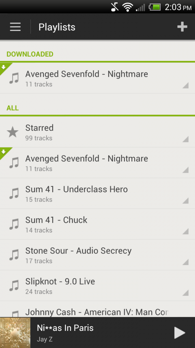
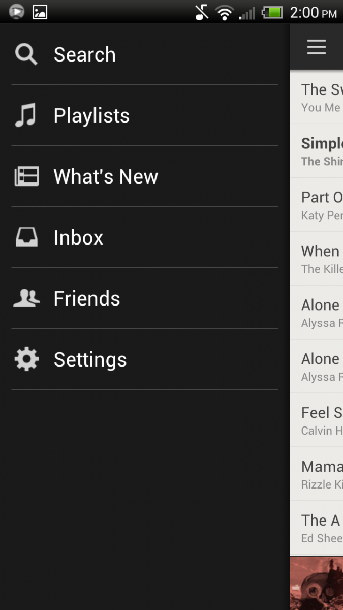
The top left corner is where you'll find the menu button now, again taking its cues from ICS. All the same sub-menus are there, but it slides out from the left of the screen instead of popping up from the bottom. Along the bottom of the screen, is a quick-play bar, showing your currently playing track along with a play/pause button.
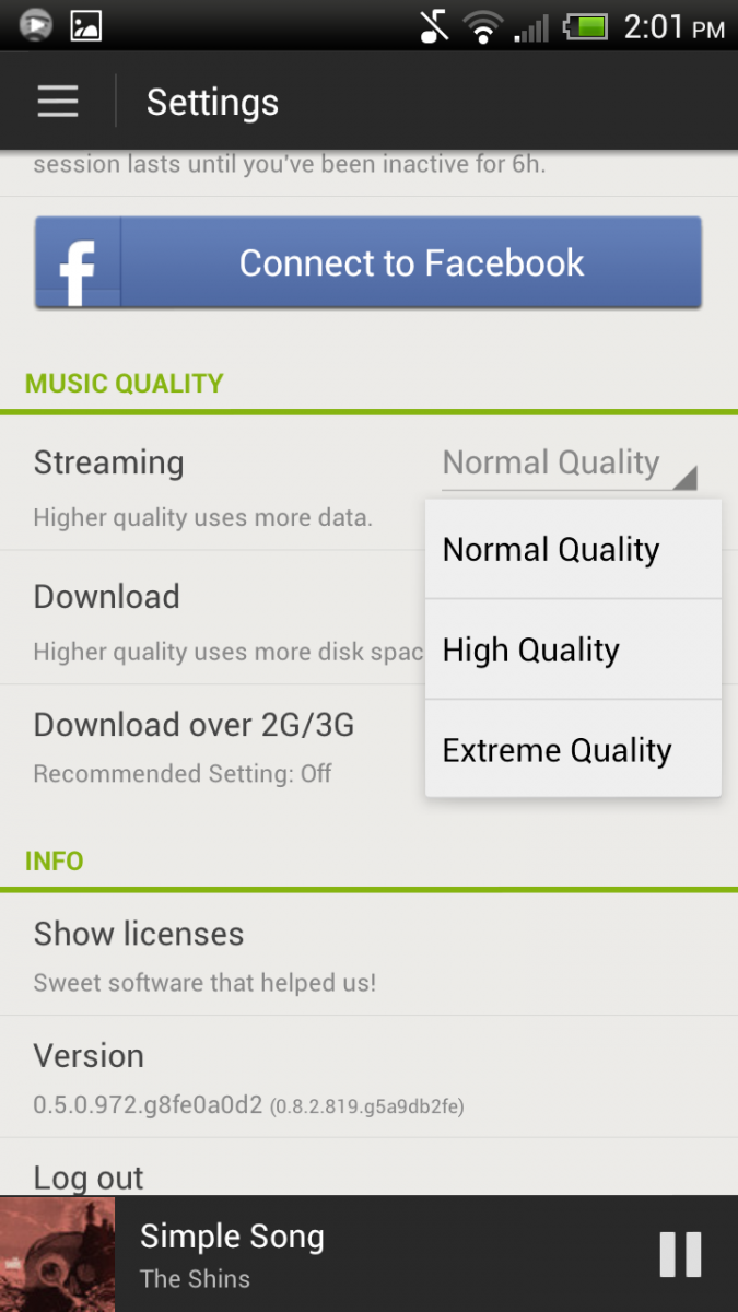
Diving into the menus then, with settings first. The settings menu gives us a tasty little treat in this new version. A little dropdown box which determines the quality of the music when streaming -- and a new "extreme quality." That's right, 320Kbps quality streaming audio. The same feature has been open to our iOS cousins for a couple of months now, and finally it's our turn.
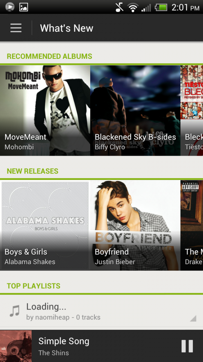
Another section lying within the main dropdown menu is the "What's New" section. On the old app this was a pretty dull affair, but the new version looks a lot closer to the cover flow-esque desktop version. Nice big images of album artwork -- a shame one of them in this image is Bieber, sorry for that folks -- and lists of top playlists and top tracks.
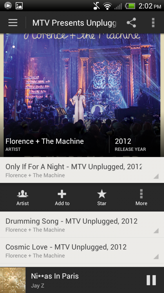
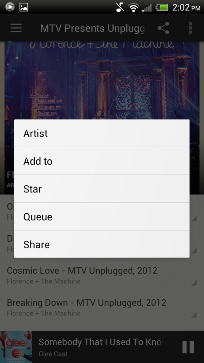
Each track, be it in a playlist or in the actual player, has a little tab next to the track name. This opens up a very nice quick menu bar. The links contained within differ slightly depending on where abouts in the app you are. Put simply, it provises links to the artists, album, adding to a playlist, queue, starring the track, and your sharing link. Some are covered within the "more" tab.
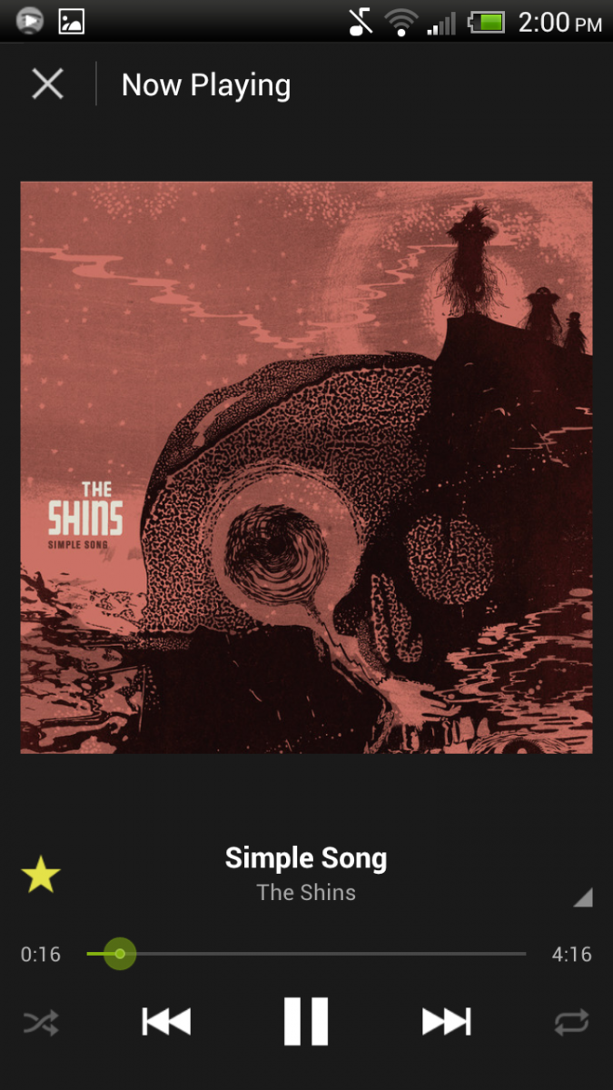
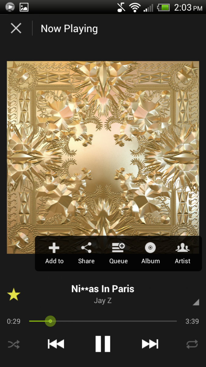
Finally, what about the actual music player? Functionally it's the same basic player as in the old version of the app. The difference is in the appearance, and all the better it is for it too. Finally, Spotify have graced us with a good looking, easy to use Android application. So far -- for me at least -- this version hasn't crashed in two days of pretty constant use. The same couldn't be said for the previous version.
Be an expert in 5 minutes
Get the latest news from Android Central, your trusted companion in the world of Android
There you have it. If this has whetted your appetite, hit the source link below where you can find the download link for yourselves.
Source: Spotify

