Hands-on with the new Google Play Music app and All Access subscription service
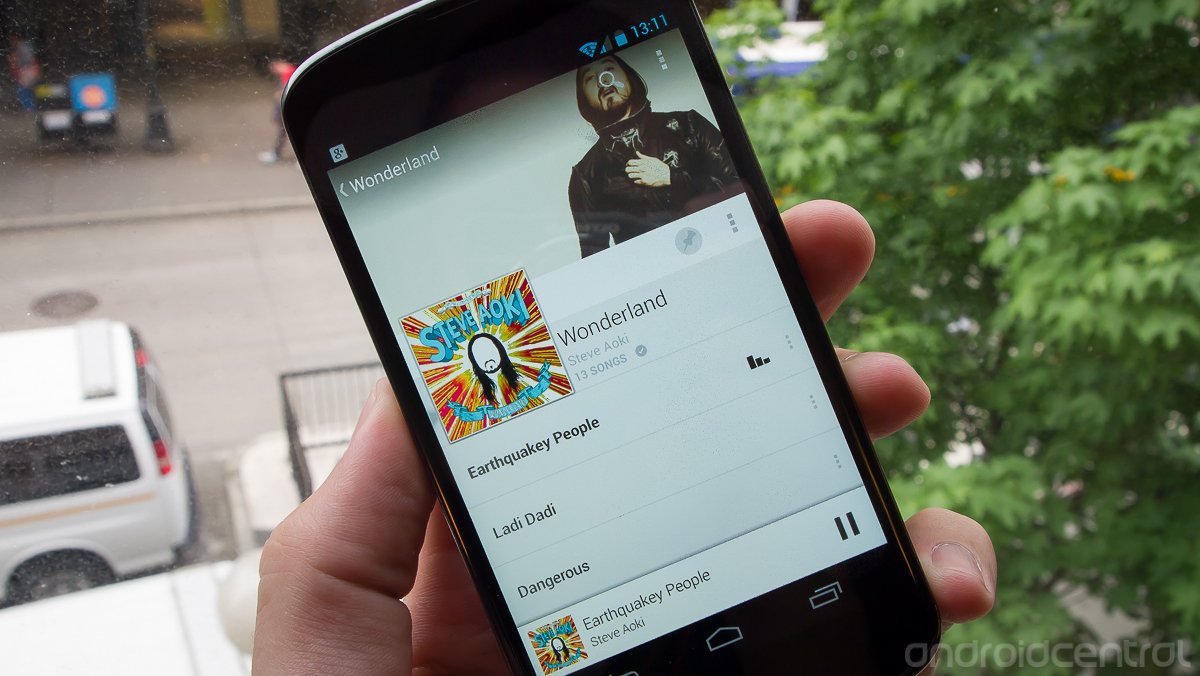
Improvements in design highlight the latest music subscription service
At today's massive Google I/O keynote, one of the bigger announcements was centered around music. Not only did we get the rumored Google Music subscription service -- now called "All Access" -- but we also got a completely refreshed Play Music app and web interface to go along with it. Google is making a pretty compelling push with its new music service, which goes beyond just radio and just streaming to offer customizable playlists with unlimited skips as well as unfettered online and offline access to any music in the Play Store catalog. You can also now access that music through a beautifully redesigned Android app and web player that just tie the entire experience together.
Hang with us after the break for a closer look at Google's refresh of Play Music, one that is likely to be a hit well after the Moscone Center empties this week.
Android Central @ Google I/O 2013
All Access
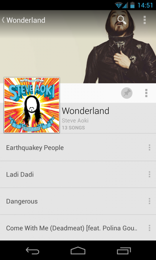
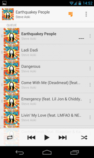
All Access is the name of Google's new subscription music service, positioned as a paid tier above the free offerings from Google Play Music. For the subscription price of $9.99 per month, users have access to the entire Google Play Music catalog to stream and play at any time on any device. You also get radio functionality, similar to what other services like Pandora offer, that generates limitless playlists based on artists or songs. These radio stations can be skipped, reordered and tweaked as you listen to them, or simply played on without your intervention. The last portion of All Access is "smart recommendations", which analyzes your music listening to give you more suggestions on what to listen to next.
As we noted above the subscription goes for $9.99 (plus sales tax) per month, but Google is of course offering a 30 day free trial so you can see if it's right for you. Users participating in the free trial before June 30th also receive special pricing if they decide to buy -- $7.99 per month. The free tier of Google Play Music remains the same, with the ability to upload 20,000 of your own songs for both streaming and local playback on devices.
The updated Play Music app
While the Google Play Music app has received some subtle tweaks in the last few months, there hasn't been a drastic overhaul of the interface in some time. Well now is a perfect time for a music facelift, and Google has gone with an all-out redesign to follow its new design language. Following a basic color scheme of orange and off-white, the design follows many of the same principles we've seen in the most recent update to the Play Store. You of course have sliding panels to switch between categories, but Google has also introduced a new slide-in panel from the left side that is completely new to Android and lets you switch between different categories of the app
Be an expert in 5 minutes
Get the latest news from Android Central, your trusted companion in the world of Android
The app is now dominated by a main page labeled "Listen Now", which gives you a look at recent played, recently added, and suggested music albums and artists. Each thumbnail of album art can be tapped to play, or a more precise tap on the "settings" button for each gives options to start a new radio station with that artist (if you've paid for All Access), add it to your music queue, pin it to your device, add it to a playlist or just go to the artists listing. Listen Now works best when you've paid for All Access, as it doesn't care what's on your device and what's available for streaming through All Access. Once you've signed up, there's very little distinction between the two.
You can add music that you haven't purchased or uploaded to "My Library", pin it to your device for offline listening and do anything else with that music as if you had uploaded the files yourself. Google wants you to think of your entire music library together, not as separate things that you own and are subscribed to.
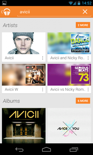
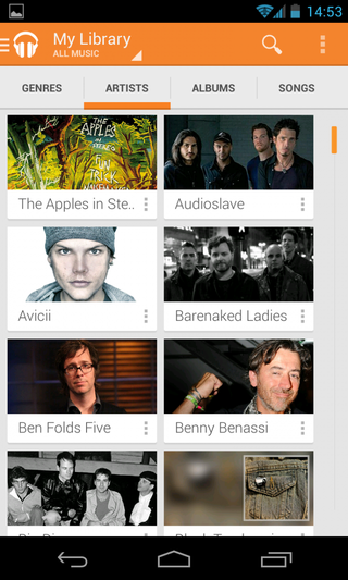
Using the new Google Play Music app will be quite familiar to anyone who has spent time in the old version, but with some usability tweaks that are both overwhelming and empowering. Google has crammed a whole bunch of new features all into one app that can be a bit much until you get ahold of them. Luckily the universal search is fantastic, and makes finding music, artists and albums extremely easy. The visual flourishes like high-resolution artist images that take the place of album art in the artist view and full album view make the app feel higher quality than your average music player. It's more than a couple of steps ahead of the old app in terms of design, features and usability.
The refreshed web experience
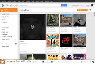
While we're talking about Play Music, it's hard to ignore the web component. The entire web experience has received a facelift as well to fall in line with the app's new design, and offers all of the same features that you expect. The landing page has now been changed into a "Listen Now" page, with suggestions of radio stations, artists and albums to listen to just like the app. The music player gives a nice readout of upcoming songs and current information, and all of the small visual flair like artist pictures carry over to the web as well.
Overall, Google has really gone above and beyond to try and make a music service that feels complete. The app and web redesigns have made serious improvements to the look and feel of using the service, and bring it right up to the modern standards of Google's design. Whether or not you can justify the $9.99 (or $7.99 if you're quick) price for All Access is another question best answered on a person-by-person basis, but if you do decide to spring for the paid service you'll get a seriously good set of perks that casual users and music buffs alike can appreciate.
Andrew was an Executive Editor, U.S. at Android Central between 2012 and 2020.
How to update Android apps on your phone
Google Play Services: What is it, and how does it keep your Android phone safe?

