Google's got a crazy new launcher in the Android M Developer Preview
We're all still absorbing everything Google announced at I/O today, but it couldn't be more clear that the next version of Android is all about polishing the experience and making Google a part of every nook and cranny of the operating system. We've got a little bit of a wait for Android M to graduate to a full version of Android with its own hardware and everything, but the M Developer Preview images mean we can take a peek at the things Google is working on before that hardware launches.
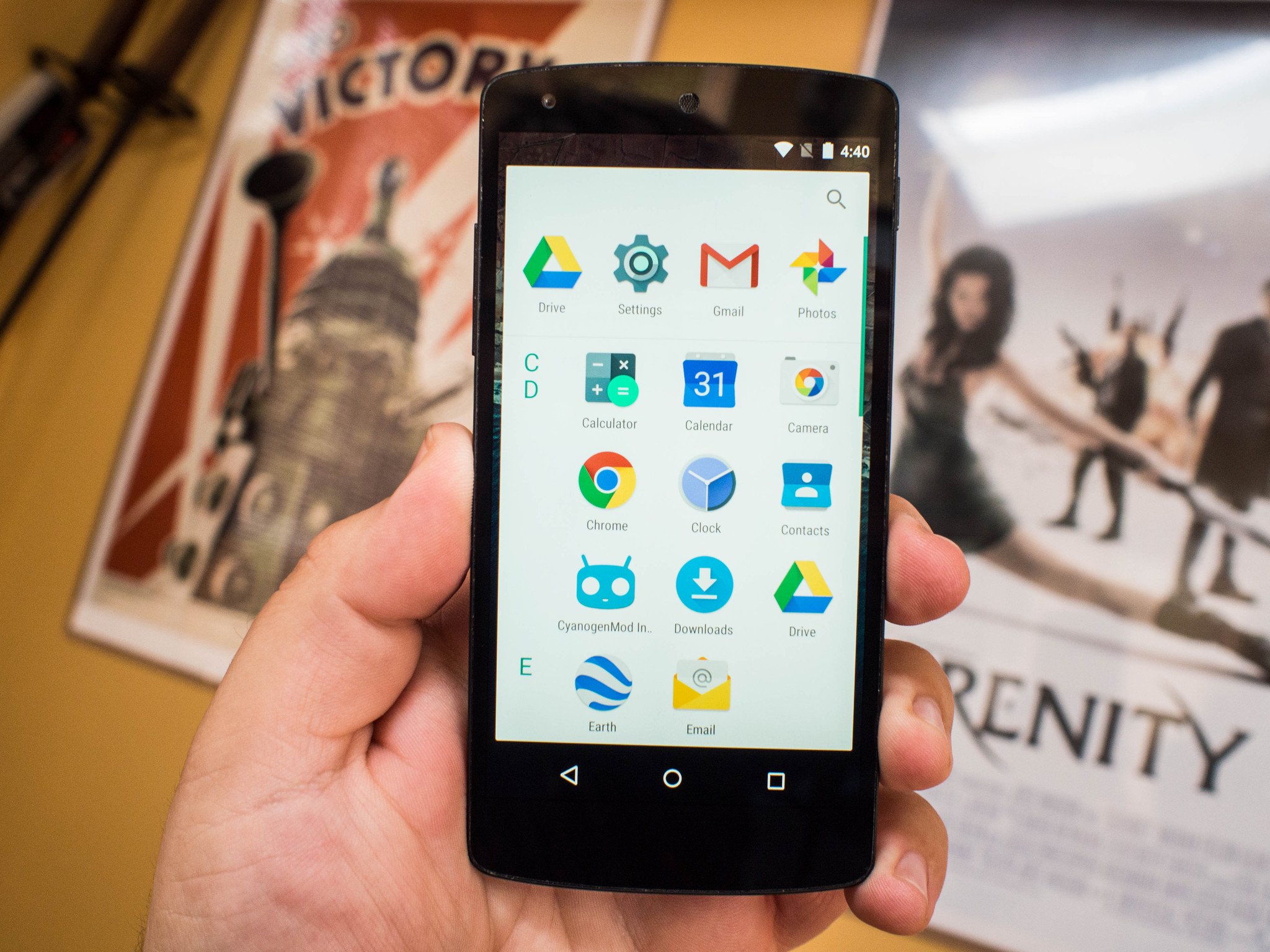
If you do decide to flash the preview on your Nexus 5, Nexus 6, or Nexus 9, the first thing you'll notice upon opening the app drawer is a wildly different interface. We don't know if this is going to make it into the final version, but so far it's fun to play with.
The first thing you'll notice here, if you're a fan of the Google Launcher experience, is Google Now is not to your left by default. Google Now needs to be activated through the launcher settings, which live a long press away on the homescreen. Outside of this and a few shiny new wallpapers, the homescreen looks and feels quite similar to Lollipop.
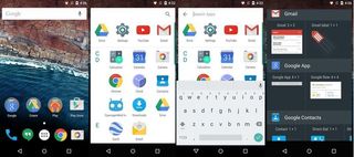
Instead of the paginated app grid on a flat white card like we see in Lollipop, Google has opted to bring back the alphabetical list view, with a few improvements over the list views of yesteryear. This list puts apps in rows as they apply to the large alphabetical character to the left, and a flick on the screen will bring you to the top or bottom of the list with ease. There's no quick way to jump to a letter like we've seen in other implementations, but the scrolling is fast enough that it's not likely to be an issue. This same list view has been applied to the widgets panel as well, with the same large examples we've come to expect in that window.
Above this alphabetical list you see a search icon for locating something specific, but also a block of four apps that change based on your usage. The drawer updates these icons based on usage, so your four most recently used apps will be at the top for you to access. This may seem redundant with the multitask icon right there, but remember that Google wants you to treat individual Chrome tabs like app pages in this view, so the drawer icons are a fast way to get to apps if you have a lot of Chrome tabs open.
It's a fun change, especially if you're a fan of the scrolling list launcher, but don't get too comfy or concerned just yet. The most important thing to remember here is Google's Developer Previews are not set in stone. We saw plenty of things in the L Developer Preview that changed quite a bit when the final product was available to users, so whether you love it or hate it this launcher is far from set in stone.
Be an expert in 5 minutes
Get the latest news from Android Central, your trusted companion in the world of Android

