Google testing big redesign, new features for web-based Gmail

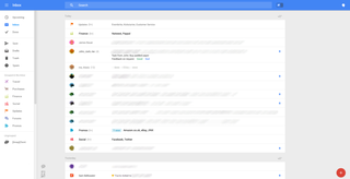
Remember those leaked screenshots of a mobile redesign for Gmail? Next up its the turn of the regular web version which according to Geek.com has its own redesign currently in testing. And if you look at the two side-by-side there's a bunch of similarities.
One of the biggest changes is the introduction of the slide-in menu on the left-hand side of the inbox, taking the place of the current tabbed layout. Hangouts gets a collapsible home on the other side of the screen. Replacing the current starring system the leak shows off the previously seen Pin system, there to help you highlight important emails you don't want to lose track of.
All-in-all it looks pretty good, but there's no telling when or at this point if this will ever actually become reality. To see it in more detail, head on over to the source link below.
Source: Geek.com
Be an expert in 5 minutes
Get the latest news from Android Central, your trusted companion in the world of Android

