The quick take
The Google Pixel and Pixel XL deliver what we've always wanted from a Google Android experience: an attractive design, lightning-fast performance and unique Google features you won't find on any other phone. Meanwhile the Pixel nails the essentials, with good "all-day" battery life, cameras that go toe-to-toe with the high-end competition, and update support unrivaled in the Android space. Though expensive, and lacking water resistance, these are great phones with a long life ahead of them.
The Good
- Speedy performance
- Latest Android, with fast updates and thoughtful software additions
- Excellent build quality
- Great, fast camera that excels in video
The Bad
- No water resistance
- Eye-watering SIM-free price
- Google Assistant is still learning
- Back glass prone to scratching
The Google phone
Google Pixel Full review
The "Google phone" has been a long time coming.
The rumors of such a device — a true Google smartphone to directly take on the iPhone — predate Android as we know it today. In the years it took for the OS to rise to dominance, we've seen the T-Mobile G1, Moto X and various Nexus phones attempt to match up to that original promise — with mixed success. Only last year's Huawei-built Nexus 6P came close to living up to the hype.
It's time for a change of strategy. So here are the Google Pixel and Pixel XL, marketed quite forcefully as phones "by Google." No co-branding, no compromises. Two size options for what amounts to a single high-end Android experience, presented with new and unique software features from Google that won't come to other phones anytime soon.
Get the latest news from Android Central, your trusted companion in the world of Android
The Pixels go hand-in-hand with Google's evolution into something more than just a search engine. In Sundar Pichai's October 4 presentation, it was very clear what the move to an "AI-first" computing environment meant for the future of the company. The new Google Assistant is a big part of that, and a major pillar of Google's hardware push, building upon the past several years of predictive search and voice interactions. At the same time, Google has made some bold software design changes, painting a clearer picture of its vision of Android.
The Pixel phones are a bold product, one that competes with not just Apple, but Google's own Android partners. The price tag is a far cry from the wallet-friendly Nexus products of yore. And the exclusive software experience is sure to grind the gears of fans and Android manufacturers alike.
So has Google at least made a good phone this time? Read on to find out.
- 5-inch Full HD / 5.5-inch Quad HD
- AMOLED
- Gorilla Glass 4
- 12.3MP rear camera
- ƒ/2.0 lens, PDAF, Laser, 1.55µm pixels
- 8MP front camera, ƒ/2.4 lens, 1.4µm pixels
- 2770 mAh / 3450 mAh
- Fast charging
- Qualcomm Snapdragon 821 processor
- Quad-core 2.2GHz
- 4GB RAM
- 32-128GB internal storage
About this review
We're publishing this review after six days of using Google's Pixel phones. I (Alex Dobie) have been using a rest-of-world spec Google Pixel XL (5.5-inch, 32 GB, "Quite Black" color) in Manchester, UK, and while traveling in Hong Kong, Shenzhen and Shanghai, China. In the UK, we used the EE network. In China, we roamed on the China Mobile LTE network through Vodafone UK. Our review device was running Android 7.1 Nougat, build NAE63P, with the October 5, 2016 security patch.
Daniel Bader has been using a North America spec Pixel (5-inch, 32GB, "Very Silver" color) in Canada on the Rogers network. His review unit was running Android 7.1 Nougat, also with build NAE63P and October 5, 2016 security patch. Portions of this review, where specified, were written by him.
Since much of the experience of using these phones is the same, we're presenting a combined review of both Pixel and Pixel XL here, noting any major differences as we go.
Watch and learn
Google Pixel Video walkthrough & unboxing
We've got many words ahead to break down our thoughts on the Pixels. But if you're in a hurry, watch our full video review! When you're done, take out some time for our full written review below to get the full explanation of what the Pixel and Pixel XL are all about.
And if you've still got some stamina after that, stick around for Daniel's unboxing video, which goes from cardboard to setup and everything in between!
Made by Google
Google Pixel Hardware
You could easily argue that we've reached peak black rectangle in the past 12 months, and that phone designs are becoming boring as a result. It's increasingly difficult to put a screen on the front of a 5- to 6-inch metal slab in a way that actually turns heads and opens wallets. Being (in a manner of speaking) a new player in the phone hardware game, that's a central challenge for Google. But at the same time, the company has the experience of six years of Nexus partnerships to draw from. It's a newbie, but it's had plenty of practice.
A simple, pleasing design that feels like a relatively safe choice from Google.
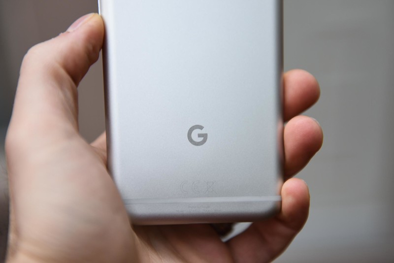
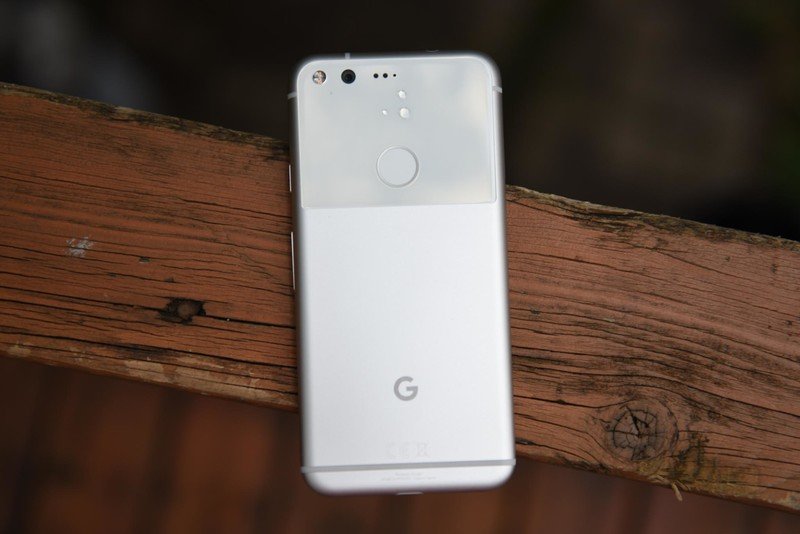
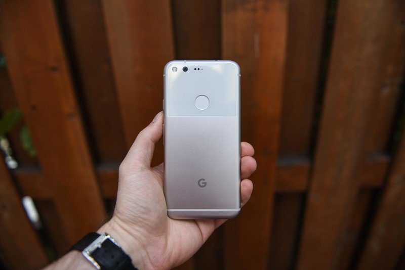
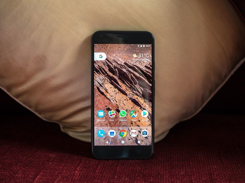
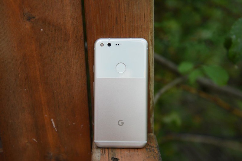
The fruit of Google's labor is a phone that's pleasing to both the eyes and the hand, yet at the same time feels relatively safe and non-risky in design terms. Google and behind-the-scenes manufacturer HTC (you won't find its logo anywhere on the phone) follow a well-worn path: a metal unibody with subtly curved extremities, made more grippable by flattened edges, and rounded off by display-framing chamfers at the front. And although the back is mostly flat, there's an ever-so-slight, barely noticeable top-to-bottom "wedge" shape going on, with the top section being ever so slightly thicker than the bottom. In terms of overall weight and heft, it's not a totally svelte, hardly-there design. There's a certain substance to it, meaning that while it's relatively light, the overall package is nicely balanced.
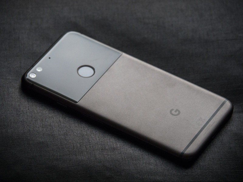
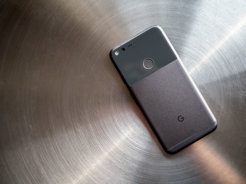
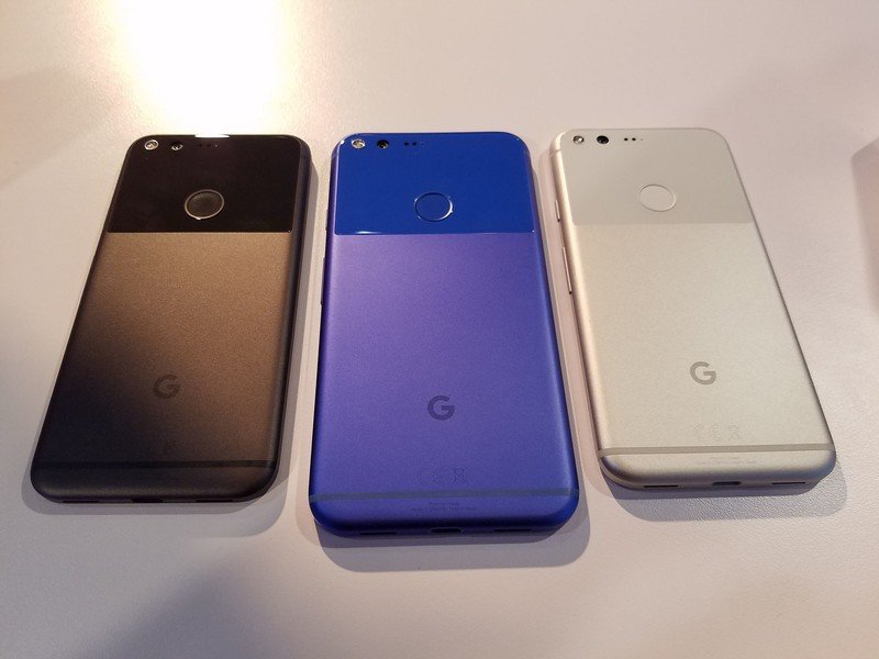
The "Quite Black" model I'm using cycles between black-ish and a more muted grey depending on the ambient lighting; if you go for the lighter "Very Silver" variant, expect a traditional, bare, brushed aluminum finish with a white face and matching antenna lines around the sides and back. (The vibrant "Really Blue" is a whole other retina-searing question.)
The much-discussed iPhone similarity is kinda there, I guess, though I feel like this has been largely overstated. Sure, the Pixel's spartan front face looks a bit like an iPhone with the home button chopped off, but then there's only so much you can do with a rounded rectangle of tapered 2.5D glass. The most obvious inspiration seem to have come from phones like the HTC 10 and One X9, with a little Nexus 6P DNA snuck in. What's more, the Pixels feel nothing like their Apple-built rivals in-hand.
Scratched-up back glass is going to be A Thing with these phones.
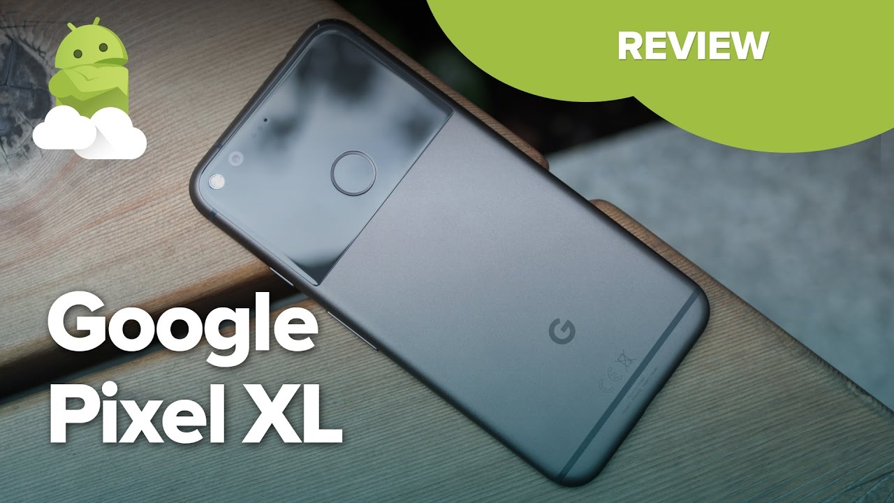
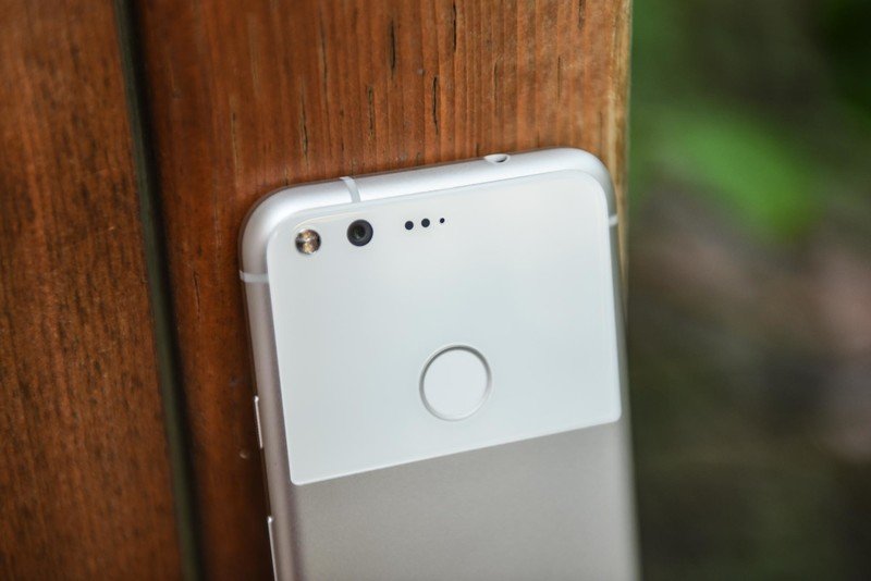
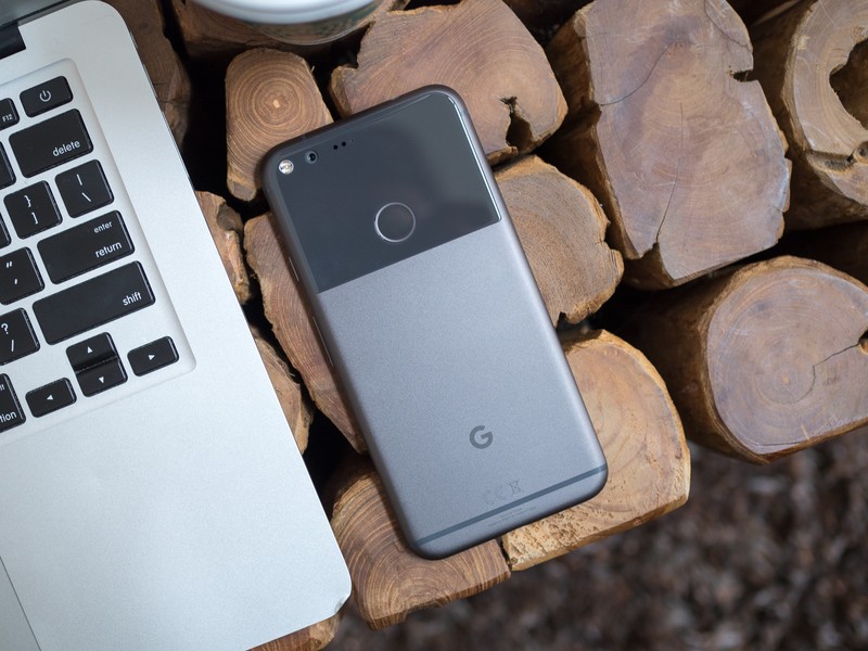
The front face is deliberately bare, so as to not distract you from the display. And so as a counterpoint the back has become slightly more showboaty. The large glass section dominating the top third of the chassis is a controversial inclusion, perhaps made for design reasons, perhaps an engineering concession to improve antenna reception. Either way, it's a big visual differentiator in a space where most competitors look fairly samey. I'm mainly neutral on the aesthetic qualities of the glass "window," aside from the unfortunate fact that it picks up hairline scratches incredibly easily. I spotted at least two or three in just the first few days of using the XL, even while taking extra care handling it. Other reviewers I've spoken to in recent days have picked up similar abrasions (scratches are much less obvious on the white-backed "Very Silver" model, for what it's worth). So let's just say this: scratched-up back glass is going to be A Thing with these phones.
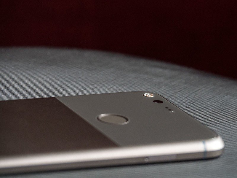
That glass area houses the Pixel Imprint (neé Nexus Imprint) fingerprint scanner, which I've found fast, accurate, and thankfully resistant to triggering in my pocket like some other phones. It's relatively large, but that, combined with its placement, makes it easy to hit with your index finger. Setup, as with Nexus Imprint, was quick and painless.
The window is also home to your NFC antenna, and like the iPhone the very top of the back section is where you'll need to waggle the phone to pay for stuff with Android Pay. That's a good thing, leaving little ambiguity about what you need to point at the payment terminal.
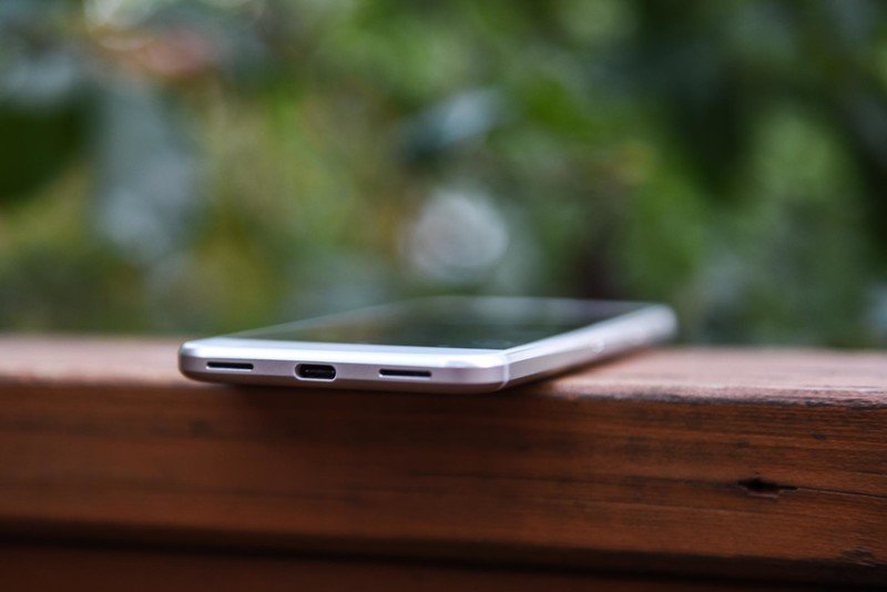
In other areas, a standard loadout of ports and buttons awaits — an HTC 10-like textured power key up top on the right side, above the volume rocker, a single nano-SIM tray over on the left, headphone jack up top and USB Type-C charging port down below, flanked by two speaker facades. As is smartphone tradition, only one of those grilles actually has a speaker behind it, and the Pixel doesn't do stereo audio through its earpiece like some rivals. Regardless, the quality is loud and clear at most volumes, only showing signs of distortion at the highest output levels.
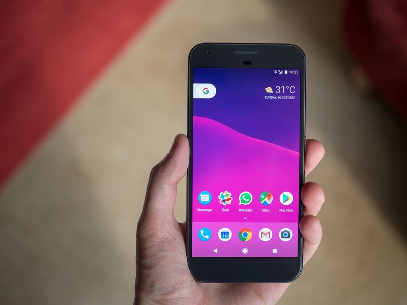
The displays, both AMOLED panels, manage to impress as well. The regular Pixel packs 1920x1080 colored dots into a 5-inch panel — a perfectly reasonable 440 ppi display density — while the XL ups it to 2560x1440 over 5.5 inches, for 534 ppi. The AMOLED panels in Google's Nexus phones were decent but never trailblazing, with the Nexus 6P in particular being disappointing in bright daylight.
The Pixels' AMOLED screens are really good, and give Samsung's latest phones a run for their money.
The Pixels' screens are a big step beyond the previous generation, coming close to matching the quality of Samsung's latest phones. Even under the bright sunlight of southern China, I had no problem using the Pixel XL outdoors. (And the display looked fantastic in the comparatively gloomy UK.) The smaller Pixel's screen is equally bright, though it doesn't quite match that of the Galaxy S7 in subjective outdoor tests.
Samsung's latest panels look more vibrant, and maybe more pleasing to the eye as a result, but that probably has as much to do with display tuning as anything else.
On the inside, Google provides a loadout of leading Android hardware — Qualcomm's new Snapdragon 821, a beefed-up version of the 820 chip powering many 2016 flagships, along with 4GB of RAM. There's no expandable storage, so you'll need to choose wisely between the 32GB and 128GB options. (There's a hefty $100 premium to pay for the latter, whichever Pixel you pick.) I'm using a 32GB Pixel XL, and after a week of solid use I'm down to just under 16GB of space remaining. Your mileage will vary, and of course Google Photos can help you free up space by offloading older pics to the cloud.
A smorgasbord of top-notch Android hardware, but choose your storage capacity with care.
After the surprisingly good (but painfully slow) Nexus 6P camera, Google has doubled down on photography in the Pixels — more on that later in the review. But from a design perspective, the standout feature is the lack of a camera bump. In a year when the iPhone's photographic protrusion is more pronounced than ever, it's an easy "victory" to flaunt over Cupertino.
There is a case for saying this doesn't really matter. In fact, I'm fine with the camera bumps in the Galaxy S7 or iPhone 7 Plus. (On a glass-backed phone like the Pixel, a slight camera bump would've propped the phone up, likely countering the constant hairline scratches we've been seeing.)
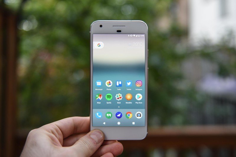
Depending on whether you opt for the 5-inch Pixel or the 5.5-inch XL, you'll either get a phone that's an easy one-handed fit, or one that requires a bit more manual manipulation, but is still easy enough for anyone who's handled larger Androids.
Having wrangled a Nexus 6P in recent weeks, the Pixel XL is so, so much easier to juggle around without using a second hand. In the case of the smaller Pixel, you're getting top-notch specs in a pleasing, compact design that's considerably less slippery than an iPhone 7. That's rare thing in the Android world.
Google Experience
Google Pixel Software
Google's Nexus phones were defined by their software. Now that Google itself is in the hardware game, the same isn't quite true of the Pixel phones. Nevertheless, the Google software experience remains a huge part of what makes these Google phones.
The Pixel handsets run Android 7.1 Nougat out of the box, a new version of the OS that's so far exclusive to Google's own phones. A final code drop of Android 7.1 for other devices won't happen until December, after which we'll start to see 7.1 appear on other devices.
The Pixels ship with Android 7.1 — months before any other phones.
Android 7.1 is the first maintenance release for Nougat, adding features like "night light" mode for reducing eye strain at night, by adding an orange screen tint, and new app shortcut options through a long press at the home screen. The former builds into the base OS a feature we've seen in third-party apps for some time, and something Apple recently added to iOS. And the latter is basically a one-dimensional copy of Apple's 3D Touch implementation, letting you jump to specific areas of an app more quickly. (And it also makes moving your apps around feel a bit weird, at least until you get used to it.) Other features include minor tweaks like enhanced wallpaper metadata, letting developers and artists provide more information about the pictures on your home screen.
That's alongside all the features of Android 7.0, like split-screen multitasking, bundled notifications, enhanced "doze on the go" for battery life improvements, and data saver mode for making your allowance go further.
The rest of the new stuff in Google's phones makes up what we'll call, for want of a better term, the "Pixel experience." The UI, visuals and features you see on the Pixel phones are a far cry from the barebones Android experience of the Nexus 6P. Google has brightened up its color scheme, switched Nexus teal for Pixel blue, added a new home screen launcher, fresh icons and a handful of new apps and services.
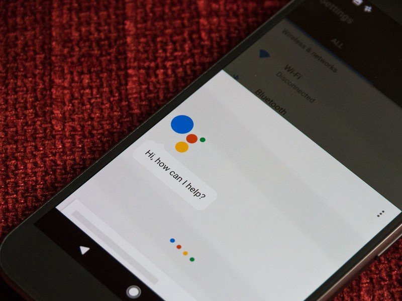
The most important of these is the new Google Assistant, which we've been trialing in the Allo chat app for the past month or so. Essentially, Assistant is meant to be Google personified — an AI with access to all the data on your Google account (Gmail, Calendar, location, etc.), as well as Google's immense knowledge graph. In an ideal world, "your own personal Google" would always be at your beck and call, enhancing your life with its wisdom.
Assistant is, so far, very much a version 1.0 product.
The reality is that Assistant is, at the time of writing, very much a version 1.0 product. When it works, it works well — Assistant is generally smart about the way it handles questions or requests about the data Google already collects. But it can be hit and miss about things you'd expect to work: For example, "Play the new album by [band name]" in Play Music. Or "Show me my next trip." Or "Who's the guy from the Mobile Strike ads?" Or "How long does it take to get to Camden?" When it fails, usually it fails pretty intelligently, offering up a web link that would probably be helpful in the place of a personalized answer from Google's vast data reserves.
The central problem here is that the goals of Assistant are so lofty, and the scope of the things it could potentially do are so wide, that it's almost impossible to judge what it reasonably can do right now. And when it fails, there's a frustration factor — the info you needed could've been gotten more easily via an email search, or checking your calendar app, or opening Maps and checking transit times. Instead Assistant offers a vague web link saying "This came back from a search." (In a tone which implies a ¯\_(ツ)_/¯ at the end of that sentence.)
And there are additional frustrations for anyone using multiple Google accounts (for example a work account), since Assistant ties into just your main Google account at present.
For Assistant to be the killer app that Google wants it to be, this mixed success rate needs to be improved upon. Still, there's a ton of potential, and Google is surely going to refine its AI over the coming months.
Where Assistant really impresses is with its speed and speech recognition. In a week of using the Pixel XL, I've yet to have a single query misunderstood, and Assistant is always ready to go instantly, waiting behind a long press of the home key. What's more, the new action for getting to Screen Search (formerly Google Now on Tap) gives the impression that that feature is faster too. The intelligence and information retrieval may need to improve, but the experience is promising.
Speed is also a big part of the overall Pixel picture. As well as having the latest Qualcomm processor, the care taken to tune performance and enhance touch responsiveness is evident in every second of use. These phones absolutely fly, to such an extent that even the iPhone — with its big, swooping, silky animations — sometimes feels like a laggard. We'll have to see how that performance holds up over time, but at week one it's pretty clear — there's nothing out there faster in the Android world.
Google Assistant is sometimes useful but often dumb, and very much still learning how to assist.
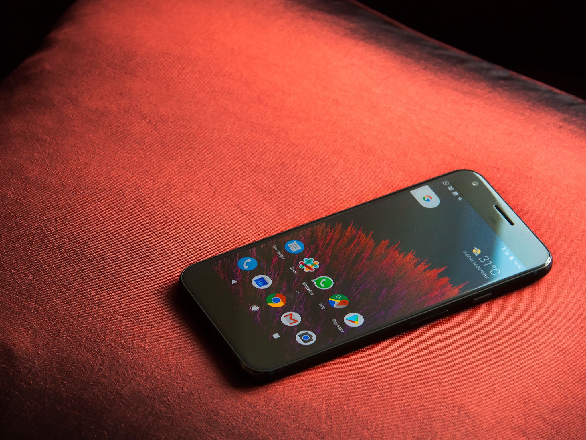
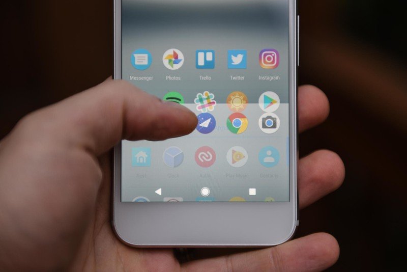
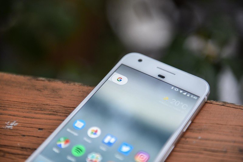
The handful of visual customizations in the Pixel UI bring some of the biggest changes since the beginning of Material Design. Front and center, you've got the new Pixel home screen launcher, which does away with the iconic Google search bar (after all, Google is way more than just Search now, right?) and rearranges the app drawer to live behind an upward swipe of the favorite apps tray.
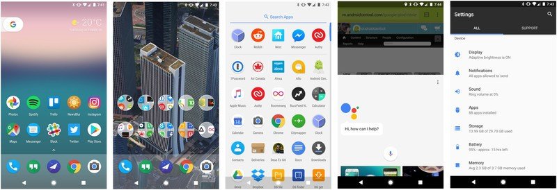
App icons are smaller across the board, and Google will display the current weather at the top of the main home screen, assuming you have location history turned on. It's not a million miles away from the Google Now Launcher, but it is different, and feels slicker and more modern. Google Now still lives off on the left, under its new name as your personal Google "feed."
Other visual flourishes can be found in Android's soft keys, which now look a little different — filled-in icons, save for the home icon, which is now encircled to indicate the presence of Assistant. (Tap it and you'll get a neat little pulse of colored orbs in the Google primary colors.)
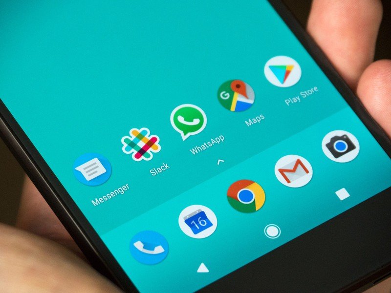
And for better or worse, most Google app icons (and in fact many third-party app icons) are now circular. Circular icon support is part of the Android 7.1 spec, but the implementation in these early days is patchy at best, even among Google's own applications. Take Gmail for instance, which uses the regular grey and red envelope icon on a white background. Or Maps, which crops the full-sized Maps icon to fill a circular cookie cutter. The look isn't entirely consistent, and that's before you open your app drawer to reveal a mess of squares, circles, rounded rectangles and other shapes of different sizes. Google's end goal is a more unified gallery of app icons, like the iPhone has had since Day 1, but it's going to take us a while to get there.
It's also early days for app shortcuts — right now the feature letting you jump to specific areas of your apps with a long press is basically unsupported outside of a handful of Google apps.
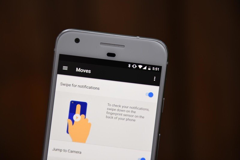
Other handy features include gestures in the new "Moves" menu, which let you swipe down on the fingerprint scanner for notifications (a feature borrowed from Huawei), double-tap the power key for camera access (borrowed from Samsung and others), and double-twist the phone to jump between the front and rear cameras (hello Moto, and also in the latest Nexus camera app). And built-in customer support in the Settings app is a feature many power users will dismiss, but something which surely forms a central part of Google's longterm plan for Pixel devices. It's all part of Google's push to make the Android experience more friendly to a mainstream, non-tech-enthusiast audience.
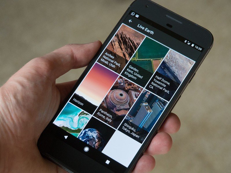
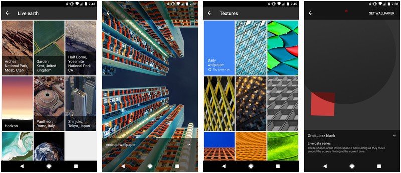
The Pixel's unique new live wallpapers are gorgeous and highly compelling.
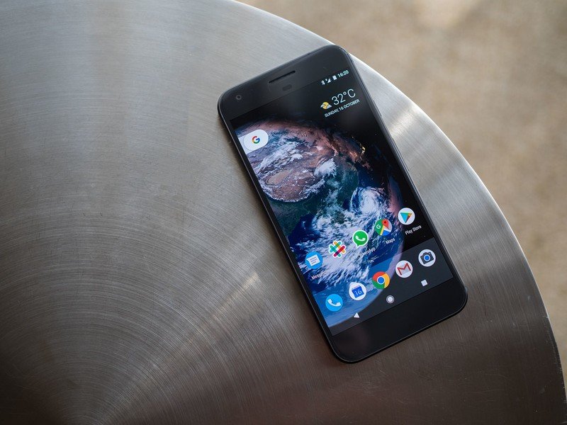
And that polish extends to some phenomenal live wallpapers, just when we thought Google might've forgotten about this feature, first introduced way back in 2010. Along with a selection of gorgeous static wallpapers and live-updating "daily" wallpapers from various categories, Google has gone all-out with a selection of jaw-dropping animated offerings.
Live Earth gives you a subtle satellite-style 3D overview of notable places, including a live view of the Earth itself, centered on your current location, shaded to reflect the day/night cycles, and updated with realtime clouds. Or for a more abstract approach, Live Data lets you show geometric animations reflecting the current time and weather. That includes the default "Aurora" animation, which animates soothing colored gradients based upon the weather, temperature and time of day.
This is all stuff you wouldn't find on a Nexus, were Google still making them. The Pixel offers a freindly, approachable Android UI that goes beyond just delivering a responsive, bloat-free, fast-updated experience.
Previous Nexus phones have been "pure Android." The Pixel phones are different — they're "pure Google." Some of the changes between the two are subtle. Others, like Assistant and the new icon scheme, hit you right between the eyes. It'll be fascinating to see how the relationship between this new Google phone and rest of Android plays out in the months ahead. For now, the Pixel is off to a great start with some genuinely useful features, and a prized place as king of the hill for Android updates.
Pixel pics
Google Pixel Cameras
It's been just a couple of years since Google was genuinely bad at smartphone cameras, but the company is learning (and improving) at a rapid pace. The Pixel phones pack a 12-megapixel rear camera with dual-LED flash, laser autofocus and 1.55-micron pixels behind an f/2.0 lens. If that sounds familiar, it's because the Nexus 6P also boasts all those specs.
But let's be clear about a few things: to start, this is an upgraded version of the sensor from the 6P (Sony's IMX378, as opposed to the older IMX377.) And that gets you native phase-detection autofocus and SME-HDR technology for faster HDR exposures. All this stuff, combined with a faster processor and improved tuning, elevates this year's Google camera to new heights.
Google's new camera can stand proudly alongside the GS7 and iPhone 7.
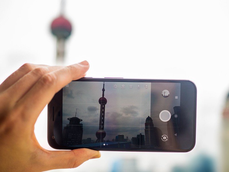
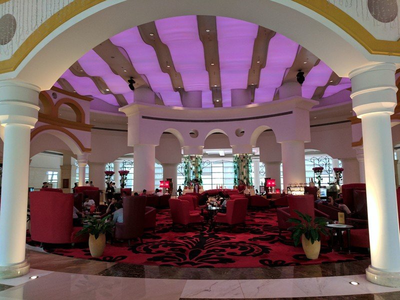
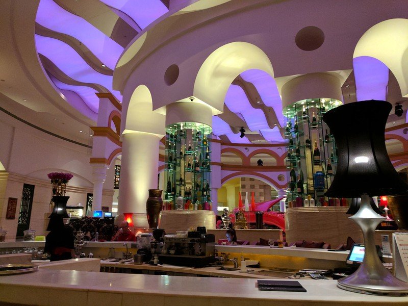
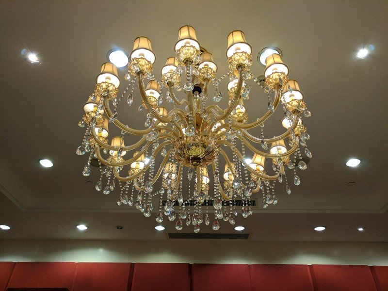
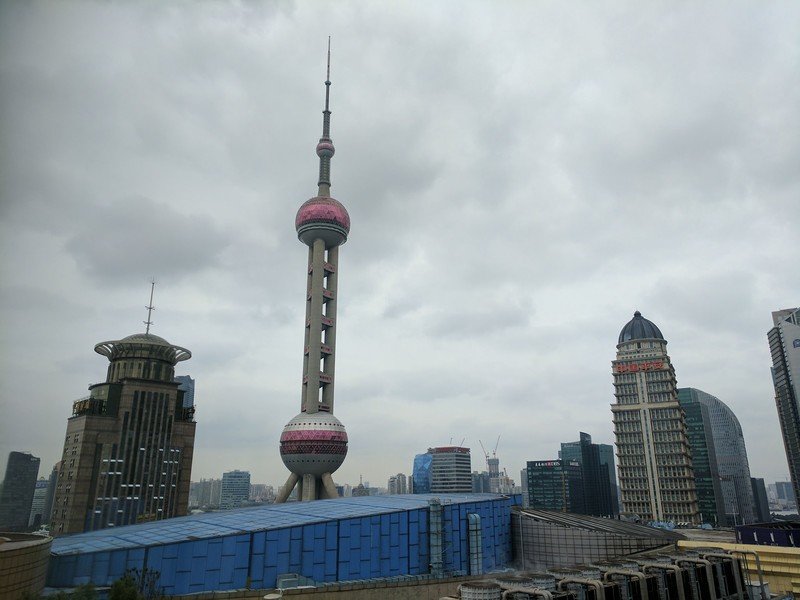
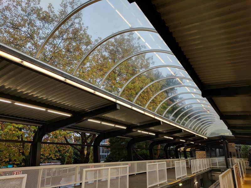
For the first time, Google has a camera that can stand proudly alongside the Galaxy S7 and iPhone 7. I was skeptical about the lack of OIS, but between the upgraded sensor, the beefier CPU and ISP (image signal processor) and some welcome software tweaks, Google has a highly impressive camera setup. Captures are quick, there's plenty of fine detail in a wide variety of lighting conditions, and Google's Auto-HDR+ trickery produces photos with excellent dynamic range in situations where many rivals stumble. Colors are punchy, but not excessively saturated. And even in challenging lighting conditions, such as dark restaurants at night, a good amount of fine detail and color detail is preserved.
We'll have a direct comparison with the Samsung Galaxy S7 coming up soon, but on the surface the main difference is in how the phones handle low light shots. Samsung tends to capture sharper looking images, through with a yellowish tint and some loss of color, while Google's photos are a little softer, but with more accurate colors.
The Pixel's camera is mind-blowingly fast, and takes better-looking pics than the Nexus 6P.
Like the rest of this phone, the camera is mind-blowingly fast. As in, so much faster than the Nexus 5X and 6P it's not even funny — especially while focusing and taking HDR+ shots. If you're used to stabilizing shots and carefully timing things just right to get great photos on the 6P, prepare to get even better-looking images with zero shutter lag on the Pixel. There's still a short pause before you can view your photos in the gallery, but processing times are significantly quicker too. And at the same time, the Pixel's camera is far easier on the battery life than its forbearer.
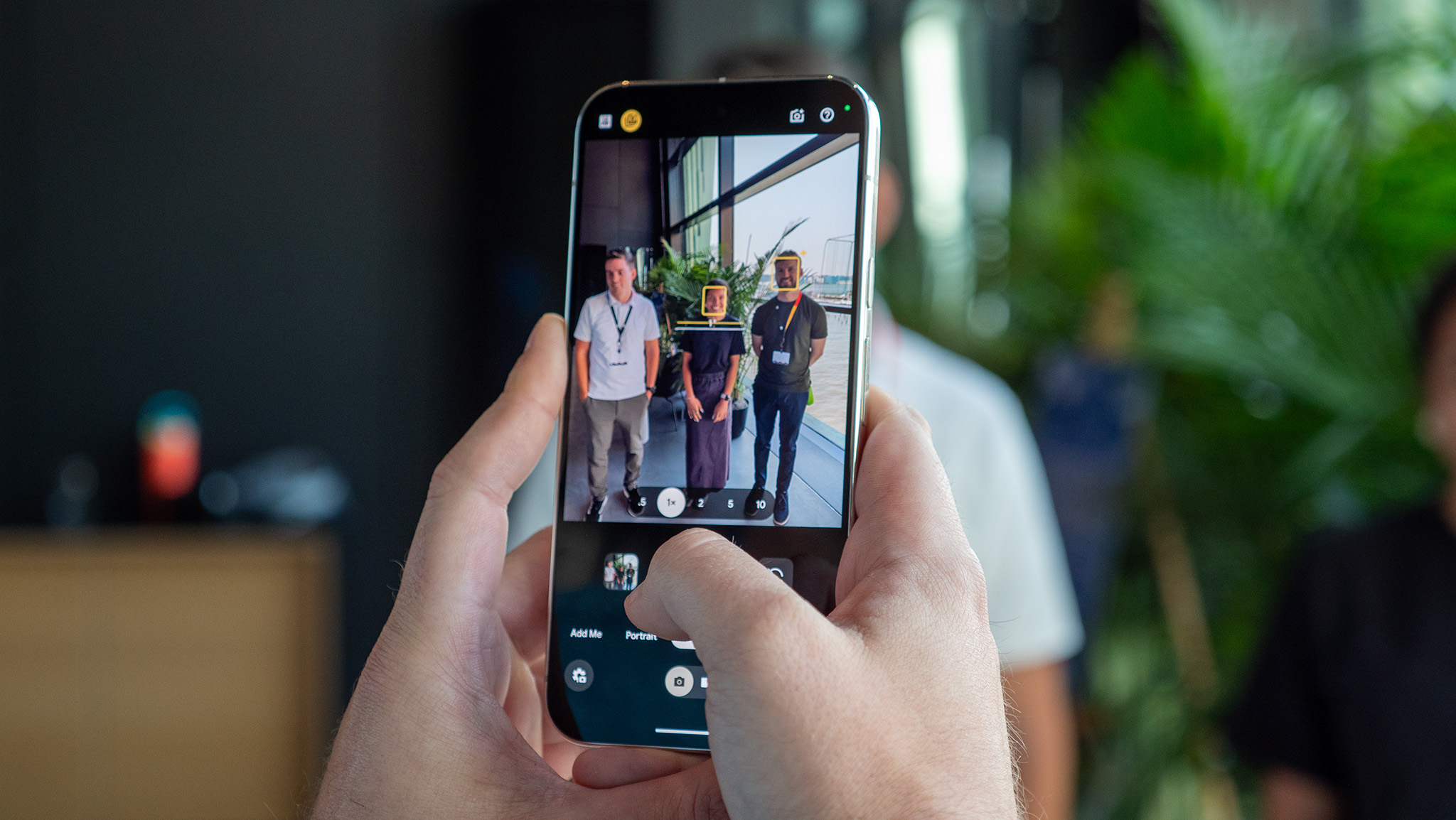
Google's redesigned camera app gives easy access to modes like Panorama, Photo Sphere (360-degree photos), Lens Blur effects (since that's suddenly all the rage again, and slow-mo video.
Speaking of video, you'll be able to record at up to 4K resolution with gyroscope-based software stabilization — a new feature that is possibly the single most impressive thing the Pixel can do. In an almost magical way, the phone manages to scrub out unintended jitters in moving shots, and the results are never clearer than when filming with the phone in one hand, on a ride through bumpy rural roads. In reality, the viewfinder is bouncing around all over the place, yet the resulting footage is silky smooth. The spell is briefly broken when the software tuning overcompensates for intentional motion, sometimes leading to artificial-looking pans and sudden movements. Even so, the Pixel makes for a highly impressive video camera.
The gyro-based video stabilization is so good it seems almost magical.
One small camera bugbear to report: like some other phones with laser autofocus, the Pixel sometimes aggressively favors focusing foreground when maybe it shouldn't. An easy way to show this is to try taking a picture out of a window, or shooting video through a car or airplane window. The laser autofocus all too often wants to focus on muck on the window as opposed to the scenery outside.
On the front, the 8-megapixel selfie camera also benefits from HDR+, evening out exposures and producing surprisingly decent shots even in relatively poor lighting. The front camera sits behind an f/2.4 lens, which isn't the brightest we've seen in a selfie shooter, but Google's lens blur feature helps out to some extent, artfully blurring backgrounds while leaving your mug in the clear.
One fortunate/unfortunate omission depending on your proclivity for digitally enhanced selfies: There are no built-in beauty modes to be found here.










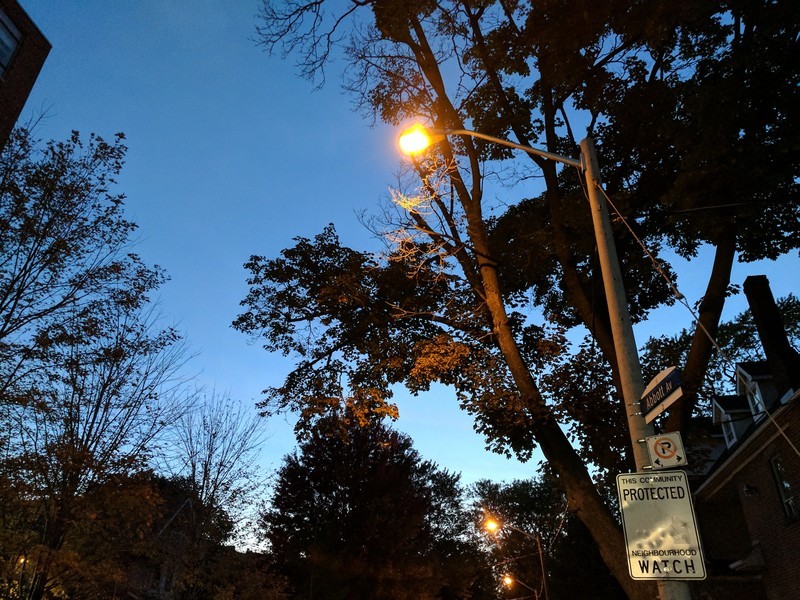


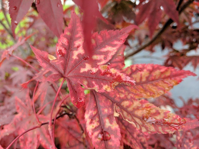

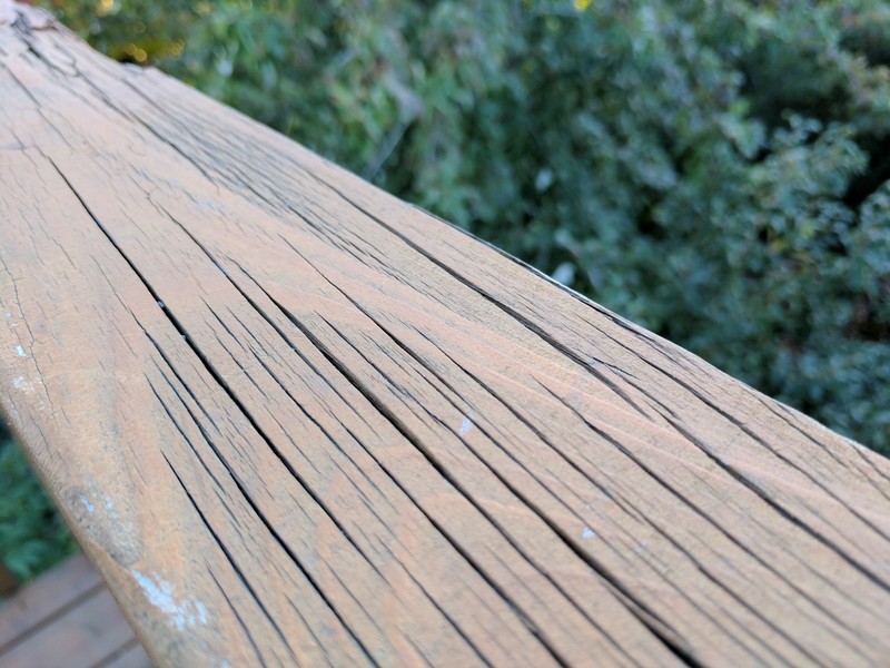

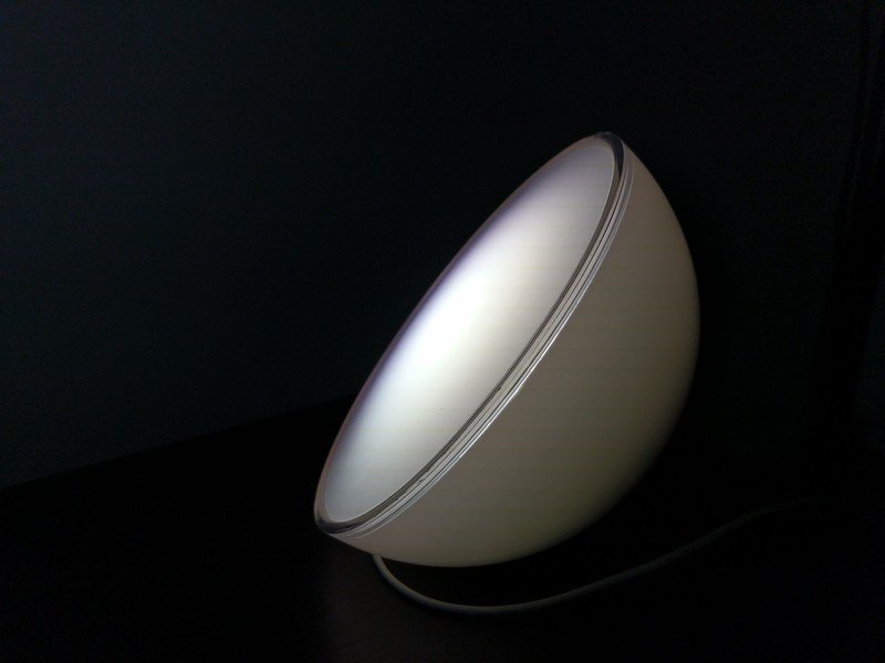
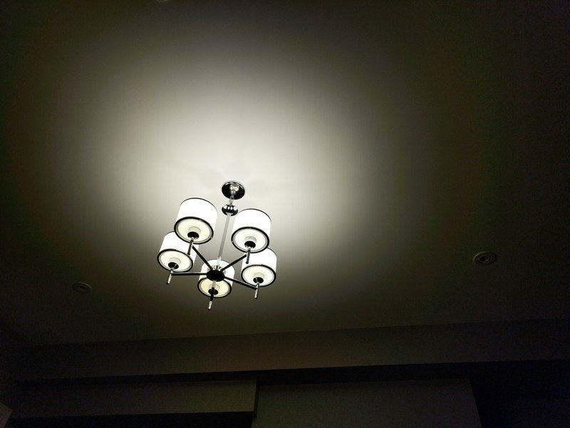

So is it the best smartphone camera ever made, as Google claims, holding its DXOMark score of 89?
That's going to depend on how you use it. In many situations I still favor the Galaxy S7. But Just the fact that this discussion is a discussion is a measure of how far Google has come. There's no doubt in my mind that this is a top-tier phone camera, and will remain one in the year to come.
Pixel power
Google Pixel Battery life
You're looking at a 2770 mAh battery in the small Pixel, or a 3,450 cell in the larger XL model. In the former case, that's a little on the small side. (But then again, the same is true of the phone itself, and its screen resolution.) In the latter, the XL's fixed cell is about in line with high-end Android phones of that size, like the Samsung Galaxy S7 edge.
In both cases you're likely to get a decent, full day of use out of the Pixel and Pixel XL, though the XL fares a little better on heavier days.
The XL never failed to get me through a full day of regular use, with a typical day getting me 14 to 16 hours off charger with 4.5 to 5 hours of screen on time. That's with mixed use across LTE and Wi-Fi, and approaches what I've gotten out of the Galaxy S7 edge earlier in the year. Unremarkable for a high-end Android phone perhaps, but the major difference I noticed with the Pixel XL was how it weathered heavy use that much better than many rivals.
The camera, for instance, didn't tank the battery anywhere near as much as the GS7 or LG G5, to say nothing of the battery-guzzling Nexus 6P. The same was true of using the XL in areas with patchy or rough cellular coverage — where some of the year's earlier flagships would hemorrhage power, the XL didn't get as hot to the touch, nor drain through its battery as quickly.
A solid day of use, with high-powered, intensive tasks less likely to tank your battery.
Daniel Bader has been using the smaller Pixel for the past week, and has found its performance generally good, though more susceptible to battery drain from heavy usage.
On the smaller Pixel's battery life
By Daniel Bader
I had no shortage of anxiety going from a phone with ample battery life, the Moto Z Play, to one that was considerably smaller and less capacious. Fortunately, the Pixel managed to last an entire day most of the time, reaching the dreaded "red exclamation point" between 11 p.m. and midnight.
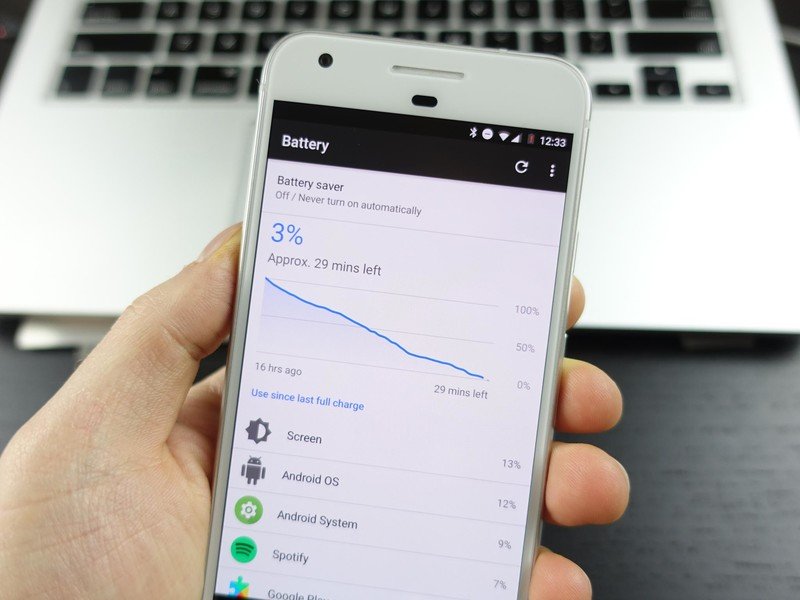
These were days that I was pushing the phone pretty hard, too, which leads me to believe that once things settle — in my life, and with the phone — it will last a bit longer. That said, there isn't much breathing room for a really busy day, or an errant app using too much juice in the background. As I type this, it's 5 p.m. and I'm down to 40% with just over four hours to go. That's the fundamental problem with a phone like the Pixel: despite the improvements made to Doze, and efficiencies gained from the Snapdragon 821's 14nm process, a 2770 mAh battery just isn't enough to comfortable end the day in the black.
As long as you're willing to top up the phone once or twice a day, even for a few minutes, the smaller Pixel's battery life should be fine, but if you're a truly avid user — and who among us isn't? — then the Pixel XL, or a diminutive battery pack close at hand, is probably a better option.
Both Pixel models support quick charging through the USB-PD (USB Power Delivery) standard, with the bundled plug and cable charging at up to 5V/3A or 9V/2A. The move up to 9V quick charging allows a dead Pixel to return to life (around a half charge) faster than last year's Nexus 6P, while the crossover in charger specs means the Pixel will happily charge rapidly with a 6P or 5X plug.
Finally, it's worth noting that the Pixels (like the last Nexus phones) use a USB-C to USB-C cable to charge with the bundled adapter, so it might be worth investing in a few spares cables, since most Android phones still use a USB-A connector in the power brick.
Big or small?
Google Pixel vs. Pixel XL
By Daniel Bader
Google's Pixel has made me fall in love with small phones all over again. Before we get into which one you should consider, let's go over the two main differences between the two devices: the screen size and resolution; and the battery.
The first is not important: both phones have high-quality AMOLED screens, and are plenty dense for most people. The Pixel's 1080p resolution gives it a density of 440ppi, which is lower than the larger phone's 534ppi, but unless you're really scrutinizing you won't notice the difference. And while I haven't spent a lot of time with the XL, I noticed a small amount of color fading when holding the Pixel at off-center angles, a minor criticism common in AMOLED screens. Still, the Pixel's screen is vivid, responsive, and stunning, with saturated colors and perfect blacks.
Google's Pixel has made me fall in love with small phones all over again.
The second, battery life, is certainly more important: the Pixel has a cell 25% smaller than its larger counterpart, which probably doesn't scale linearly given the XL's higher screen resolution. You shouldn't expect a 25% difference in average uptime, but it probably won't be too far off: if you use your phone a lot — and primarily for media consumption and gaming — the Pixel XL is a better choice. Another reason to go for the Pixel XL: Nougat's multi-window multitasking mode is much more comfortable to use on the 5.5-inch display of the Pixel XL.
But let's go back to my original statement: The Pixel has made me fall in love with small phones all over again. After using devices that often took two hands to comfortable handle and safely operate, I found myself constantly elated to regain the natural ability to use the Pixel with just a thumb, three fingers wrapped around the back with a pinky to steady the metal chassis.
Even more liberating is the knowledge that the smaller Pixel, aside from the two main differences listed above, is identical to its larger counterpart, and could be considered a flagship in its own right. The phone is incredibly fast: I have never used Android like this, and there is something joyous about being able to do all this on a one-hand-friendly handset.

Bottom line
Should you buy a Google Pixel? Yes
The Google Pixel XL is my new daily driver. As for the smaller Pixel, I know it's going to take a lot to tear Daniel Bader away from this compact Android powerhouse. (Ed: True.) Both are excellent smartphones which we can wholeheartedly recommend, even with their sky-high price tags. The question of whether a smartphone can be worth $700 to $1,000 in 2016 is a debate altogether. But if any phone is worth that amount of cash, the Pixels are. Just as that same argument can be made for the iPhone 7 or Galaxy S7.
The chassis is attractive, though some may say it's not as bold as Samsung's glass and metal designs. The software is fast and mostly good-looking. It's always going to be up-to-date with the latest Android software, and exclusive tricks from a new and highly ambitious AI-focused Google. The battery easily lasts a day, and charges quickly. The camera matches the Galaxy S7.
The main argument against the Pixel, besides its price, comes down to the one or two high-end features it's lacking. Both the iPhone and GS7 boast water resistance. The Pixels do not. There's also the question of whether the camera — which is already great — would be superlative with the addition of OIS (optical image stabilization), which is increasingly seen as table stakes for flagship smartphones.
I can't think of a better phone to buy going into 2017.
On the other hand, the Pixels' status as Google phones, with the backing of a major platform holder, allow them to ship with Android 7.1 months ahead of rivals, and pack exclusive features like Google Assistant which, though imperfect at present, will undoubtedly improve throughout the long life of these phones.
With Pixel, the company finally delivers on what we'd wanted all along from a Google phone. With each cycle of Nexus handsets, it used to be a question of "What would they screw up this time?" We're far beyond that with this new, singular vision of what a Google Android phone should be.
And I can't think of a better phone to buy going into 2017.
See at Google
Pixel XL review: A U.S. perspective
If you're looking to see where the Pixel XL fits in terms of the U.S. market, Andrew Martonik has you covered with a full review. Whether you want to know how it fares on various carriers, who can get you the best deal or how it compares price-wise to other phones in the States, we have you covered.
Google Pixel XL review: A U.S. perspective

Alex was with Android Central for over a decade, producing written and video content for the site, and served as global Executive Editor from 2016 to 2022.
