Completely new UI coming to imo instant messenger


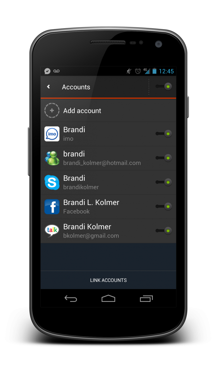
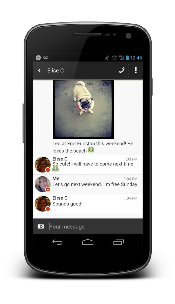
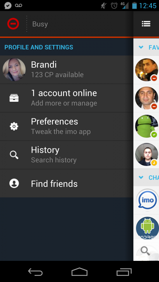
Following a general tidying up of its app just a month back, imo instant messenger is getting a complete UI overhaul today. The app is transitioning to a darker UI that is primarily black with red accents, accompanied by white backgrounds in the conversation view. Ease of use is the main goal with this update, with a combined conversation and contacts tab as well as improvements to the "imo network profile". The new UI looks very clean and in some ways mimics the design of stock Android's apps.
The update is scheduled to be live this afternoon at the Google Play Store link above. In the meantime, we've got a few more screenshots of the new UI for you after the break.


Be an expert in 5 minutes
Get the latest news from Android Central, your trusted companion in the world of Android
Andrew was an Executive Editor, U.S. at Android Central between 2012 and 2020.

