Carbon for Twitter turns v2 with grand redesign [#C2PointOh]
New look, new features highlight a hefty update to one of our favorite third-party Twitter apps
At long last, Carbon for Twitter — long one of our favorite third-party Twitter clients — has been updated to version 2.0 with a major redesign and a host of new or revamped features. We've always had a soft spot in our dark little hearts for Carbon, having used it on webOS back in the day, and then Windows Phone — and finally on Android. It's been as functional as it has been beautifully designed, and it's managed to somehow avoid (we don't ask questions) the token limitations that have plagued other excellent Twitter apps.
The update should be going live Tuesday morning (it's live now), and we've got your walkthrough for the changes.
Stick with us here — it's as simple as it is complex.
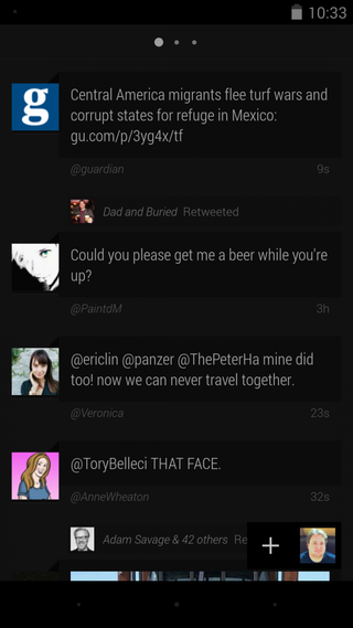
First and foremost, you'll notice the visual changes. While the original Carbon was one of the more minimalist Twitter apps available, v2 has taken things even further. Depending on what kind of display you have (as well as where your brightness level is set), the first thing you'll notice is that it's black. As in Black Album, None More Black, black. The notification area is mostly obscured (though not in an intrusive way — you'll still get notifications). On-screen navigation buttons dissolve to dots. (And if your brightness is turned way down, you might not see them at all, causing an odd bit of blank space.)
After that, it's just you, your timeline, mentions and direct messages. Individual tweets also have a new look, switching to the Roboto font. As we learned with the introduction of Ice Cream Sandwich, this isn't always the easiest font to read. And the default "medium" tweet size might be too small for you. There's an option to bump it up a size or two, and we suggest you give that a shot. (My old-man's eyes certainly needed it.) Also, the Twitter handle for each tweet has been de-emphasized and placed beneath the Tweet itself. That means you'll need to become more familiar with avatars — a tricky proposition for those of us with bloated follower lists — and have to keep up with friends who changes theirs frequently. It's a deliberate design decision, but not one we're sure is for the better. Time will tell.
You swipe to move between them, with the telltale dots hanging out above to remind you where you're at. (Hint: It's timeline:mentions:DMs.)
Also new: you get a larger image preview, which looks especially good for Instagram shots and Vines now that things have gone square.
Be an expert in 5 minutes
Get the latest news from Android Central, your trusted companion in the world of Android
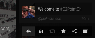
Tap a tweet to pull up the quick actions, which include reply, quote, retweet, favorite and share. If you're looking for an entire conversation of tweets, this is where you'll find it. Instead of tapping and scrolling, hit the conversation icon on the far right of the quick actions. I'm not 100 percent sure that's an improvement, either, but neither is it all that difficult to get used to. (Tapping on a direct message automatically gives you the full conversation.)
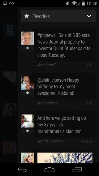
From any of the three timeline views you can slide over from the far right to get the new "quick timeline." You can choose to have it display retweets, favorites or saved searches, giving you a, well, quick timeline of just about anything. Nice.
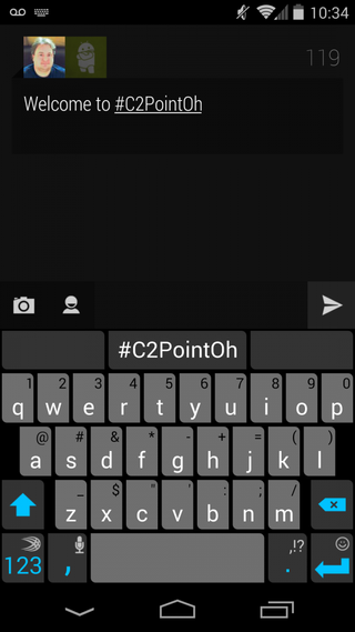
By now you'll probably have noticed that the compose window has disappeared. Hit the + symbol in the bottom right to open it. You still have the option to choose to post from one of multiple accounts, if that's how you roll (but not simultaneously), take a picture, use the last one shot or choose from the gallery, or reference specific Twitter users.
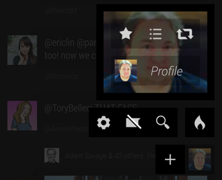
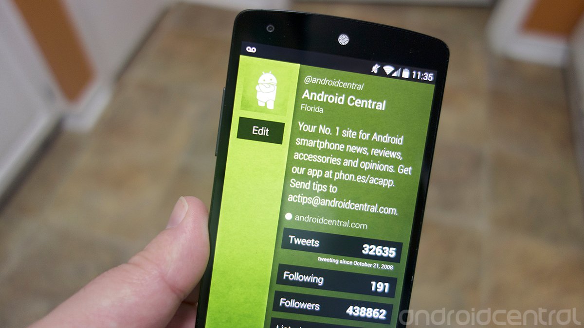
Tap your avatar in the bottom right and you get what's called the "Chaos Menu." Here you'll find a wealth of options, including a toggle for any other accounts you've added, starred tweets, lists, your retweets, a shortcut to your profile (from which you can edit your info if you like — and note how nice your Twitter background looks here, and you can update your avatar as well), trending lists, search, the ever-important mute filter, and a traditional settings menu.
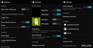
The settings menu is worth exploring as well. Here your find the option to open links in your usual browser, though Carbon's internal webview is pretty darn good. This is where you'll also get the font size options, choose to show media preview, and the option to make avatars and images grayscale in your timeline with "Oxide" mode. (Be sure to quit and relaunch Carbon to have any of those options take effect.) You can also chose how you want quoted tweets to appear, whether to use Twitter's image uploader or Twitpic, and which notifications you want to see. Plus, you can now choose how often you want Carbon to poll for Tweets — as often as every 5 minutes, or as infrequently as 2 hours. Plus, there's a new do-not-disturb option. (By default it's set for midnight to 8 a.m.)
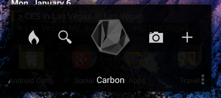
And, finally, the widget has been redone, giving you quick access to rending lists, search, the camera, compose window — or just Carbon itself.
All in all, an interesting and diverse update. We've only been using it for a few hours now, so we'll withhold final judgment. But any Twitter app that gets update love these days is a good thing, especially given the direction that the official app has taken. Look for Carbon v2 in Google Play shortly with the link at the top of this post.


