Android 8.0 Oreo review: Vive la évolution
Get the latest news from Android Central, your trusted companion in the world of Android
You are now subscribed
Your newsletter sign-up was successful
Some Android releases represent massive sea changes for Google's OS, overhauling technical underpinnings or introducing new design elements. Others are content to tighten up the screws and add polish to an already well-established platform.
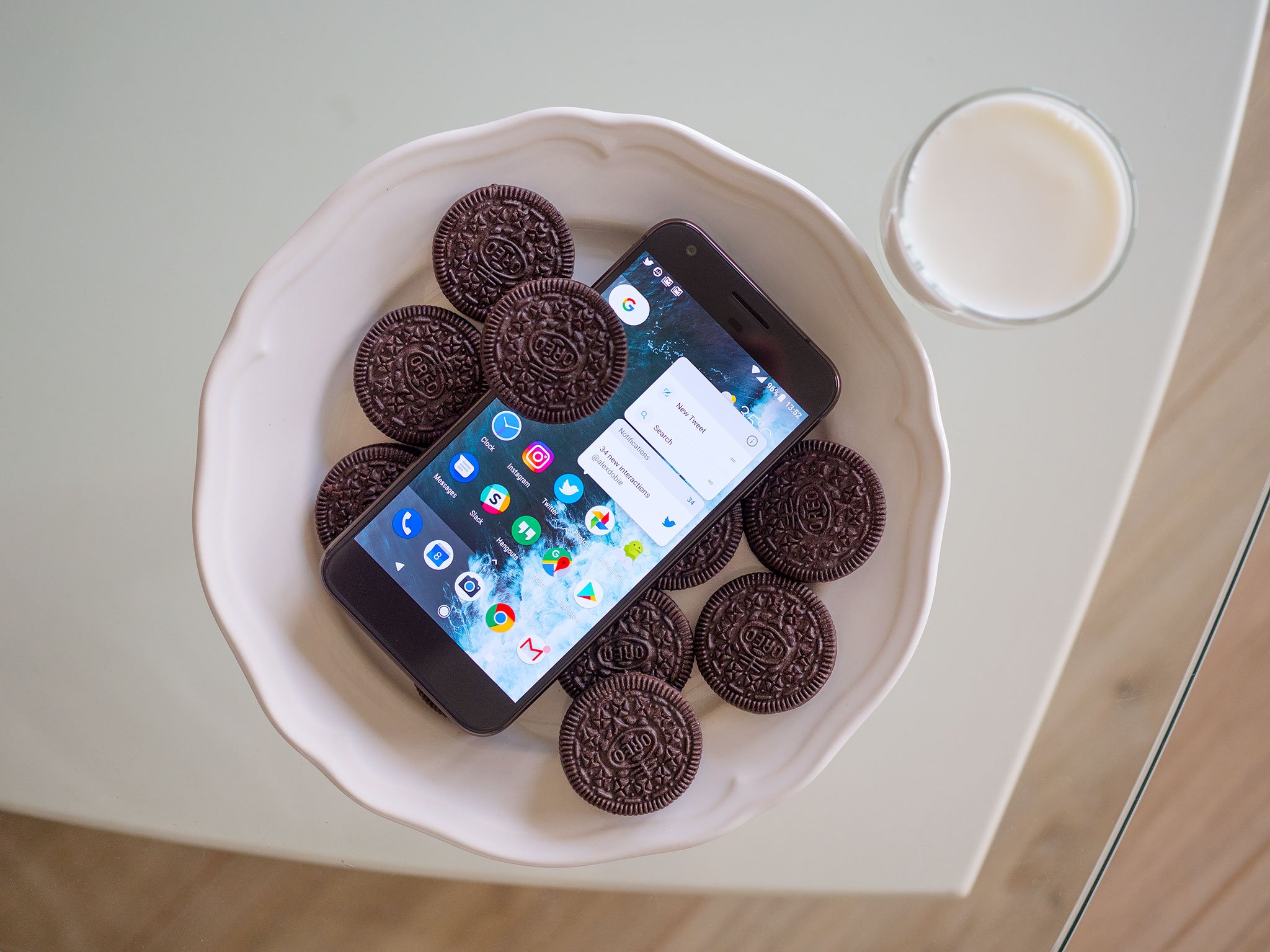
The new release of Android for 2017/18 — version 8.0 Oreo — fits somewhere in between those two extremes. Android itself is pretty stable at this point, so it's natural that broad, sweeping UX and functionality changes are less likely to happen with every new version. Yet although Oreo looks and feels a lot like the previous Android Nougat, contained within are myriad feature tweaks and low-level tune-ups that make Android more mature and powerful.
With Oreo, your phone (or, let's be honest here, your next phone) will be able to view videos in the foreground as you use other apps in the background. It'll become easier to keep track of multiple notifications from the same app, thanks to the new notification channels and notification dots features. Smarter text entry and autofill APIs will take the tedium out of entering passwords and other sensitive info. And Google's "Project Treble" should help phones shipping on Oreo get faster updates to Android P and beyond.
Article continues belowThat's alongside subtle visual and animation tweaks that make Android lighter, brighter and more dynamic.
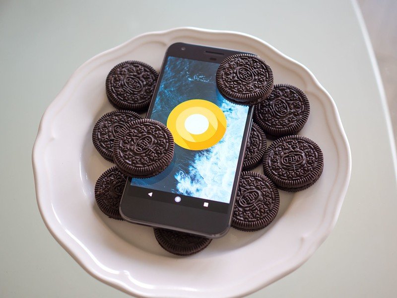
Google kept us guessing until the end when it came to the eventual nickname of Android 8.0, but the software itself has slowly been coming into focus through the past five months of developer previews. And now, with the final, stable release of Oreo in our hands, we're ready to get stuck in.
This is the Android Central review of Android 8.0 Oreo.
About this review
I (Alex Dobie) started work on review in early August 2017, having used Android O in developer preview form since it first landed in March. Most of what's written here is based on the last developer preview, which is considered a near-final "release candidate" quality build. We're not expecting to see any significant differences in the final release of Oreo for Pixel and Nexus devices, but we will update this review should we find any noteworthy changes.
Get the latest news from Android Central, your trusted companion in the world of Android
This review isn't intended to be an exhaustive list of every little change Google has made in Android 8.0, nor will we go into excessive detail on the developer-centric additions, like the introduction of Kotlin as a fully supported language. These changes are important, but this review is intended to give regular Android users an idea of what to expect in the new version of the OS.
That said, we're not writing an instruction manual here either. Instead, we're presenting this review as an overview of the direction Google has taken Android in Oreo, zeroing in on major additions and offering a critique of how these affect the overall Android experience.
Enjoy!
Look and feel
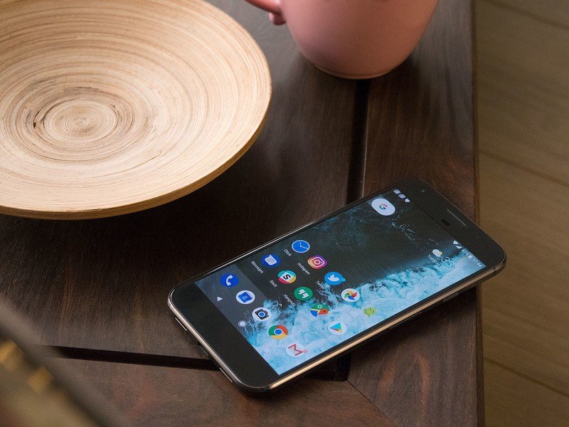
Most of us see Android through the lens of whichever manufacturer's UI we choose. This long-standing trend isn't going to change in Oreo, and so bear in mind that when you get 8.0 on, for example, your Galaxy S8, it'll look a bit different to what we're reviewing here on Google's Pixel devices.
Nevertheless, more manufacturers than ever — Motorola, Lenovo, OnePlus and HTC, to name a few — are using a near-stock Android UI right now. So in that context, the design direction of vanilla Android continues to matter.
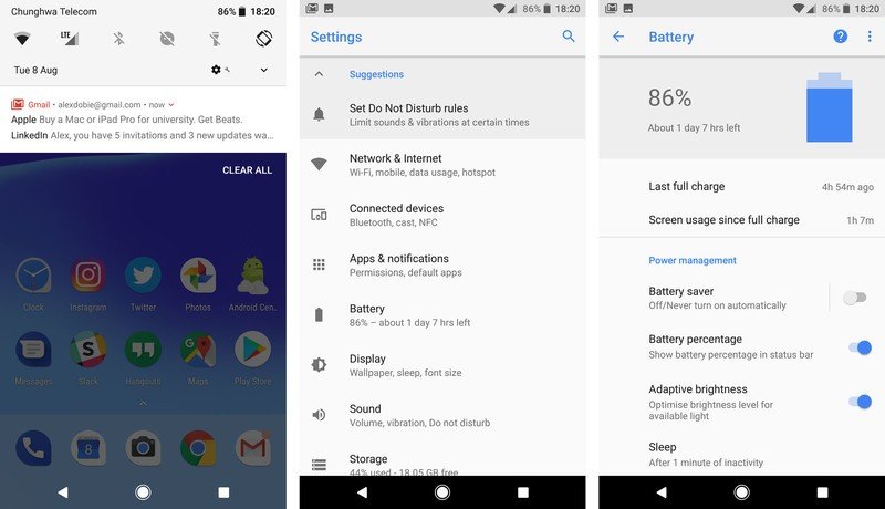
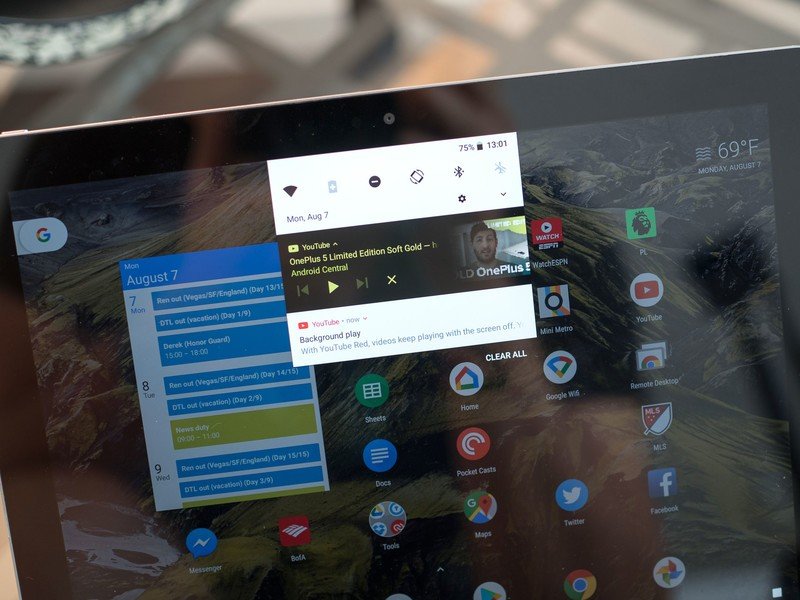
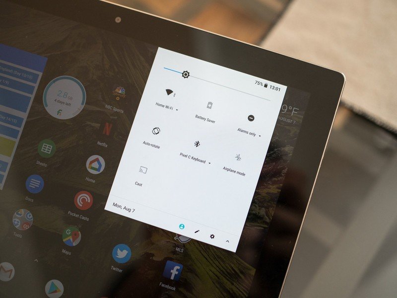
There's been no major visual overhaul in the new version of Android. In fact, the most striking visual difference is the brighter color palette for the quick settings area in the notification shade. It's now light gray, not dark gray, reflecting similar color changes in the stock Settings app. For the non-phone nerds among us who own Pixels, these might well be the only visual change they notice. (As for whether it's good or bad, that's a matter of personal taste.)
Aside from this color change, there's been some minor rearrangement to the quick settings panel, bringing the settings, user switching and edit shortcuts further down, making these easier to reach on larger phones. With the shift to an 18:9 aspect ratio in many popular flagships this year, improving reachability on taller phones is important.
The redesigned Settings app is the next most significant visual change. The slide-out "hamburger" navigation panel added in Nougat has been removed, and instead Google has made navigation easier by redesigning each of the 13 sub-menus. Many of the major settings options are accompanied by icons, and Android now does a better job of surfacing important items within each sub-menu.
Android's settings are lighter, simpler to navigate and easier to reach.
The new battery settings page is a great example of this. Screen usage (screen-on time) is shown right up top, along with the time since your last full charge. Scroll down a little, and your most battery-hungry apps are displayed.
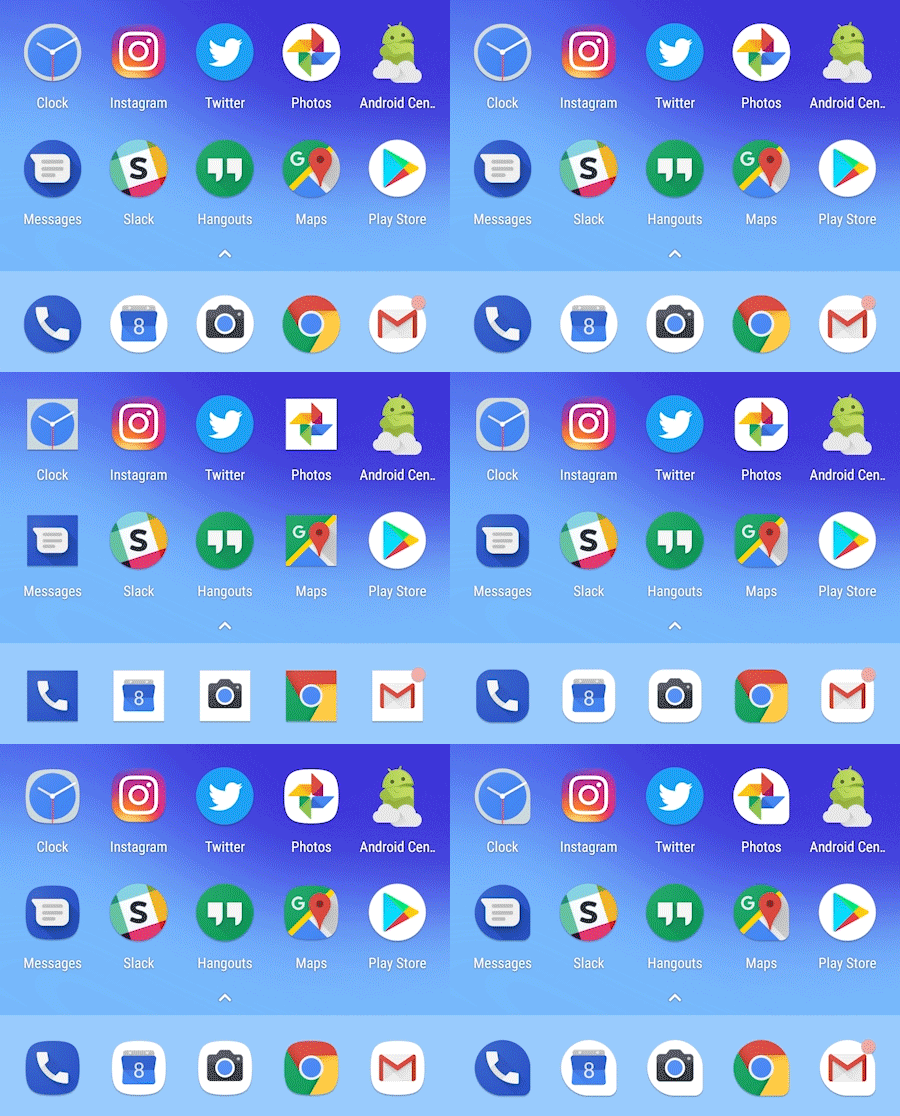
You need to look below the surface to spot many of the other visual changes in Android 8.0. For instance, Google has finally started bringing a sense of order to app icons, with the new "adaptive icons" feature. Just as Google pushed towards circular app icons in Android 7.1, adaptive icons lets phone makers change this cutout shape to what best fits their own visual style. (On the Pixels, you can choose between five cutout types.)
This means manufacturers like Samsung, Huawei and LG, who like to use their own icon cutout shape, have a more reliable way to do this that doesn't result in bad, weird-looking icons for third-party apps. The new icon style should also bring some uniformity to Android app drawers and home screens, which for a long time have been a jumble of mismatched shapes.
Oreo introduces a handful of neat new animations in the notification area.
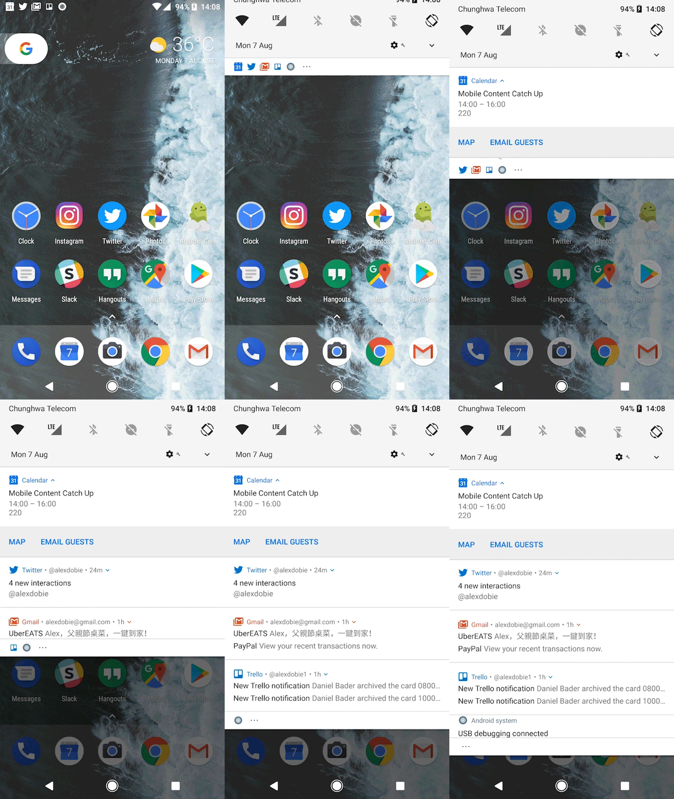
Android's animations haven't changed a whole lot in Oreo, but there are a couple of spritely new animation behaviors in the notification shade that add to the polish of Google's Material Design. Icons smoothly transition from the status bar into their notification cards, then into the overflow area if you have lots of notifications. And icons also juggle themselves around the status bar places as new alerts arrive, making the whole system feel more dynamic.
These are small changes, but they go a long way towards making this important area of the system feel more lively and dynamic.
Finally, it's worth mentioning a handful of upgrades to that most important of smartphone features, emoji! Android 8.0 adds a handful of new emoji in Emoji 5.0, while redesigning the graphics themselves in a move away from the old-style "blobs". Going forward, Google's emoji compatibility library will allow developers to support new emoji on older Android versions (all the way back to 4.4 KitKat).

Meanwhile, behind-the-scenes font changes in Oreo allow developers to customize the way emoji look in their specific apps, while making it easier for devs to use custom fonts in their apps. (Thanks to fonts becoming a full resource type in Android 8.0.)
Arguably, the Emoji Compatibility features in Google Play Services is the more significant changes here. Nevertheless, system-level support for new icons, and more consistent-looking emoji, are also a big deal. It's easy to shrug off the importance of emoji, but they're an important part of communication for millions of people, and Google is doing the right thing by focusing engineering effort on them, both in Android and Play Services.
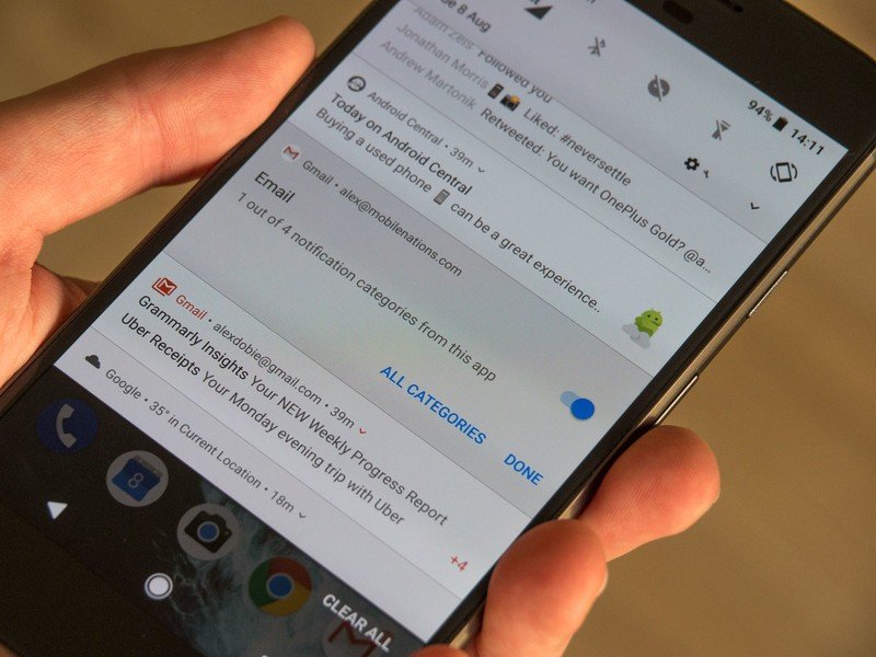
Notifications, alerts and widgets
Android notifications were overhauled in Nougat, and Oreo brings a handful of smaller changes to make handling the daily firehose of alerts a little easier.
The big new thing is notification channels, a new feature which brings categories of notifications to apps, making it easier to manage and filter different types of alerts from the same app. A social app, for example, might have channels for direct messages, status updates, likes or other interactions.
And you can then choose how you're alerted for notifications in each of these channels — sound, vibration, or LED — or even block notifications from some channels altogether. Long-pressing on a notification lets you see and configure its notification channels — just as in older versions of Android, you could choose to allow or block notifications.
There's a certain amount of micro-management involved in getting to grips with notification channels.
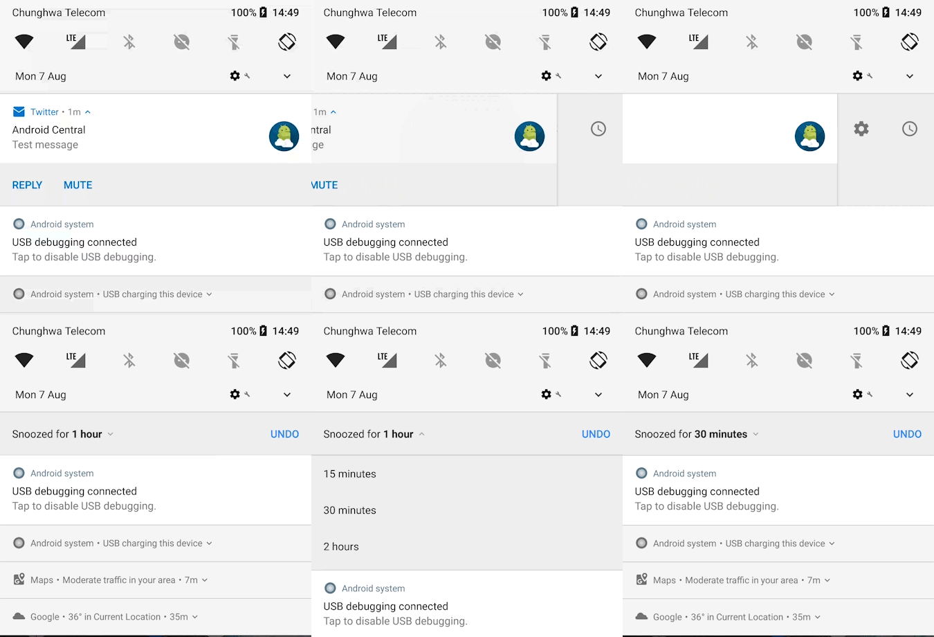
There's a certain amount of micro-management involved here, and it's questionable whether most users will even be aware of notification channels in the short to medium term. Google is hoping to speed this process along by requiring notification channel support when apps target Android 8.0 on the Play Store.
And that's the other caveat here — it's going to take time, and a lot of individual app updates, before we know how successful this feature is going to be. Maybe notification channels will be genuinely useful. Or perhaps we'll all be too lazy to bother with them.
Speaking of laziness, Android 8.0 also allows you to snooze individual notification groups for 15 minutes, 30 minutes, one hour or two hours, by swiping right and hitting the clock icon. The use case here is pretty obvious — this should be a helpful way to dismiss a notification you don't need to deal with right away, without getting rid of it permanently.
Elsewhere, media player apps like Google Play Music, YouTube, and eventually others, can introduce a splash of color to their notifications, drawing upon the main colors of album art, video thumbnails or poster art. It's a somewhat contentious feature, with some commentators arguing that it adds unnecessary visual clutter. The faded transition into album art is a little distracting, particularly when brighter colors are introduced, but it's also arguable that this helps set media controls apart from other miscellaneous alerts.
Colorful playback notifications jump into the foreground, as persistent notifications fade into the background.

Just as media controls are being pushed more into the foreground, persistent notifications — for example, from Maps, the Google app, a Wi-Fi hotspot, USB connection or any other process that might be running in the background — are being de-cluttered. These now shrink down to a shorter notification card in a slightly darker shade, setting them apart from more important alerts. If you need to see more info, you can expand them like any other notification.

The changes to Android's notification setup are small but numerous, and they aren't confined to the notification shade itself. Ambient Display, first introduced way back on the Nexus 6, has seen its biggest overhaul thus far in Android 8.0.
The main Ambient Display area actually shows you less information than it did in Nougat, with only the time and a series of icons appearing when the phone is raised. The other side of that coin is that individual notifications now flash up in a more user-friendly way.
Notification pop-ups on the Ambient Display are larger and easier to read, and if you have the option enabled, a double-tap is all it takes to open up the main lock screen.
Balancing information density and glanceability is always tricky, but Google manages a reasonable blend of both in Oreo.
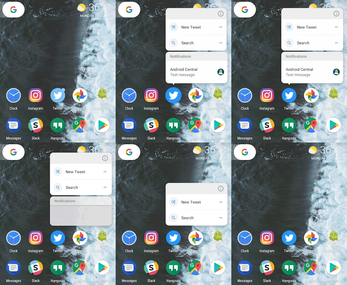
And last but not least, in addition to the notification shade, lock screen and always-on display, Android 8.0 allows launchers to show you individual app notifications through the notification badges feature. Apps with a pending notification will display a colored dot, and long-pressing to open up the shortcut menu will show notifications alongside app shortcuts, complete with the ability to swipe to dismiss.
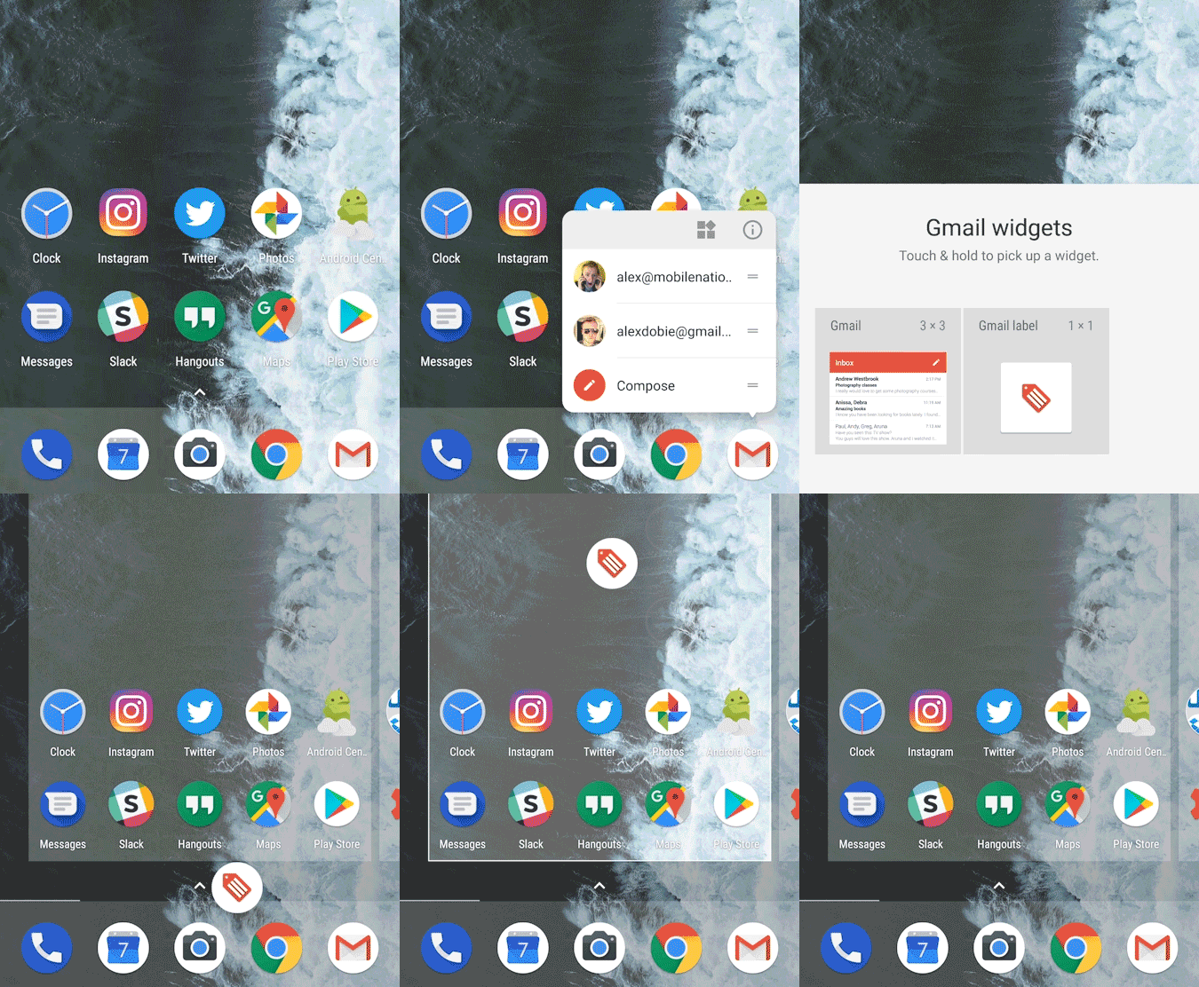
That's not the only new trick hiding behind the app shortcut menu in Oreo — a new widget shortcut button frees users from long, cumbersome widget menus, with an easy way to see all the widget from a particular app.
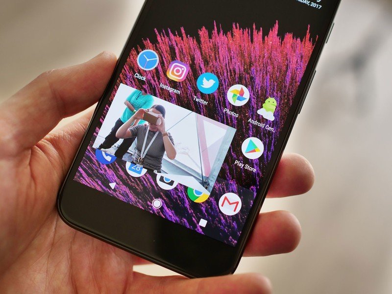
Picture-in-Picture
Picture-in-picture mode was actually introduced in Android 7.0, but only for Android TV devices. Version 8.0 brings it to phones and tablets, introducing a potentially huge feature for owners of extra-large phablet-class devices.
PiP mode varies a little depending on how the developer implements it, but basically this feature lets you start a video from within one app, then hit the home key to shrink it down into a smaller floating window with its own playback controls. You can resize and move it around the screen in the foreground, while opening and using other apps as normal in the background.
It's similar to multi-window, introduced as standard in Nougat. And while you can use multi-window to split the screen between video and other apps, PiP is a much more elegant approach.
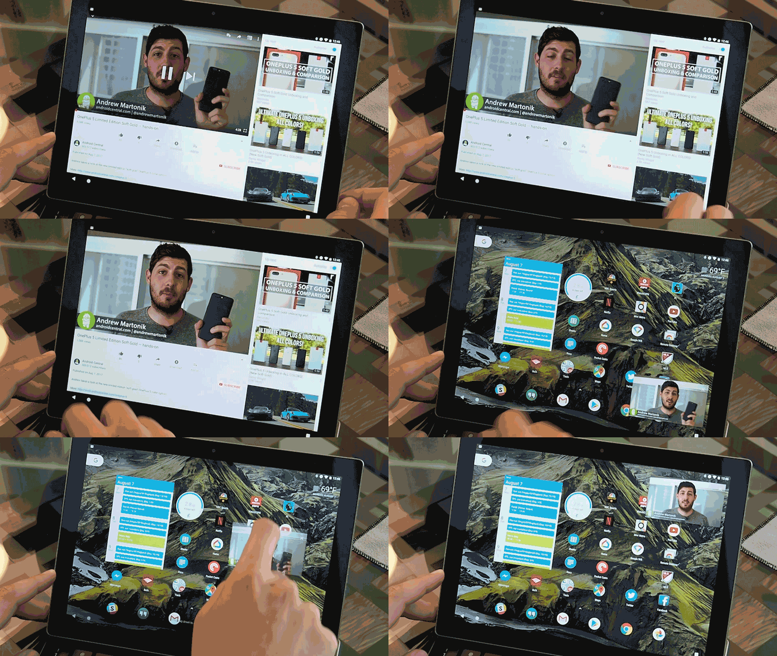
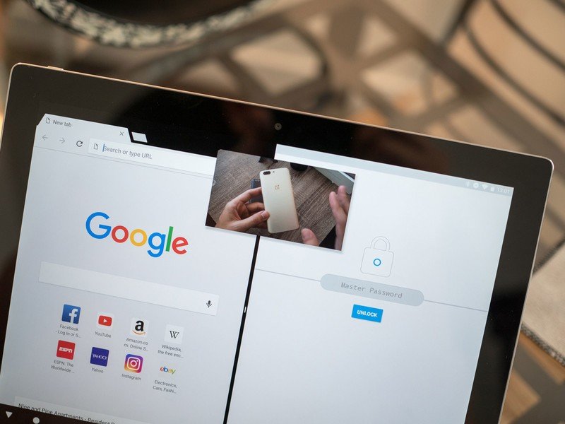
Picture-in-picture mode finally arrives on mobile devices — but will content providers make users pay to use it?
Like many Android 8.0 features, we're going to have to wait for developer to update their apps to take advantage of PiP. And as always, some platform holders (or their advertisers), and rights holders (or their lawyers) may object to allowing background playback in some instances. We're already seeing background playback gated off behind a virtual paywall in YouTube, where a YouTube Red subscription is required to play videos in the background.
In any case, Oreo lays the technical foundations for this feature on phones and tablets. And with the possibility of more Google-branded Android tablets ahead — and even more Android-enabled Chromebooks — there are exciting possibility for users and developers alike.
Smarter logins and text entry
Everyone hates entering passwords — the tedium of password entry has spawned an entire industry of password managers. But these still require a lot of frustrating copying and pasting.
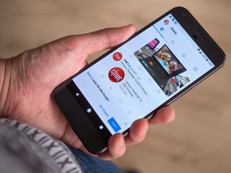
So in Oreo, Google has tackled the password pain point on two fronts. Firstly, "Autofill with Google" can help you sign into accounts on your phone using information already stored in your Google account — all with a single tap. For instance, if you've signed into Twitter on the web through Chrome, Google can then use these saved credentials to help you sign into the Twitter app on your phone.
Android Oreo is the beginning of the end for password entry on phones.
If you've already signed up to a password manager service (and they've updated their app to work with Android 8.0), you'll be able to pull in passwords from their app automatically, with any hopping back and forth, or copy-pasting between text fields.
This feature certainly takes a lot of the pain out of setting up a new Android devices, and from Google's perspective, the benefits work both ways, giving Android users an additional reason to use Chrome for their desktop web browsing.
Taken to its logical extreme, Android 8.0's password features could entirely do away with having to enter passwords on a mobile device. (With the exception of your Google password and two-factor code, of course.) But like many of Android's most convenient features, you'll need to be comfortable with giving Google all this information in the first place to reap the benefits.
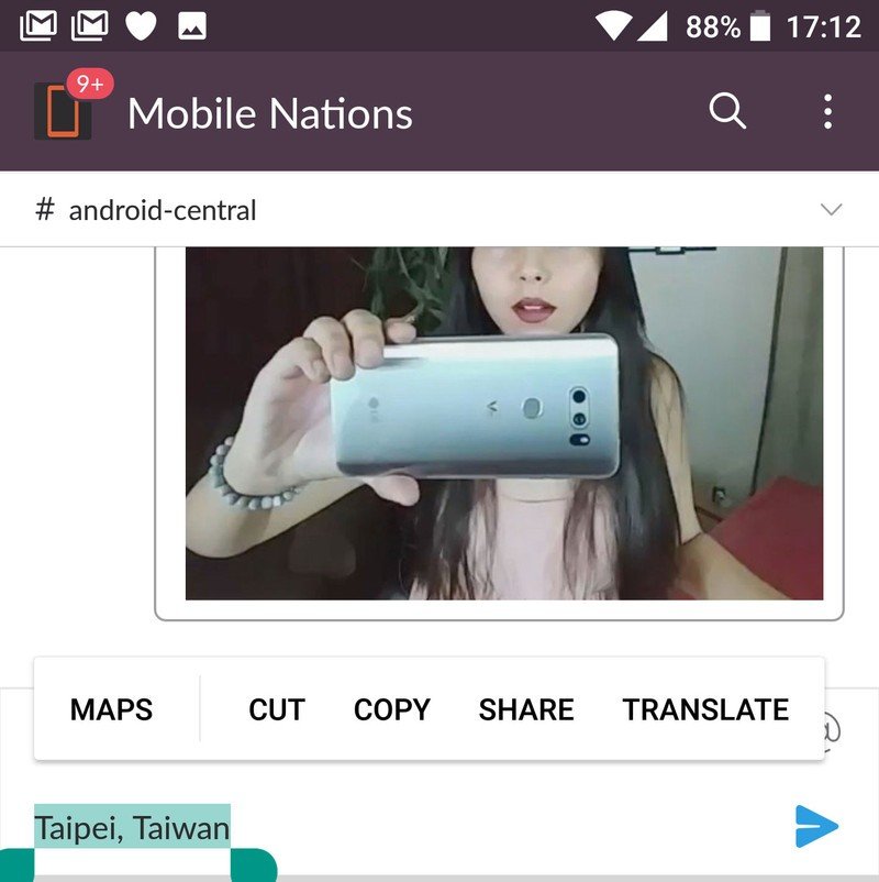
On a related note, Android is also getting smarter about how it handles specific kinds of information in text fields. When highlighting text, Google's machine learning figures out what kind of data you've selected and offers relevant contextual options — for example, a shortcut to the Dialer app for phone numbers, or Google Maps for addresses.
This is supported in Google Chrome on older versions of Android, but it's great to see it being introduced throughout the OS in Oreo.
New features for convertibles
Despite the moribund state of the Android tablet market, Oreo provides clues that Google still intends to push into the convertible space — either through Android as we currently know it, Chrome OS running Android apps, or something else entirely.
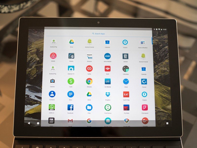
Android 8.0 brings new life to the soon-to-be-retired (yet still criminally overpriced) Pixel C tablet. On top of the new multitasking interface introduced for tablets in version 7.1.2, Android 8.0 adds a new system for keyboard shortcuts within Android apps, making it quicker to get around apps and menus where it's not convenient to touch the screen. That's particularly useful considering that a vast majority of a large tablet's life is spent attached to a keyboard.
No more awkwardly resizing that Netflix window to fit alongside your other apps.
More broadly, the Pixel C, and Chromebooks in general, should benefit from the new picture-in-picture mode, which will be particularly useful on a laptop, tablet or convertible. (No more awkwardly resizing that Netflix window to fit alongside Chrome, Twitter and other apps.) It's not a full desktop window system, but instead brings Android tablets in line with where the iPad is right now.
Also noteworthy: New audiovisual improvements that should help make Android tablets more appealing to content creators. Support for wide-gamut color in apps (such as DPI-P3, Adobe RGB and Pro Photo RGB), aim to make Android tablets a better fit for photographers, while the new AAudio API will reduce audio latency, bringing Android a step closer to taking on GarageBand on the iPad.
Android still has a long way to go before it can challenge Apple and Microsoft on tablets and convertibles, but the new features in Oreo shouldn't be discounted. As ever, the critical issue with Android tablets is still app support, where very few apps — even Google's own — properly support large, landscape displays. Android 8.0, for all of its improvements, can't really do anything to fix that.
Under the hood: Background limits, better battery life, faster OS updates
Out-of-control apps running in the background have long been the number one reason for poor battery life on Android phones. And now, building on the "Project Doze" and "Doze On-The-Go" enhancements in Android 6.0 and 7.0, version 8.0 makes it harder for badly-behaving apps to run roughshod over your device's battery.
In Oreo, Google has introduced even more limits on what apps can do while they're not in the foreground. Broadcast limitations in the new version mean that (with a few exceptions) apps in the background can't react to broadcasts (things happening on the device) that don't specifically target them. Google is using these restriction to nudge developers towards Androids job scheduler feature, introduced in Lollipop, which manages background tasks in a way that's easier on your battery.
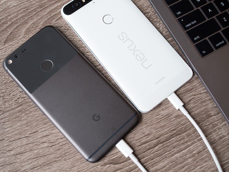
As the owner of a device on Android 8.0, you don't need to do anything to take advantage of the battery life (and performance) benefits of tighter background controls. Over the past couple of weeks using the final Oreo developer preview, I can't say I've noticed any huge difference in battery life on my Pixel XL compared to Nougat. (Then again, I've always found that phone's standby battery life to be solid.)
Oreo makes it harder for misbehaving apps to devour your battery.
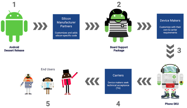
Another major pain point being addressed in Android 8.0 is OS updates. Through its new Project Treble initiative, Google is has created a modular structure that hardware companies can use to separate out their own customizations from the core OS. The idea is this will make it easier to push out firmware updates without completely reinventing the wheel. This isn't a panacea for Android's update woes, but it should significantly reduce the workload required to update a phone shipping on Android 8.0 to a hypothetical version 8.1 or 9.0, in addition to speeding up the rollout of security patches in the interim.
It's going to take years, not months to judge the success (or otherwise) of Google's new Project Treble.
It's going take time to judge how much of a success Project Treble has been. AC understands that it's not a hard requirement for OEMs shipping a phone on Android 8.0, but that Google will push device makers towards using Treble rather than continuing in the old way.
Watch this space.
Android 8.0: The Bottom Line
It's hard to get excited about any single feature in Android 8.0 Oreo, even for smartphone nerds like us. That's very much a product of where we are in the OS's lifespan right now, but it also speaks to the fact that Google is using this release to target specific areas — notifications, autofill, picture-in-picture, background battery life, Project Treble — as opposed to doing any major work on the user-facing side of Android.
As a result, Oreo is the sum of many smaller changes that make the OS easier to use, with better performance, fewer pain points and added convenience. Android still feels like Android, but in 8.0 it's more polished than ever.
Oreo is free from the early wonk that affected the first round of Android 7.0 releases.
That said, Nougat is still more than good enough for most folks, for the time being. And as Google and its partners continue to roll out security updates independently of OS updates, being out of step with the latest platform version doesn't mean you're open to malware. That's just as well, because if past years are any indication, we'll be well into 2018 before Oreo hits double figures in terms of its Android ecosystem share.
In the grand scheme of things, Project Treble could turn out to be the most significant addition in this version of Android, as Google finally picks away at the technical barriers that keep so many phones on older versions of the OS. At the same time, the introduction of picture-in-picture mode, as well as refinements to keyboard navigation, see Android shuffling closer to desktop/convertible OS status.
On the surface, this is a fairly safe release cycle for Android — evolution, not revolution. And true, most of us will see Oreo for the first time on a new 2018 handset, unless there's an unexpected rush among OEMs to update existing devices. (That's almost certainly not going to happen.)
But despite the lack of an exciting headline feature, Oreo is still an important update. More importantly, it appears to be free from the woes which affected early Nougat firmware for the Nexus 5X and 6P this time last year. And for Pixel and Nexus owners lucky enough to be on the early release track, they'll be among the first to experience the most stable and capable Android release in years.
Andrew Martonik and Jerry Hildenbrand contributed to this review.

Alex was with Android Central for over a decade, producing written and video content for the site, and served as global Executive Editor from 2016 to 2022.
