Google+ for Android walkthrough
Google+ (pronounced "Google Plus") is still pretty fresh on the scene. It's barely a week old as of this writing, actually, and still in a relatively closed beta process. But it's definitely been a trial by fire. We've read about it, we've talked about it, and shoot, the app has even gotten it's first second update in the Market, so now it's time for a thorough rundown of Google's latest baby, mobile-style.
Join me after the break to see what the hype's all about, how Google is doing things right, and why you should still lust for an invite (but without spamming your email!).
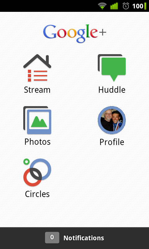
Take another look at that image above. That's the Android app for Google+. The interface is sleek and familiar, kind of akin to its competitor, Facebook. Icons are arranged in the same grid format, icons are simple are cartoonish, but it all feels very clean and very Google.
It's your first impression of the app after signing in, and I think Google made the right choice in their presentation. It's not obscure enough to be off-putting but not so similar it looks like a blatant rip-off. Get used to this screen, cause you'll be seeing it a lot (until you go to other parts of the app, that is).
The Stream
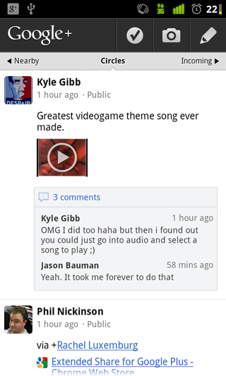
The Stream concept in Google+ is a really cool one, and it's implemented just as well on mobile as it is online. If it looks like a News Feed, that's because it is. Everything that's been shared with you (from someone else) as well as anything you post to anyone in any of your Circles goes here. It's a nice catch-all, keeping everything on one screen, but it runs the risk of being cluttered.
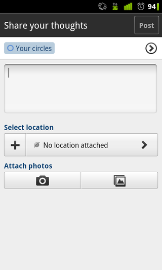
Sharing is as simple as clicking the pencil icon, typing up a post and selecting which circles you want to share it with. By default, your sharing starts off with "Your circles" being up, but you can delete that and choose specific Circles of yours (if you know who you want to share with) or even select individual's names or email addresses (if they're not on Google+). You can also share your location or attach an image to your post, via the large camera and album buttons.
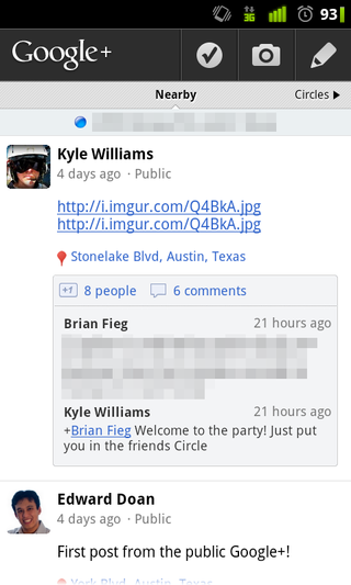
By sliding your Stream to the left, you'll be able to view all the publicly shared posts that were around your location. You might not know any of these folks (chances are you won't), but you'll still be able to see their stuff because they've made it public. Google+ will automatically determine a rough location even if you're not using GPS, so don't expect to see people's posts from another city.
Be an expert in 5 minutes
Get the latest news from Android Central, your trusted companion in the world of Android
Another part of the location feature is the ability to check-in places, straight through Google+. It's not Foursquare, Gowalla, nor Facebook Places, but it's own, independent location-sharing component. To do so, press the check icon from your Streams menu and you'll be taken to another screen with locations you're close to.
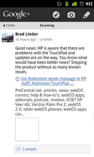
The Incoming screen kind of eludes me in purpose. It's for showing the posts of people who are following me, without having to follow them back. I know they've all added me, so if it's a separate wall to see all of the Creepy McStalkersons who've added you but you refuse to add, I guess that's all right.
As we've mentioned before, how Google+ determines what posts jump to the top of the Stream is kind of confusing. Any new activity (i.e. comments) will force the old content back to the top. It's definitely not the best system, and Google has already said it's rolling out tweaks for it this week. So don't sweat it for the mobile app.
Another thing to consider is that while you can share content with anyone in your Circles (all circles, specific circles, and even just specific people), if you're having a one-on-one conversation with someone via posting, it ends up dominating what you see for a while. For this reason, it looks like Google needs to add a dedicated inbox/messaging feature just to keep things organized, unless they present a compelling reason to keep things as they are.
The photos
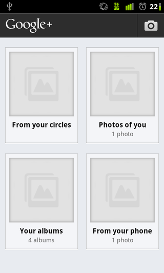
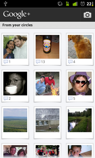
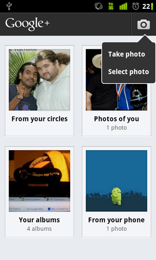
The Photos option in Google+ is really pretty stellar. When you open it up, you're shown the above menu (but with thumbnails loaded). The "From your circles" album contains all the pictures that have been shared with you by anyone in your Circles, and the thumbnail is actually a rolling slideshow of everything you can see.
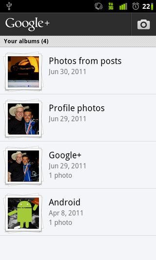
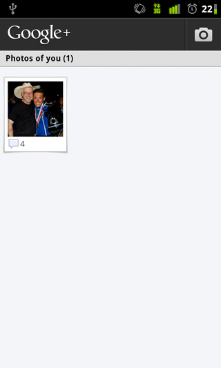
Photos of you is, obviously, photos of you. Your albums has all of your albums, whether public or private, that are linked up to Picasa. From here, you can decide to share more pictures, comment, or just check them out.
The photos from your phone are pictures that you didn't take with your camera, but uploaded to Google+/Picasa from your phone's internal memory. That's an awesome feature because it doesn't restrict you to only sharing pictures you've taken live. The camera button in the top-right of the screen opens your camera to share pictures via Instant Upload.
Instant Upload is an option in the settings menu that gives you the opportunity to have any picture you take on your phone instantly uploaded to a private album attached to your Google+ account, so not only is it already in the cloud, it's one click away from sharing with your cohorts. A few of us demoed it the first night we got into Google+ and it works really well.
The Circles
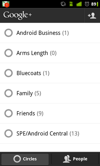
Circles on the Google+ mobile app are a fairly straightforward affair. Going into this menu gives you two lists you can choose from: Circles or People. Circles are, well, your Circles. People has everyone you've thus added to a Circle.
When you select a Circle, you then advance to a secondary screen showing you all of the people in that Circle, along with their avatar and email address. Tapping on any specific person on this screen takes you to that person's personal Stream/Posts wall thing. If there's someone specific you want to see, this is a great way to get there.
People offers the same functionality, everyone is just listed alphabetically. To help you make sure everything is still organized, instead of their email address, people's Circles are displayed in it's stead.
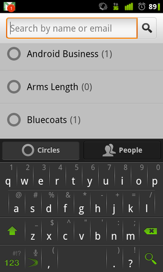
You can also add people to a Circle (or just to your Google+ in general) straight from the app via the + button in the top left corner. You can search by name or email address, and if anyone is found, you'll be prompted to add them to a Circle. Fairly simple and definitely effective.
The Huddle

Huddle is one of Google+'s absolutely killer features. It's definitely Google Talk on steroids, and I like it. You can have a list of Huddle's up to choose from, depending on who has invited you to one, but I haven't been able to test if you can actively participate in more than one Huddle at a time.
The idea behind Huddle is that you're huddled with a group of friends (how deep!), so the things you're all talking about are between only you. The other assumption is that you're only mobile when you do this, because there's no web side to Huddle; you can only do it on your phones.
If it looks and feels like a large Google Talk group chat, that's because it is. It's instant and it's real-time, though, so I can't complain. We are all hoping that they add a web-side to Huddle, and if/when they do, it'll probably become a part of GTalk. Expect those two branches to merge in the future.
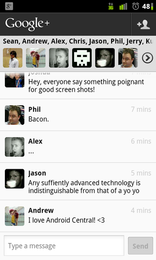
The Huddle interface is simple and functional. Up top, you've got everyone participating in the Huddle. Down below, the actual text. Me and most of the other Android Central writers tried one out and it works like a charm. It's a very cool idea that's only going to get better with time.
The Profile
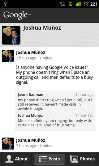
The Profile button is just that: your profile. You're able to see your posts, your personal information (on the About menu), or your photos, but otherwise, it's nothing revolutionary. It's clean and aesthetically pleasing, but that's something seen throughout all of Google+, not just the profile menu.
It is cool, however, that on anyone's About screen, if their cell number or email is available to you, you can initiate a text, call, or email straight from Google+.
Other odds and ends
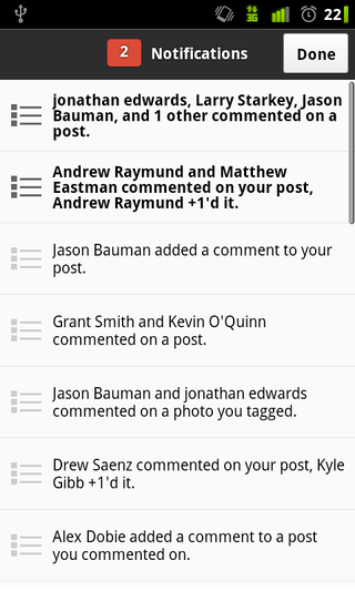
The Notifications done in Google+ are really superb. Whenever there's activity on anything you're involved in, you not only have a warning within the app (on the main menu), you also get a notification in your notification bar.
Selecting your notifications within the Google+ app pulls the drawer up, opposite the Android default, and presents you with all activity on your posts and comments. Bolded selections are ones you haven't tended to yet, and unaccented ones are ones you've already seen.
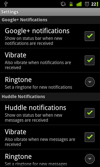
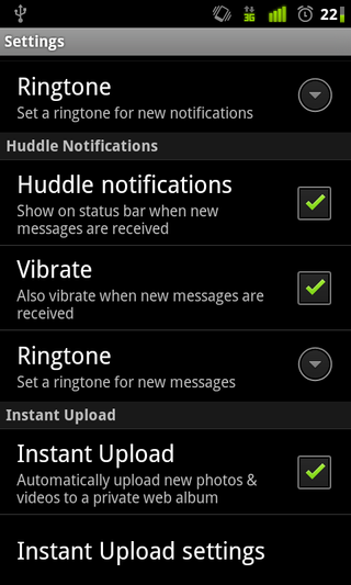
Google+ also contains the requisite settings menu, complete with notification options and your Instant Upload settings. There's not much to say here, it's nothing you haven't seen before.
The wrap up
Google's finally done social networking right. There's no other way to put it. Google+ in general has immense potential -- remember it's only a week old -- and the app they've crafted to be your gateway to that network is very well done.
While some things aren't perfect, those aren't the fault of the app, but of certain ideas motivating Google+. You can tell Google's playing for keeps now; they updated this app twice in the week it debuted. I'm sure as more tweaks are rolled out on the backend, the mobile app will see the same treatment.
Overall, this is an extremely polished foray into a "Field Trial." If you're part of the Google+ community, there's no reason not to have this app on your phone. If you're not, download it anyway and lust after a coveted invite. This is quite a force to be reckoned with, but after some months have passed and the novelty has worn off, we'll all see how Google+ (the whole service) has fared.

