Android 5.0 Lollipop: Material Design in pictures and video
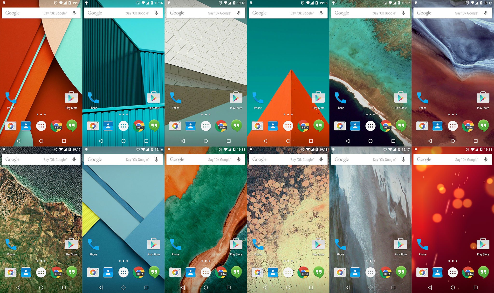
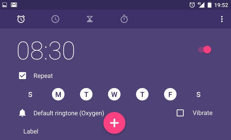
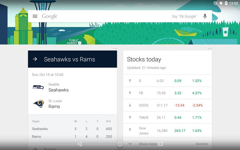
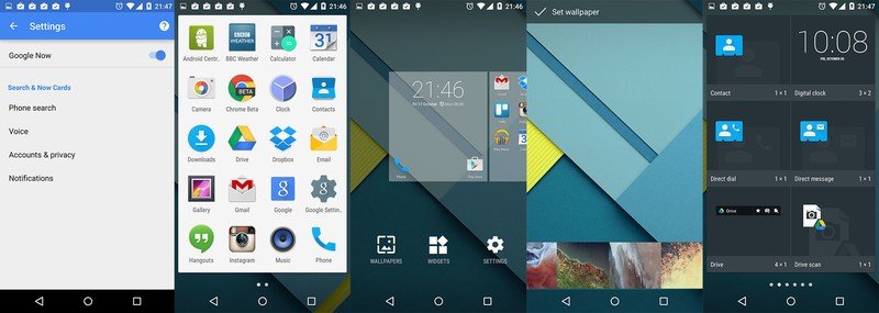
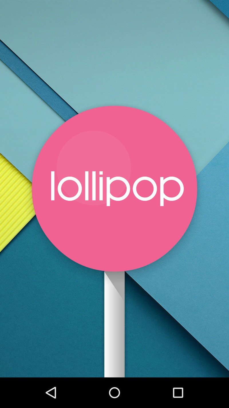
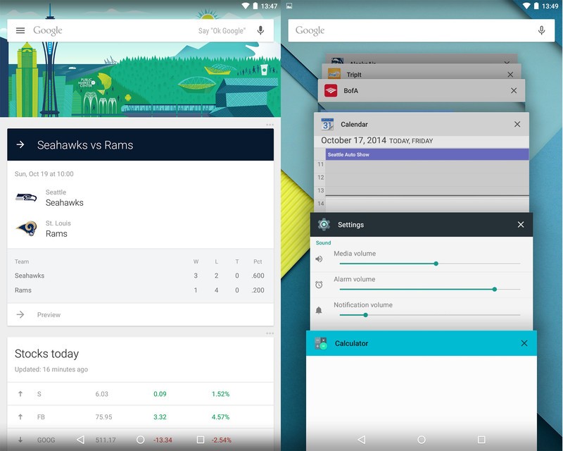
Lollipop is upon us, kind of. The latest developer preview of Android 5.0 includes a more Material Design-inspired interface all around. It's just the kind of thing we've been waiting for — and sure get developers' creative juices flowing.
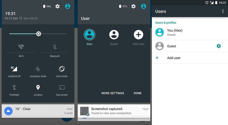
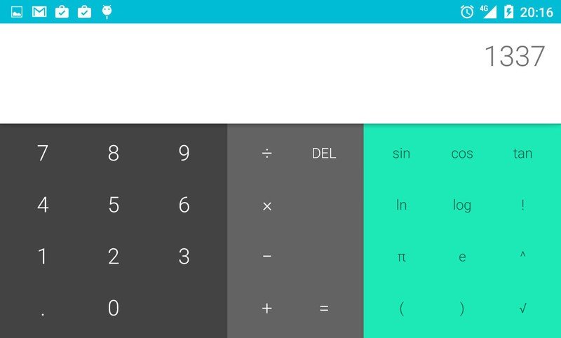
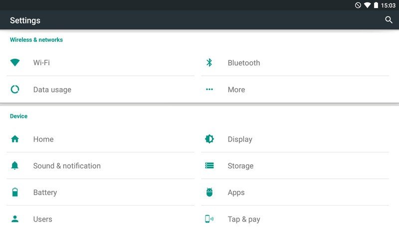
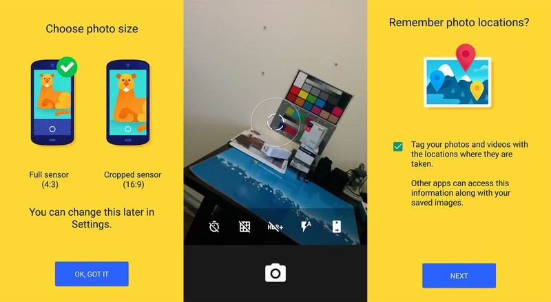
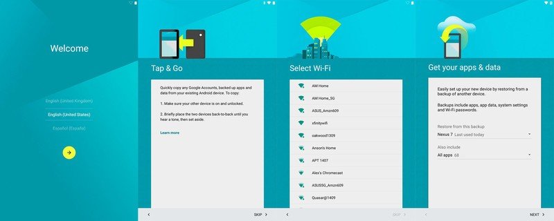
There are small changes everywhere — and when combined with some core features and applications that have recieved a serious revamping, we get an entirely new look and feel from the current Lollipop preview compared to previous builds. And when coming from KitKat it's a refreshing change that really feels like a new operating system.
Most of the features you love from Android are still there and working just as before, but subtle design changes give everything a fresh new look. Of course, there are some new tricks, and unlike some previous Android iterations the mix of the old and the new has a very consistant feel. Material Design is more than just a few new colors and a flat look, and when everything — down to the smallest icon — adheres to the specifications the whole system feels as if it belongs.
Of course, as Android fans we're pretty impressed. Things aren't perfect, but what we're seeing in the latest Lollipop preview has us excited. We think you'll be equally excited, so check out our montage of the Lollipop experience.



Be an expert in 5 minutes
Get the latest news from Android Central, your trusted companion in the world of Android

Alex was with Android Central for over a decade, producing written and video content for the site, and served as global Executive Editor from 2016 to 2022.
